Information Technology Reference
In-Depth Information
VI. Conclusion
The study of visualization quality provides a rich source of open problems.
Here we have introduced a new technique using the Voronoi Diagram for
assessing quality in radial visualizations. The nature of the construction of
this class of visualizations inherently links visualization quality with the
selection and arrangement of dimensions. While we presented several
examples of this method with real data sets, we also introduced more
theoretical concepts underlying our method. A comprehensive study of the
properties of the Voronoi diagram in this context will lead to further
techniques to enhance cluster analysis and the quality of visualizations.
The “Curse of Dimensionality” requires techniques such as the one we've
suggested to help in making more apparent features of the dataset [1].
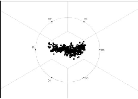
Fig. 13.15.
Voronoi diagram of Cars data set with uniformly spaced dimensional
anchors. Q score is -0.862 [9].
Similarly, since each dimension is used as a DA and so is represented
as a Voronoi site we can see that in some cases we could have many sites.
A large number of regions, especially when they are small, create an effect
that we could call noisy or dense in that the effects of any particular region
are difficult to determine. In these cases we may wish to begin selectively
reducing the number of sites.
The placement of dimensional anchors is another important problem.
Daniels
et al.
[1] have shown that dimensional anchors need not stay on the
unit circle (or hyper sphere); data images must always remain within the
convex hull of the dimensional anchors. We have simplified our work here
by working with the CDL+AAM placement method described in Section II.


Search WWH ::

Custom Search