Graphics Reference
In-Depth Information
collaboration between graphic designers and cultural geographers, and in particular
the communicative possibilities of typography and graphic design when used in rela-
tion to the understanding and representation of place.
Alison's work centres on exploring notions of everyday life and place through print-
based graphic design. By everyday life, she means the kind of daily routines or things
that we tend to take for granted. For her, these seemingly inconsequential events or
items are fascinating. Whether it is a favourite ornament on a mantelpiece or the re-
cycling of unwanted household goods, there is always a story waiting to be revealed.
These stories, and the work that develops through them, are not driven by a commer-
cial perspective, but by Alison's own personal interest. However, that is not to say
that she would describe her work as 'self-indulgent'.
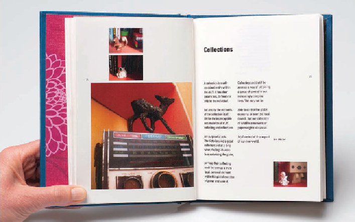
The design of the grid and the setting of the typography have been developed conceptually. The
grid is modular, designed in response to the notion of a collection being the sum of several parts.
In places this is used in such a way to reference meaning within the text; for example, in the
section of the essay that references collectors, the text is set in small blocks that begin to fill the
page. At the end of the topic, the text begins to break out of the grid, resembling a collection of
separate, disconnected lines, to reflect the idea that on death, possessions that once held mean-
ing more often than not simply revert to becoming inconsequential junk.