Game Development Reference
In-Depth Information
The type of
Transition
determines the result of the previous events; they include:
•
ColorTint
(the default shown in the preceding screenshot): This changes the
base tint color for the selected
Image
based on the control's state
•
SpriteSwap
: This replaces the target image with an alternate sprite based on
the control's state as shown here:
•
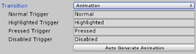
Animation
: Instead of just some basic features as discussed previously,
controls implementing the
Selectable
component also come with an option
to do, basically, whatever you want to when the events occur by using the
full power of the Mecanim animation system.
So based on the control state, the animation controller will activate an animation
with the name supplied. To make things even easier, Unity has provided a handy
button to generate the default animation states and a controller (aren't they nice).
If you want to use the same animation on multiple buttons, just add an
Animation Controller component to the additional buttons and then drag
the controller you initially created to the new buttons.
We'll cover the animation option in more detail in an example later.
•
None
: Basically don't do anything, be a really boring button if you really
want to.