Game Development Reference
In-Depth Information
What makes it Selectable?
The
Selectable
component covers everything that is needed by a GameObject to
react to inbound events from the
UnityEvent
system; it then offers several graphical
actions based on these events.
Note: For the
Selectable
component to function correctly, it must have
a component that will interact with the current raycast system in use.
By default, it requires an
Image
component attached to work with the
default Graphic's Raycaster. Other raycasters may be used if you wish;
you would then need to attach the corresponding detection component
(for example, a mesh with a physics collider for the Physics Raycaster)
to the Selectable's GameObject.
The events that the Selectable control manages by default are:
•
OnPointerEnter
/
OnPointerExit
(hover/highlighted)
•
OnPointerDown
/
OnPointerUp
(pressed)
These provide input to the control from the
UnityEvent
system (either touch, mouse,
or keyboard). If we look at just the Selectable component part of the
Button
control,
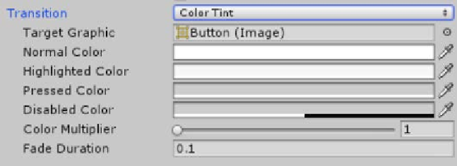
we see the following
Transition
options:
These
Transition
options provide us with several customizable options we can use to
affect the visualization of
UI
components based on the current input state:
• Whether the pointer is on top of (hovering over) the GameObject (mouse only)
• Whether the GameObject is being pressed (mouse, touch, and keyboard)
• Whether interactivity on the control is disabled