Database Reference
In-Depth Information
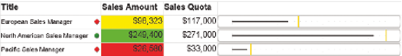
Conditional formatting is also very easy with SSRS, as Figure 15-15 shows.
FI g u R e 15 -15
Adding conditional formatting to an SSRS table
Of course, being cautious with colors is imperative if you don't want your chart
selection of colors. As shown in the chart in Figure 15-15, using indicators is
a more subtle and less garish way to show the data points.
PErForMANCEPoINT
Although PerformancePoint is not a great embedded
visualization tool, it is the most capable of the indica-
tor tools with its scorecard component. And with a bit
of work, conditional formatting can also be applied.
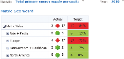
An example scorecard with both indicators and condi-
tional formatting is shown in Figure 15-16.
FI g u R e 15 -16
Conditional formatting in
PerformancePoint
IMPleMenTATIon eXAMPleS
The implementation examples all use the OECD_Data model. See Chapters 4
and 5 for creating this data model.
EMBEDDING VISuALIzATIoNS oN A PIVoT TABLE
Pivot tables are the most likely place for you to need visualizations; in this sec-
tion you will create a new pivot table, add sparklines, and use conditional for-
matting. Data bars can be added in the same manner as conditional formatting.
Combining too many
of these visualiza-
tions in a single chart
is overkill and should
be avoided.
Start by creating a connection to the OECD_Data tabular model. Do this in
Excel by going to the Data tab, clicking Connections, and then clicking Add.
(You need to click Browse for more and then New Source if a connection does
not exist already.) Your connection type will be Microsoft SQL Server Analysis