Database Reference
In-Depth Information
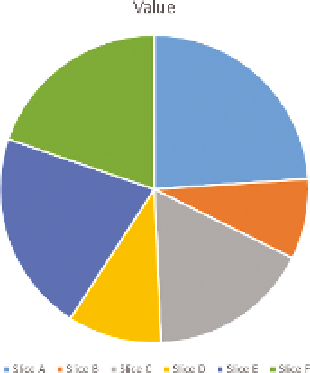
slices of a pie chart with similar but not identical values opposite each other
can be hard to read. As you learned in Chapter 2, background images can
also distort comparisons.
PIE CHArTS VErSuS BAr CHArTS
People commonly use pie charts as a
comparison visual. However, you need to
carefully think before using a pie chart.
Figure 12-3 shows a pie chart. Look care-
fully. Is Slice B or Slice D bigger?
It's fairly difficult to determine which slice
is larger. While, as shown later, ordering
the pie chart by value will assist in this
comparison, there are better methods.
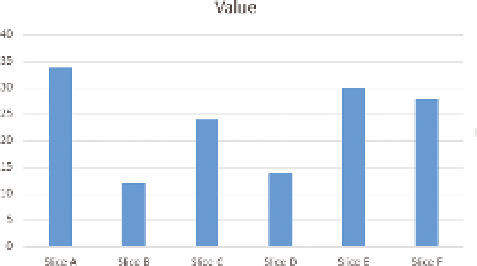
Compare Figure 12-3 to Figure 12-4, a col-
umn chart of the same values.
In Figure 12-4, it's much easier to deter-
mine which column is larger, and it's also
easier to tell the absolute values.
F I g u R e 12 -3
An Excel pie chart with
similar-sized slices
F I g u R e 12 - 4
An Excel column chart with the same values
Another option is a stacked column. With a stacked column, as with a pie chart,
it aids perception greatly to order the numbers by value. You can see by this
by comparing the pie chart in Figure 12-5 with the stacked chart in Figure 12-6.