Database Reference
In-Depth Information
the interval type to Months. Set the Axis title at the same time. On the same
screen there is a text box for the Axis title, which will replace the words “Axis
title” displayed previously. Make the axis title
Country
.
Reporting Services
automatically con-
verts the axis display
to a date format when
an interval type that
corresponds to a date
is chosen.
Run the report by clicking the Execute button and you see a display similar
to Figure 11-44.
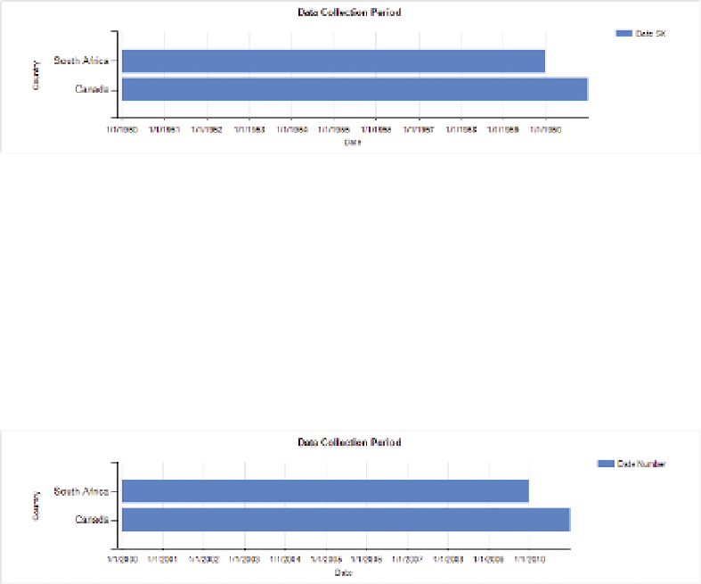
F I g u R e 11 - 4 4
Running the report
It's immediately apparent that the dates are wrong. This is because the data
set uses 1950/01/01 as the base date, and a date type in SSRS is based upon
a date starting in 1900/01/01. If you create a new calculated field in which you
add 18262 to the DateSK and then add 18262 to the minimum and maximum
values, you get a chart such as that shown in Figure 11-45, which shows an
accurate timeline for when data was collected for South Africa and Canada:
F I g u R e 11 - 4 5
Date ranges displayed in SSRS
SuMMARy
In this chapter you learned about using visualizations to present data that
changes over time, and the pitfalls to avoid. The different tools in the Microsoft
stack are all good at displaying temporal data, but for different purposes:
PerformancePoint is good with custom date ranges, Power View has an ani-
mated bubble chart, Excel has trendline functionality, and Reporting Services
can display timelines with ease.