Database Reference
In-Depth Information
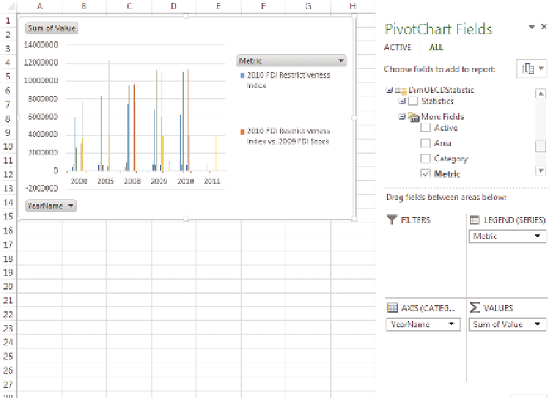
At this point, you see an empty pivot chart on the left and the PivotChart
Fields pane is on the right, but you need to add the appropriate fields to the
chart. Start by adding the Value field from the FactOECDPopulation table
to the Values block, and Metric from DimOECDStatistics to the legend, and
YearName from DimDate to the Axis, as shown in Figure 11-37.
F I g u R e 11 - 3 7
An Excel pivot chart
At this point, the chart isn't showing anything meaningful for analysis, just a
selection of the metrics. Start narrowing down the selection by clicking Metrics
in the pivot chart and selecting Gross Domestic Product and Population Levels.
This restricts your data set to the values you want to compare. However, to
compare them you need to format them to show a line and a column, and
you need to set up secondary axes. In Excel 2010 and earlier, you do this by
changing the chart series type individually, but in Excel 2013 if you right-click
anywhere on the chart and select Change Chart Type, you are presented with
the new chart selector window, as shown in Figure 11-38.
Set the chart type to Combo, and select Secondary Axis for Population levels.
Click OK.