Database Reference
In-Depth Information
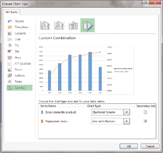
F I g u R e 11 - 3 8
Changing a pivot chart type
This chart is a great showcase of one of the biggest fallacies in temporal analy-
sis—points on the axis that have no data are hidden (for example Monday
being followed by Wednesday because Tuesday had no data), thus altering
the slope of the curve.
To fix this issue, you need to make several changes: Show the missing data
points, limit the chart to the relevant dates, and add a trendline to interpolate
the missing years.
To add the missing data points, right-click the chart area, and click PivotChart
Options. Choose the Display tab, select the Show Items with No Data on Axis
Fields option, and then click OK. All the years are now displayed, and you filter
them by clicking YearName and choosing the years 2000 through 2012. The
gross domestic product series is showing correctly as columns, but you need
to add markers for the line chart to show noncontiguous values. Right-click the
line and choose Format Data Series. If you're using Excel 2013, you should see

