Database Reference
In-Depth Information
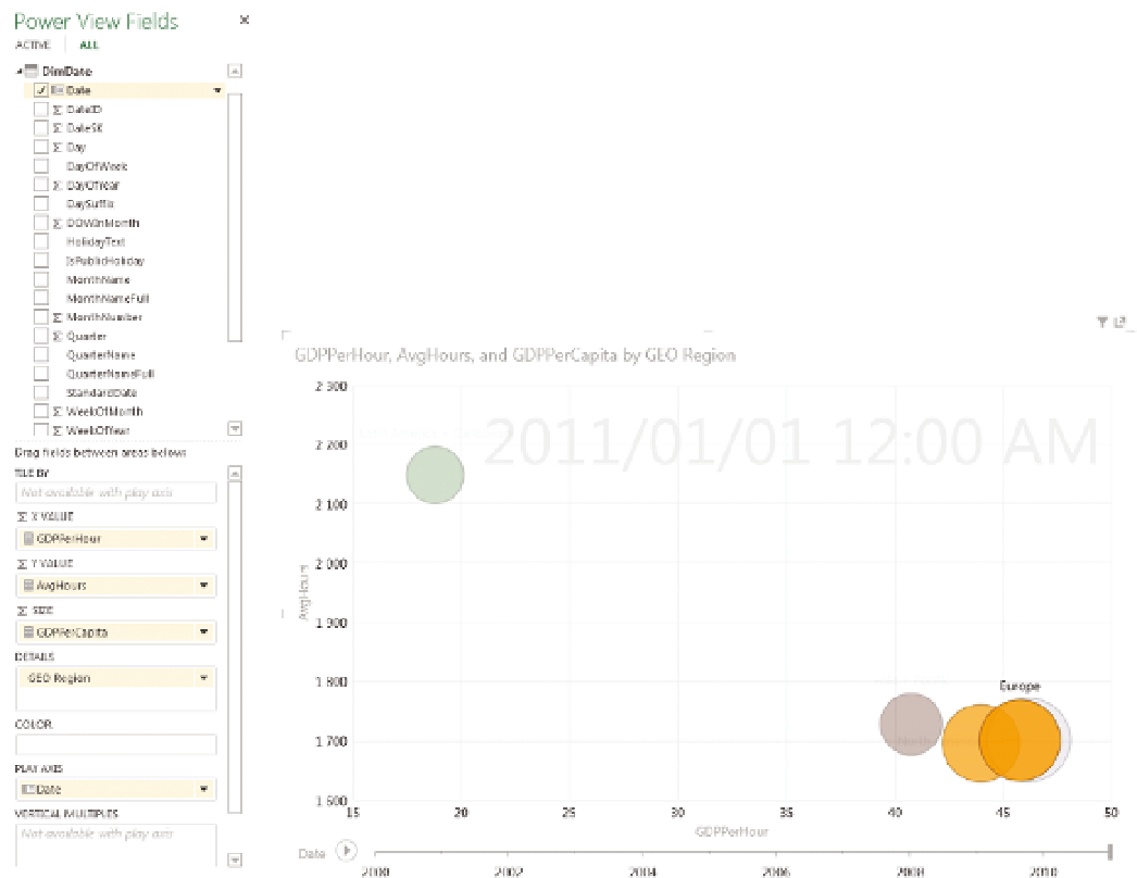
Change the chart type to a scatter plot (you do this in the Design tab,
under Other Chart). Resize the chart to fill the screen. Drag GeoRegion from
DimCountry to the Details box on the right side, and drag Date from DimDate
to the Play Axis box (see Figure 11-32).
The result is an animated scatter chart, which you can play; alternatively,
you can drag the slider to see data at a point in time. If you click a particular
data item, you see the history for that item. Figure 11-33 shows an animated
bubble chart.
F I g u R e 11 - 3 2
Power View
field choices
F I g u R e 11 - 3 3
A Power View bubble chart
CoMBINING LINES AND CoLuMNS IN ExCEL
In this section, you are going to track the relationship of Gross Domestic
Product to population size over time. This example uses Excel 2013, which has
a combined chart type that makes this process easier, but in earlier versions
of Excel it is easy enough to simply change one of the chart series types to a
line chart to create a combination chart.
Switch to Sheet 1, then start by clicking the Pivot Chart button on the Insert
Ribbon, as shown in Figure 11-34.