Geography Reference
In-Depth Information
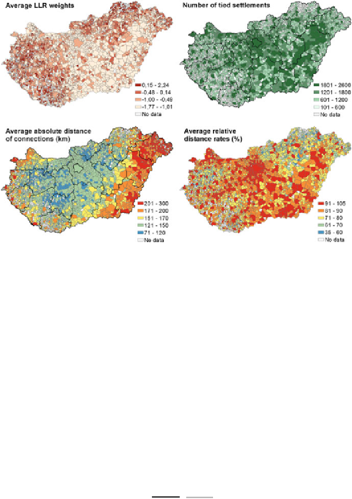
Fig. 7 Settlement level patterns of main OSN performance indicators
usually strong connections with others. The second thematic map (top right) reflects
the aggregated number of settlements, with that a certain settlement is in connec-
tion. The more settlements a certain location is connected with, the larger number of
tied settlements it has and the darker it appears on the map. It is interesting to see by
the comparison of maps that higher values appear typically at western and northern
areas on the first map (usually in case of small settlements), while at central and
south-eastern settlements on the second map (typically at larger cities). The third
map (bottom left) shows the average distance of connections, while the last one
(bottom right) indicates the average relative distance rates. The latter map was
created since average absolute distance of connections largely depends on central or
peripheral geoposition of a settlement, while relative distance rates denote
non-biased network proximity. Consequently the observed and expected distance
averages were compared as follows (Eq.
2
):
0
@
1
A
X
X
k
n
d
ij
d
ij
i
¼
k
i
¼
1
ARD
i
¼
ð
Þ
=
100
2
k
n
in which ARD
i
refers to the average relative distance rate of settlement i, d
ij
is the
distance between settlement i and j, k is the observed number of connected
settlements and n is the total (or expected) number of settlements.