Graphics Programs Reference
In-Depth Information
Since there is bright light behind our sub-
ject (the clock), you might want to bring
up the Fill Light a little bit to brighten the
clock (as shown here). Just remember, if
you drag this slider pretty far to the right,
you'll also have to drag the Blacks slider to
the right a bit to keep things from looking
too washed out (and the photo looks a
little washed out to begin with, so we
don't want to make things worse, right?).
You can f fix the wa shed out overall look
by bringing back some color saturation
and depth in the shadow areas. Just drag
the Blacks slider to the right until the color
looks nice and rich, and the photo doesn't
look washed out any longer (as shown here,
where I dragged the Blacks slider over to 30).
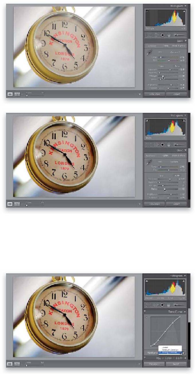
The Fourth Point:
Adding Contrast
The next point is to add more contrast
to the photo, since most RAW photos
tend to look a little flat (maybe that's why
Adobe has the Point Curve set to Medium
Contrast by default for all RAW images.
For JPEGs, there's no contrast added at
all—the Point Curve is set to Linear). Go to
the Tone Curve panel, and choose
Strong
Contrast
from the Point Curve pop-up
menu (as shown here). If that's enough
contrast, you're set. If not, just make the
curve steeper to add more contrast (click
on the second point from the top, then
use the
Up Arrow key
to move it higher
and increase the highlight areas in your
photo. Then click on the second point
from the bottom of the curve, and press
the
Down Arrow key
on your keyboard
a couple of times to increase the blacks.
I didn't think I needed it with this one,
but now you know just in case. More on
this on page 142).