Database Reference
In-Depth Information
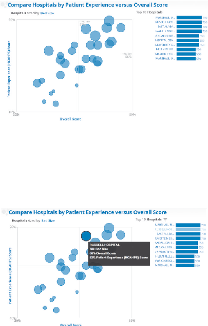
the nature of the data, the dimensions and metrics displayed, and eventually
how a small piece fits into the whole. Take the following data visualization
comparing hospitals by patient experience as an example (Figure 4-20).
Figure 4-20
Hospitals and patient experience
There is a lot going on here. The bubble chart shows three separate metrics
about each hospital. The meaning, size, and positioning of the bubbles requires
new readers to carefully review the axes and legend to get their bearings.
The connection between the bubbles and the bar chart on the right is not
immediately obvious.
It's a lot easier to tell the story of a single bubble as illustrated in Figure 4-21.
Figure 4-21
Hospitals and patient experience with emphasized bubble
Search WWH ::

Custom Search