Database Reference
In-Depth Information
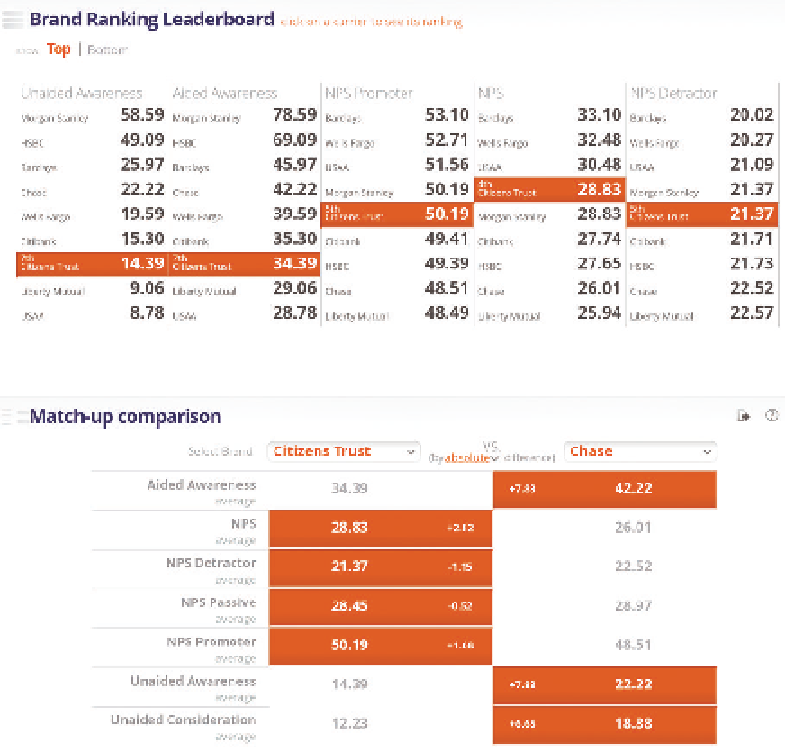
communicate improvement or regression. Direct comparisons can show how
two or more entities rank compared to each other. Numerous specialized data
visualizations have been designed to enable quick comparison, including bul-
let charts, “stop-lighting,” and leaderboards.
This dashboard (Figure 4-19) compares bank brands by a series of survey
questions. Rankings and side-by-side comparison make it obvious who is
performing better for each brand performance measure.
Figure 4-19
Brand ranking leaderboard
Find a Starting Point
A dashboard, report, or data visualization can feel like an ocean of information
competing for your attention—like a
Where's Waldo
puzzle. Rather than trying
to take in the whole picture at once, it's a good idea to focus your attention on
a small piece of the picture. Focusing on a single element can help you grasp
Search WWH ::

Custom Search