As explained in the previous part, navigations on Windows Phone use the same navigation introduced in Silverlight 3. There are two important elements in the application level which are Frame and Page, and one important element in device level.
FRAME
Frame is integrated with the whole layout of a Windows Phone application, and only one frame can be used throughout the application. Several characteristics related to frame are the properties that can be used (full screen, orientation), the ability to expose page areas in it and provide a location for system tray and application bar. System tray is an area in which system status, such as battery, signal, etc. are displayed. Application bar, on the other hand, provides space for frequently used tasks.
PAGE
A page fills the whole content of a frame. Main characteristics of a page are title and the ability to show application bar specifically on certain pages.
BACK BUTTON
One important element that has become a standard in every Windows Phone device is a "Back" button. Thi s button is used to move one page backwards. With this button present, developers are advised not to add any back button in their applications, unless absolutely necessary. By default the back button will also close any pop-up menu displayed and bring users back to the previous screen.
Navigating Between Pages
Now we will learn how to navigate between pages in a Windows Phone application. Follow these steps:
1. Use the project we have created in the previous exercise. Add a page; in Solution Explorer, select Add > New Item.
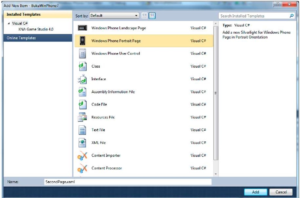
2. Select Windows Phone Portrait Page and rename the file as you like, in this example SecondPage.xaml, then select Add.
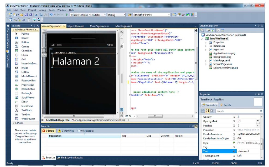
3. Change the page title into "Page 2" from the XAML code
4. On MainPage.xaml.cs, change the codes in the Button’s click event handler into the following:
Navigate is a static function from NavigationService which is used to navigate to desired pages using target URI as the parameter.
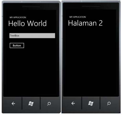
5. Press F5 and see the result. Click on the Button to go forward to the next page.
6. We can use the Back button to return to the previous page. Additionally, if we want to go one page backwards using custom button, we can do so by typing the following code into an event handler
In the next part, we will see how to do a parameter passing while navigating between pages.
Passing Parameters Between Pages
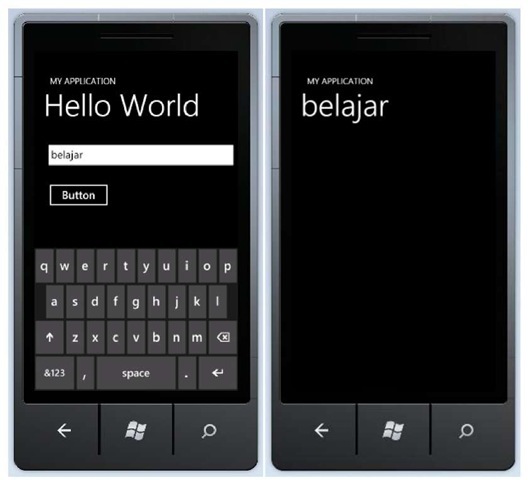
1. Use the previously developed project. The scenario we will use in this exercise is passing a string typed into the TextBox.
2. Type the following code into the Button’s event handler
3. On the second page, we will try to retrieve the sent string and show it on the page title. Type the following code to do so:
4. Press F5 and see the result. Type any string into TextBox then press Button. The title on the second page will change according to the input text.
Pivot and Panorama
Navigation is an aspect that can be found very open for exploration, especially to build a better user experience; and Microsoft seems to be concerned about the topic. In the latest release, developers have the advantage with two complete look and feel experiences available, along with the built-in controls and navigations. Let us get to know Pivot and Panorama.
Panorama
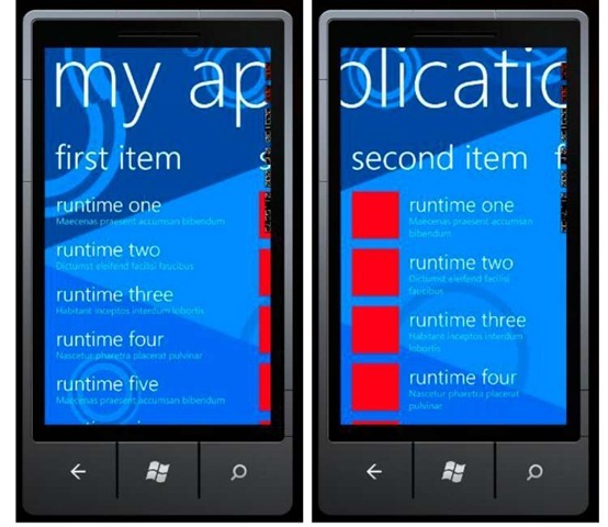
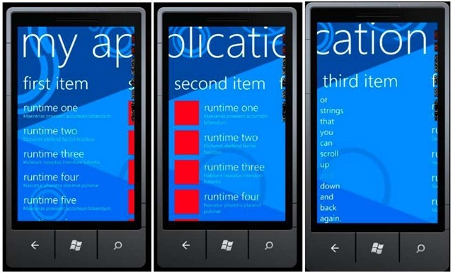
Panorama is designed to fit into the device’s main screen limitations. The panorama application offers a unique way to show controls, data, and services on a horizontal canvas which size extends beyond the device’s display. The dynamic view uses layer animations that give fun parallax effects. Panorama can be used for application with non task-oriented page browsing and hub with a lot of information.
FIGURE 2 PANORAMA VIEW [5]
Panorama view supports touch interaction for its navigations. We don’t need to re-implement. Among the supported interactions are:
1. Horizontal pan (press and drag left or right)
2. Horizontal flick (press and slide quickly left or right)
3. Navigation hosted controls
Several guidelines to develop application using Panorama:
• Make sure to limit the number of sections used to a maximum of 4 sections. If the contents are too tight or a lot of the application’s sections use hosted controls, then use less than 4 sections.
• Hide the parts where data is nonexistent.
• Sections can be extended beyond the display width by using Horizontal property.
• Use suitable background color or a wide picture background all through the Panorama control.
• The recommended size is 2000px (width) x 800px (height)
• Avoid drop-shadow effects.
• Make sure that title does not depend on the background.
• Avoid animations on Panorama titles.
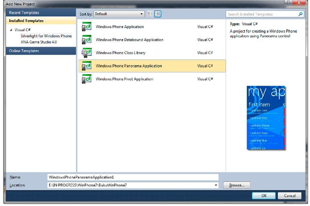
Now let’s practice making an application using Panorama view on Windows Phone. 1. Create a new project from Windows Phone Panorama Application template.
Note:
If you want to continue from the previous exercises, right click on the project and select Add Windows Phone Panorama Page. Or if you want to add Panorama control on existing page, drag and drop from the toolbox to your page.
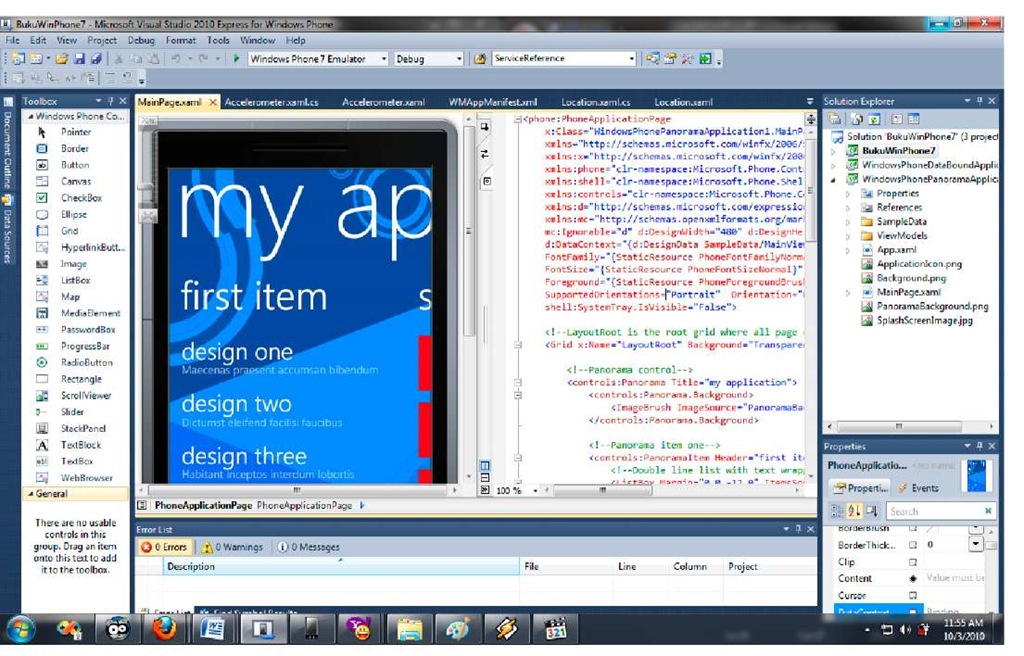
2. We will only use the template that is generated automatically while creating the application. Press F5 and see the results. Do a flick to slide to next section.
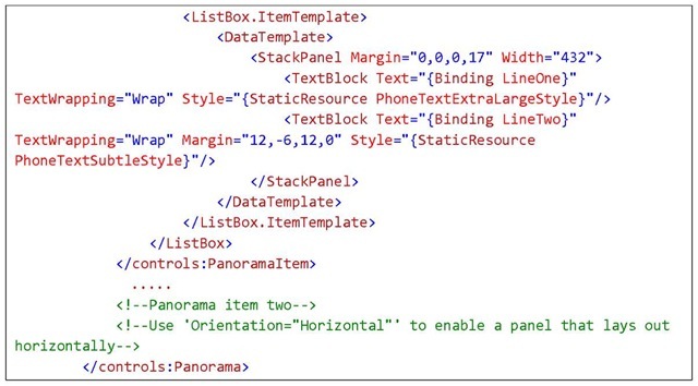
3. Now let’s review the codes to understand application structures of a Panorama view.
The main control is Panorama, which consists of a number of PanoramaItem. Consider PanoramaItem as a layout, like canvas or grid, where we can put any control in it. To add an item, all we have to do is add a panorama item within the Panorama control’s range.
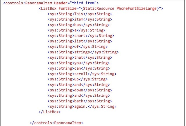
4. Add another PanoramaItem. We do the following in XAML code, adding the panorama item count on the application to 3 items.
Don’t forget to add this reference:
5. Press F5 and see the result. Adding items on Panorama is an easy matter because the project template has already given the big picture as how to use the control.



![PANORAMA VIEW [5] PANORAMA VIEW [5]](http://what-when-how.com/wp-content/uploads/2011/08/tmp1C17_thumb_thumb.jpg)
