Primary, Secondary, and Tertiary; Hue, Brightness, and Saturation
The basic color wheel is composed of colors grouped into three main categories:
• Primary colors. The color system’s main colors, from which all other colors are generated. Primary colors differ depending on the color system in use. A popular color wheel is the RYB, and its primaries are red, yellow, and blue.
• Secondary colors. The colors located opposite the primary colors in the color wheel. In an RGB system, the secondary colors are yellow, cyan, and magenta. In an RYB system, the secondary colors are purple, orange, and green. Secondary colors are also called complementary colors, since they complement the primary color. Also note that the primary color’s secondary color is created by mixing the other two primary colors. For example, purple, the secondary of yellow, is created by mixing red and blue.
• Tertiary colors. Colors that are created by mixing a secondary color with its adjacent primary. In an RGB system, tertiary colors are red-magenta, red-yellow, green-yellow, green-cyan, blue-cyan, and blue-magenta. In an RYB system, the tertiary colors are yellow-orange, yellow-green, blue-green, blue-purple, red-purple, and red-orange.
Color has three basic properties:
• Hue. The property that distinguishes a color from others in the visible spectrum. The words hue and color are often used interchangeably.
• Value/brightness. A property determined by the amount of black and white added to a color, generally identified as the lightness or darkness of a hue. You create a darker value by adding black, and you create a lighter value by adding white. The following terminology is used when talking about value:
• Tints. Colors mixed with white. These colors, also referred to as pastel, tend to produce lighter, softer hues, such as baby blue or peach.
• Tones. Colors mixed with neutral gray.
• Shades. Colors mixed with black. These colors are bolder, richer, and darker, such as navy blue or burgundy.
• Saturation/intensity. A property determined by the dominance of its hue. Highly saturated colors are bright and vivid. Less saturated colors are muted. Pure saturated colors are located on the outside perimeter of the color wheel, and less saturated colors are closer to the center of the wheel, where the hue dominates less.
Tints, Tones & Shades
Figure 4.11
Color Harmonies
As in music, where you can experience consonant and dissonant chords, colors can intensify or create tension with each other, depending on the characteristics we’ve explored so far.
Color harmonies are groups of harmonious colors that you will want to keep consistent when you are designing your title sequences and collateral designs such as posters, postcards, and other materials.
Simple color harmonies might be based on one color, and more complex ones can be based on mathematical rules. The following describe a number of techniques available to create color harmonies, also called schemes:
• Achromatic. Literally meaning without color, these color harmonies present very low values of saturation; therefore they utilize white, gray, and black. Warm and cool achromatic harmonies can be created by adding yellow or blue.
• Monochromatic. Literally meaning one color, these color harmonies are based only on one hue and its related tints and shades.
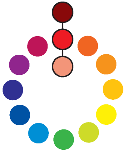
• Analogous. Literally meaning similar, analogous color harmony consists of three colors adjacent to each other in the color wheel. The middle color is generally the dominant color, the second one a supporting color, and the third one is used as an accent.
• Complementary. These are colors that are, in the color wheel, directly opposite of one other, such as green and red, purple and yellow, and blue and orange in the RYB color system. Elements designed using pure complementary colors create a visual noise generally called simultaneous contrast (see “Color Contrasts: Color and Type Combinations That Work"). Complementary colors are vibrant and they complete each other. In fact, if you mixed two complementary colors, you would create gray. Complementary color schemes can be obtained using pure hues or their corresponding shades or tints.
• Split complementary. A variation of the complementary color scheme, split complementary creates a more subtle effect. It uses the main color and, instead of its complement, uses its two adjacent colors. Split complementary color schemes can be obtained using pure hues or their corresponding shades or tints.
• Triadic. Composed of three colors located equidistant from each other in the color wheel. Again, they can be obtained using pure hues or shades or tints.
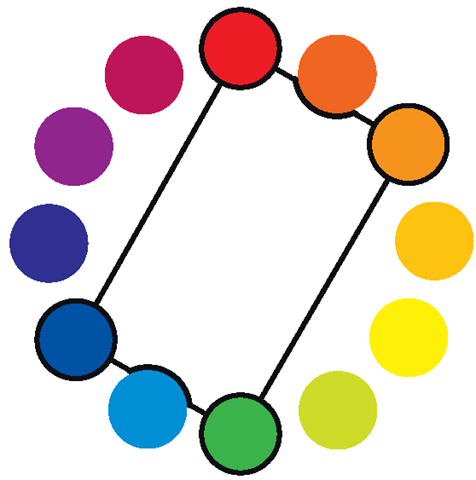
• Tetradic (rectangle). Composed of four colors, which are two complementary pairs. If you connected the colors with lines in the color wheel, you’d draw a rectangle.
Analogous Colors
Figure 4.12
Monochrome Colors
Figure 4.13
Complementary Colors
Figure 4.14
Split Complementary Colors
Figure 4.15
Triadic Colors
Figure 4.16
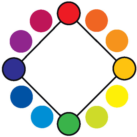
• Square. Composed of four colors equidistant from each other in the color wheel.
• Cool. Composed of colors that belong to the cool colors from the color wheel.
• Warm. Composed of colors that belong to the warm colors from the color wheel.
Tetradic Colors
Figure 4.17
Square Colors
Figure 4.18
Warm & Cool Colors
Figure 4.19
Online Resources
If you’d like to explore more about color, take a look at these fantastic online resources:
• http://kuler.adobe.com. A Web site for exploring, creating and sharing color themes. You can save color themes to show privately to your clients, or extract and create themes from an uploaded image.
• http://colorschemedesigner.com. Lets you quickly create mono, complement, triad, or tetrad color schemes and export them for use in your project.
• www.colourlovers.com. A place to discuss and share color palettes and patterns, color talks, trends, and more.
Color Deficiency
As designers we must understand that our work will be experienced by a variety of people with a variety of characteristics. Generally the creative brief will take into account some of them; the target audience and how the work will be viewed might affect the type size that you will use.
When dealing with color, though, keep in mind that a considerable number of people have various levels of color deficiency (also sometimes referred to as color blindness or Daltonism, because of John Dalton’s studies). This section should be taken as information that may or may not influence the design direction and color choices of your work.
Color deficiency prevents people from distinguishing certain shades of color or perceiving certain colors at all. There are several levels of color deficiency, from subtle anomalies to full deficiency, in which a person can only see in black and white or shades of gray. Most people affected by this color deficiency have difficulty discriminating reds and greens (approximately 8-10% of the male population) or blues and yellows (approximately 1-2% of the male population).
If your target audience includes any color-deficient users or if you want to play it safe, you should:
• Avoid picking colors of similar hues, since they are harder to distinguish from one another.
• Avoid using red characters on a dark background. Since red could be perceived as a dark brown or black, it would be hard to distinguish any lettering from the background.
• Avoid conveying relevant information in couples of green and red, especially when used as foreground or background design elements. Deteuranopes—the most common form of color deficiency, in which people have difficulty discriminating red and green hues—wouldn’t be able to read anything.
• Use saturated colors, since they are easier to distinguish than less saturated colors.
• Alternate brightness levels in the designed elements, since colors with similar brightness are more difficult to tell apart. For example, a very dark red and a light green might be easier to distinguish than a red and a green of similar brightness. A quick-and-dirty test is to convert your image to black and white and verify that the brightness levels are actually substantially different.

