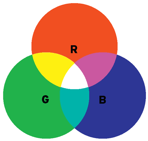
The RGB Color System
Figure 4.2
The Color Wheel
Figure 4.3
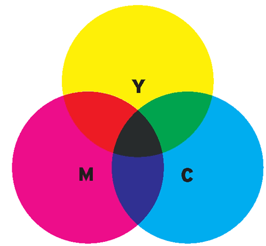
The CMYK Color System
Figure 4.4
• CMYK. A subtractive color system used in print design, which can be found when using dyes, inks, and pigments. Its primary colors (C = cyan, M = magenta, Y = yellow, K = black), when combined, create all other hues. An equal amount of cyan, magenta, yellow, and black creates gray.
• Pantone (PMS). A color system that utilizes a proprietary system, the Pantone Matching System, or PMS, that allows control over and color matching of its unique color formulas. Historically it has been an industry standard in print design, offering designers tools such as the Formula guides, color chips, and Process guides, but recently, with the introduction of Pantone Goe, designers are able to match solid Pantone colors with their respective RGB values, allowing a precise rendition of Pantone’s colors to use in web and broadcast design.
• HSL (or HSI). A color system that measures the values of hue (H), saturation (S), and luminosity (L), which is sometimes also called intensity (I), of a color. The hue is measured by the position in a circle. The saturation and luminance are measured on a scale of 100 units and are determined by the color’s position on the radial line drawn from the center to the perimeter of the color circle.
• HSV (or HSB). A color system that measures the values of hue (H), saturation (S), and value (V), which is sometimes also called brightness (B), of a color.
• YUV. A color system initially developed in the 1950s to allow black-and-white analog televisions to still receive a signal. It is used in NTSC, PAL, and SECAM video standards. It utilizes one luminosity channel (Y) and two chroma channels: blue minus luma (U) and red minus luma (V).
HSB Color System
Figure 4.5
Each color value in a system can generally be translated into another color system, although that might create some differences in the richness of colors. For example, when converting CMYK colors directly to RGB, the colors might look a bit washed out.
When working with computer software, a new document can be created utilizing a specific color mode (e.g., RGB), but you can create design or typographical elements that contain colors picked from a different color system and apply them to the color system in use. This particular case applies when, for example, you are given a style guide, which includes instructions on how to appropriately use the logo, typeface, and color palette of a specific project. If a print designer created the style guide to follow their work done on the logo of a movie or the movie poster, the color palette will most likely display color values in the form of CMYK and/or Pantone colors.
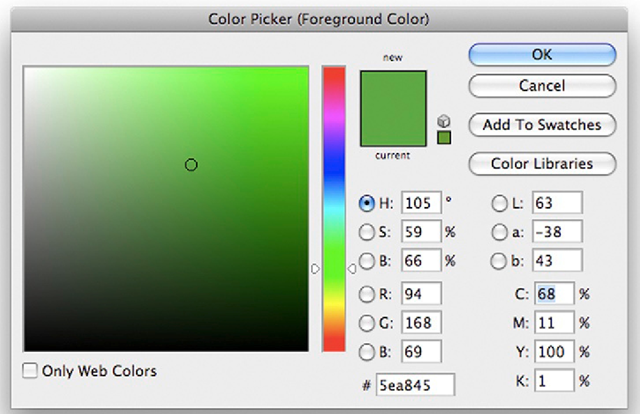
The task of a title designer is to find the corresponding colors in the RGB system. An easy solution is to identify the CMYK or Pantone color in the color picker of your software, using the color system indicated in the style guide provided, and then convert it to RGB. Some color palettes, such as the ones in Adobe Photoshop, simultaneously display the corresponding values in HSB, RGB, LAB, and CMYK, so you could simply enter your value in CMYK and you’ll automatically have the corresponding RGB value.
Figure 4.6 Photoshop’s Color Picker.
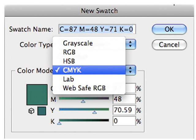
Adobe Illustrator has a similar color picker palette that simultaneously displays the HSB, RGB, and CMYK color values. If you are creating a new swatch color or working in the Edit Color palette, you simply click the pull-down menu to select the CMYK color, enter the known values, and then switch the pull-down back to RGB to know its corresponding values and to use the color in your project.
Figure 4.7 Illustrator’s Color Palette.
Figure 4.8 Illustrator’s New Swatch window.
Figure 4.9 Illustrator’s Color Picker.
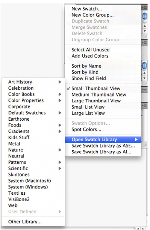
In both Illustrator and Photoshop, you can add a variety of palettes called swatch libraries (in Illustrator) or swatches (in Photoshop). You can find anything from default swatches (which include CMYK and RGB) all the way to a variety of Pantone palettes.
When deciding which color system to use on your project, it depends on what you are working on. When you are working on film titles, the answer is simple: RGB. It is the color system used when working with video. When working on a movie poster (or any material that will be printed), you should use CMYK.
Color motion picture film uses a color system that was originally introduced by Kodak in 1934. It employs a single-strip multilayer emulsion (as opposed to multiple strips of film, which included a variety of in-camera recording techniques devised to achieve color in film). In this system, three thin layers of emulsion are applied to the film’s base, and each one of them is sensitive to specific colors of light. A typical color filmstrip contains a blue, a green, and a red emulsion layer. You could say that film records its information in the RGB color system, but when the film gets processed at a film lab—through chemical processes in which the oxidized developer is formed and silver halide crystals are removed from the film strip—dye couplers will produce a colored dye. The topmost blue layer creates a yellow dye, the middle green layer creates a magenta dye, and the bottom red layer releases a cyan dye. The sum of CMY creates the full color picture.
Figure 4.10 Adding a new Swatch Library in Illustrator.
