BBP Guides Attention
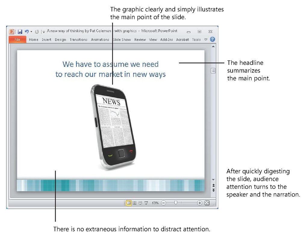
As described earlier, with the BBP approach, each slide has a headline when you start working in PowerPoint. You then write out what you will say verbally in the off-screen text box in Notes Page view and then add a simple graphic in Normal view to produce a slide, as shown in Figure 2-19.
FIGURE 2-19 A BBP slide, shown here in Normal view, guides the attention of working memory from the headline to the graphic to the person speaking.
The simplicity of this slide belies the sophisticated impact it has as it effectively guides the attention of working memory. It is crystal clear where working memory should focus first—on the headline at the top of the slide. People are used to reading newspaper headlines that summarize the main point of a story in a single sentence, and here the complete sentence headline serves the same function.
The audience doesn’t have to work hard to figure out the point you want to make— instead, you have cleared the way for them to focus on the idea at hand rather than be distracted by unnecessary cognitive work.
Headline Research
Michael Alley, author of The Craft of Scientific Presentations: Critical Steps to Succeed and Critical Errors to Avoid (Springer, 2005), conducted a study using two PowerPoint presentations, each with a different headline format. One presentation included only sentence fragments at the top of each slide, and the second presentation included a complete sentence at the top that summarized the most important point of the slide. In tests to measure the knowledge and comprehension of the information in the presentations, the audiences who experienced the slides with the complete sentence headlines saw an average improvement in test scores of 11 percentage points over the audiences who saw the slides with the sentence fragments. When you use the title area of the slide to summarize your point for your audience members, you properly guide their attention, and in the process you ease the burden on their working memory to figure out your point.
Research has found that visuals can improve learning, but only if they illustrate the point you are making.Because you choose only graphics that relate to the specific point at hand, the graphics tell a major part of the story as they communicate information through the visual channel in sync with your verbal explanation. This makes effective use of working memory by using both the visual and verbal channels, rather than just the verbal channel alone. It also ensures that working memory is not distracted by graphics that don’t relate specifically to the information at hand. Likewise, the slide background contains no extraneous information that would add more cognitive load.
The simple elements of a BBP slide work together to guide the complete presentation experience. First the audience members quickly digest the headline, then they view the simple graphic that illustrates the headline, and then they turn their attention to the verbal explanation of the speaker. The result is an engaging multimedia experience that balances visual and verbal elements and contributes to meaningful understanding.
The Old Way Does Not Guide Attention
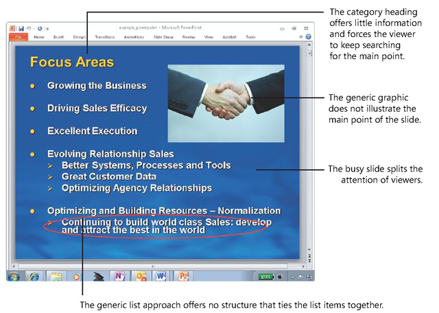
In the conventional PowerPoint slide shown in Figure 2-20, it’s not easy to see where the presenter intends to guide attention. Such a busy slide assumes that viewers have the working memory capacity to read through all the material as they might with a written document—all while they are listening to you speak. As described earlier in the discussion of the dual-channels theory, it is easy for too much material on this slide to split the attention of the audience between screen and presenter or to impair learning by using both on-screen text and narration to explain the same information.
FIGURE 2-20 The conventional PowerPoint approach does not help working memory to select the most important information.
If you grew up writing essays and reports on paper or as Microsoft Office Word documents, it’s a natural transition to think of a PowerPoint slide as a piece of paper where you start writing out your thoughts. But one of the fundamental assumptions about a piece of paper is that it can stand alone—a presenter normally does not need to be there to explain it. The only problem is that this example PowerPoint slide is accompanied by the narration of a live presenter—yet the slide does not take that fact into account.
Another problem with thinking of the slide area as a piece of paper is that you are much more likely to fill it with text instead of a graphic. Although text on a screen is initially processed through the visual channel, as described earlier it is quickly verbalized and sent through the verbal channel—thus text-filled slides essentially ignore the capacity of the visual channel to efficiently process information in sync with the verbal channel.
Myth VS. Truth
Myth: Graphics are nice to have, but they’re not essential.
Truth: Research shows that people learn better from words and pictures than from words alone. This applies when the pictures illustrate what the words say, not when pictures are added for decorative effect.
One of the reasons the example slide does not guide attention is that it uses a category heading—like those you see in almost all PowerPoint presentations. A category heading like "Focus Areas" can help you quickly brainstorm a list of information, but as you see here, it does nothing to guide you to a quick understanding of what is the most important information on the slide. Simply categorizing and listing information does not entail the critical thinking it takes to determine the point of the lists in the first place.
Category headings don’t say anything specific, and to uncover the mystery of what you are trying to communicate when you use them, your audience members need to invest extra capacity of working memory they don’t have to connect all the dots of the bullet points below the headings. And these headings put an extra burden on you and your audience as you both struggle to see the focus of your ideas through the sequence of slides in your presentation. As your audience views these headings and their corresponding stacks of bulleted lists, slide after slide, it’s no wonder that they find the presentation unfocused, hard to understand, and overwhelmed with unnecessary details.
Although the slide includes a photograph of a handshake, it does not illustrate the specific point of the slide and was likely added for visual decoration to "spice it up". This runs counter to the research that shows that the less you overload working memory with extraneous information, the more people learn.
Myth VS. Truth
Myth: People learn more when I wow them with special effects and spice up my presentations with razzle-dazzle.
Truth: Research shows that people learn better when extraneous information is removed from a presentation.
Audiences might not know about the research that indicates that you need to guide their attention, but they do know what they are talking about when they frequently say conventional presentations are "incoherent lists" with "no direction" and "a jumble." Instead of guiding working memory through the experience, this example slide creates unnecessary work by not quickly getting to the clear point, by not tapping into the visual channel, and by creating split attention and redundancy with the narration of a live presenter.
The Misaligned Template
Many organizations create a corporate PowerPoint template in an effort to ensure that every presentation created in the organization has a similar graphical style. Although these templates can ensure a similar look across presentations, if they ignore the three research realities described in this topic, they also diminish the effectiveness of presentations of all the presenters who use them.
A Well-Trained Tool
These three research realities reveal a stark contrast between BBP and the conventional approach to PowerPoint and explain why BBP gets dramatically better results. Now you can personally connect the dots between this research by adopting a new metaphor, the eye of the needle, and by using the BBP approach to guide you through the challenges of creating powerful and effective presentations.
Forget the old ways of using PowerPoint, because as you saw in this topic, when you ignore the research realities, you use an approach that is broken, ineffective, and frustrating for audiences. Instead, when you choose an approach that fixes the problems, you produce experiences that audiences find engaging and meaningful.
That’s because you have now reoriented the three fundamental views of PowerPoint to align with the research, and with these new ideas in mind.


