BBP Respects the limits of Working Memory
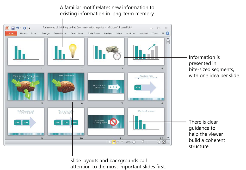
With the eye of the needle metaphor in mind, take a look at how a BBP presentation appears in Slide Sorter view, as shown in Figure 2-9. Studies have found that people learn better when information is broken up into digestible pieces, and here in Slide Sorter view, you see each specific digestible piece—in the form of a single slide that contains only one main idea that is clearly summarized by a headline. This eases your audience through your story and explanation frame by frame, one piece at a time.
FIGURE 2-9 Slide Sorter view shows a presentation that is broken up into digestible chunks for easier handling by working memory.
In the Slide Sorter view of a BBP presentation, your eye immediately goes to the most important slides because you use layouts and backgrounds to cue your audience to where they are. This approach draws from the hard work you do when you distill your complex ideas to the essence and identify your key points.These visual cues also indicate the slides in the presentation that explain your key points, and provide backup detail.
You also see from Slide Sorter view that BBP uses a visual motif through a presentation. Researchers have found that you improve the ability of working memory to process new information by applying familiar organizing structures. This works because an important quality of working memory is that it is a two-way street. Although working memory has only limited capacity to handle new information as that information arrives, as shown on the left in Figure 2-10, it also has unlimited capacity to pull in existing information from long-term memory, as shown on the right.
FIGURE 2-10 Working memory is limited in its capacity to process new information (left), but it is unlimited in its capacity to process existing information from long-term memory (right).
This plays out in the classic test of working memory, when a researcher presents someone with new information in the form of a series of unrelated numbers, such as 1 2 1 51 5 2 3 5 4. The number of these individual chunks of information that someone can recall is considered the capacity of that person’s working memory.
However, people can remember more of the same set of numbers when working memory pulls from long-term memory a structure they already know. This organizes the new information into meaningful chunks that hold the same information in a more memorable way, such as 212-555-1234—the familiar structure of a U.S. telephone number.
Thus a "chunk" is defined by the audience as they apply a meaningful structure from their long-term memory to new information. You help your audience accelerate understanding of new information with BBP by introducing a familiar "chunking" structure to new information you present.
For more information about using familiar structures to overcome the limited capacity of working memory to process new information, see John Sweller, "Implications of Cognitive Load for Multimedia Learning," in The Cambridge Handbook of Multimedia Learning, Richard E. Mayer, Ed., pp. 19-30 (Cambridge University Press, 2005).
The Old Way Ignores the Limits of Working Memory
For comparison, take a look at a conventional PowerPoint presentation in Slide Sorter view, as shown in Figure 2-11. Audiences might not know about the limited capacity of working memory, but they do know what they’re talking about when they say presentations like this are a "Data dump!" and "Overwhelming!" They’ve been down the road to overload before, and Slide Sorter view shows exactly how the conventional approach takes them there. The new information is clearly not presented in bite-size pieces; instead, it fills every slide, slide after slide, with overwhelming detail.
FIGURE 2-11 Slide Sorter view of a conventional PowerPoint presentation reveals no digestible pieces and no cues about the presentation’s structure or organization.
What you see here is visual overwhelm rather than visual organization. Using the same predesigned background for all of the slides gives them a uniform look, but it also prevents you from using a range of design techniques to visually highlight the most important information on single slides or across slides. It also makes the overall presentation appear visually repetitive, which causes boredom that quickly shuts down attention.
Myth VS. Truth
Myth: There’s no need for me to use graphical cues to point out the organization of the presentation.
Truth: Research shows that people learn better when you use visual cues to highlight a presentation’s organization.
For more information about the research described in the Myth vs. Truth sidebars in this topic, see Richard E. Mayer, Ed., The Cambridge Handbook of Multimedia Learning (Cambridge University Press, 2005).
Looking at this big-picture view of the presentation, you can’t see immediately the location of the most important slides. Instead, every idea has equal visual weight, and there are no cues given by the slide backgrounds about relative importance of ideas. Working memory, with its limited capacity to process new information, has to sort things out on its own and is presented here with the impossible task of holding all this new information while it figures out what’s most important to know.
Myth VS. Truth
Myth: People will learn more if I show more.
Truth: Research shows that people learn better when information is presented in bite-size pieces.
You also see that there is no structure that ties each of the individual slides together into a coherent whole—this presentation is just a series of bulleted lists and diagrams, slide after slide. There is no familiar framework that the audience already has in long-term memory that can guide working memory to make sense of the new information.
Realignment 2: Use Notes Page View to Synchronize What You Show and What You Say
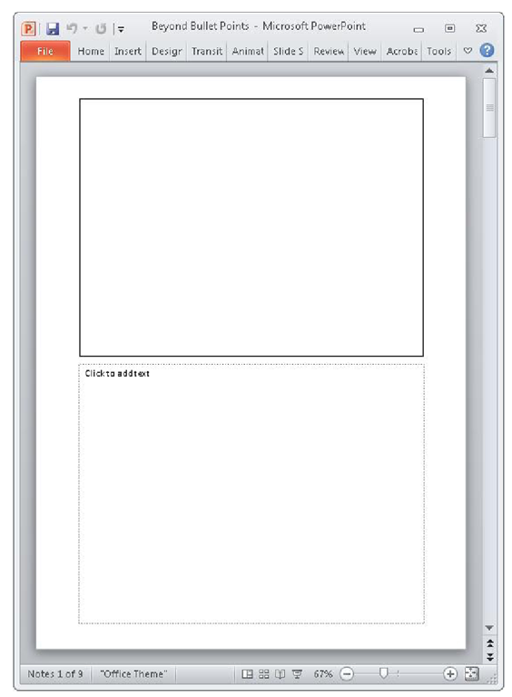
Now that you’ve realigned the way you use Slide Sorter view with the research, it’s time to move on to another seldom-seen view in PowerPoint. Click the View tab, and in the Presentation Views group, click Notes Page, to switch to Notes Page view, shown in Figure 2-12. As described earlier, Notes Page view lets you see the on-screen slide above, along with an off-screen notes area that the audience does not see.There are research-based reasons to do that, as you’ll see next.
FIGURE 2-12 Notes Page view includes the on-screen slide area above and an off-screen notes area below.
Research Reality 2: You Have to Address the Two Channels
The next research reality, the concept of dual channels, states that people receive and process new visual and verbal information in not one, but two separate but related channels. Allan Paivio described his theory of dual coding in the 1970s, and during the same decade, Alan Baddeley and Graham Hitch described a similar two-channel structure in working memory.
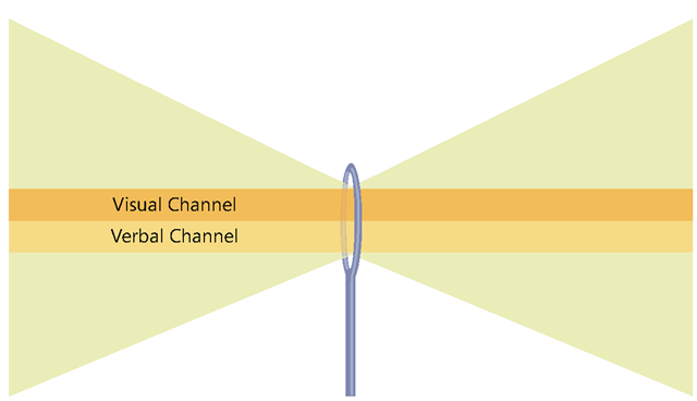
Today, the concept has become a widely accepted standard among researchers. In the dual-channels model, the images someone sees are processed through a visual channel, the domain of images including photographs, illustrations, charts, and graphs, as illustrated conceptually in Figure 2-13 (top). What a speaker narrates is processed through the verbal channel (bottom), which is the domain of language.
FIGURE 2-13 The second research reality is that working memory receives information through two channels—a visual channel and a verbal channel.
Although text on a screen is a visual element, working memory quickly verbalizes the words and sends them through the verbal channel. Research over the years has found that the way information is presented to these two channels has a big impact on the effectiveness of working memory.
For more information about the dual-channels concept, see:
■ Alan D. Baddeley and Graham Hitch, "Working Memory," in The Psychology of Learning and Motivation: Advances in Research and Theory, G. H. Bower, Ed., Vol. 8, pp. 47-89 (Academic Press, 1974).
■ Allan Paivio, Mind and Its Evolution (Lawrence Erlbaum Associates, 2007).
BBP Addresses the Two Channels
You see how BBP addresses the reality of dual channels by looking at a typical slide in Notes Page view, as shown in Figure 2-14. A clear headline at the top of the page always summarizes the point.The offscreen text box in the bottom half of the page contains what you will say aloud while the slide is on screen.
FIGURE 2-14 With BBP, you use Notes Page view to manage the visual channel in the on-screen slide area above and the verbal channel in the off-screen text box below.
Writing out the spoken information in the off-screen text box before you add a graphic significantly reduces the amount of information you otherwise would place in the slide area and instead keeps the slide area simple and clear. This helps working memory focus attention on the single point that you explain verbally during this slide. Instead of reading the headline verbatim, you let the audience quickly read and digest it on their own.
BBP uses Notes Page view in this way to tightly integrate screen and narration in order to make the most efficient use of the two channels of working memory. Looking at the visual and verbal areas together in Notes Page view is like looking at a single frame in a filmstrip, which is made up of a sequence of connected visual frames, each with a corresponding chunk of audio.
When you design for multimedia such as film, you apply a different set of conventions than the ones used for print because a film model has two coordinated informational tracks—a visual track that contains pictures and an audio track that contains the spoken words.


