The general idea of step Q in listing 1.1 in the PDF-creation process using docu-ment.add() is that you add objects implementing the Element interface to a Document object. Behind the scenes, a PdfWriter and a PdfDocument object analyze these objects and translate them into the appropriate PDF syntax, positioning the content on one or more pages, taking into account the page size and margins.
In this section, we’ll explore text elements that implement the TextElementArray interface. As the name of the interface indicates, these objects will be composed of different pieces of text; most of the time, it will be text wrapped in Chunk objects.
The Chunk object: a String, a Font, and some attributes
A Chunk is the smallest significant piece of text that can be added to a Document. The Chunk object contains a StringBuffer that represents a chunk of text whose characters all have the same font, font size, font style, and font color. These properties are defined in the Font object. Other properties of the Chunk, such as the background color, the text rise—used to simulate subscript and superscript—and the underline values—used to underline text or strike a line through it—are defined as attributes. These attributes can be changed with a series of setter methods.
Listing 2.1 wrote the names of 32 countries to a text file to test the database. Here you’re creating a PDF document with nothing but Chunks as building blocks.
Listing 2.2 CountryChunks.java
This example is rather unusual: in normal circumstances you’ll use Chunk objects to compose other text objects, such as Phrases and Paragraphs. Typically, you won’t add Chunk objects directly to a Document, except for some special Chunks, such as Chunk.NEWLINE.
THE SPACE BETWEEN TWO LINES: LEADING
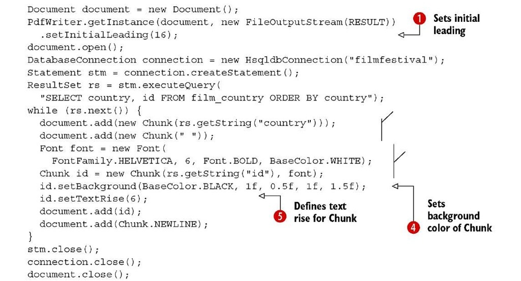
A Chunk isn’t aware of the space that is needed between two lines. That’s why you set the leading in O. The word leading is pronounced as ledding, and it’s derived from the word lead (the metal). When type was set by hand for printing presses, strips of lead were placed between lines of type to add space—the word originally referred to the thickness of these strips of lead that were placed between the lines. The PDF Reference redefined the leading as “the vertical distance between the baselines of adjacent lines of text” (IS0-32000-1, section 9.3.5). As an exercise, you could remove setInitialLeading(16) from line O. If you compile and execute the altered example, you’ll find that all the text is written on the same line.
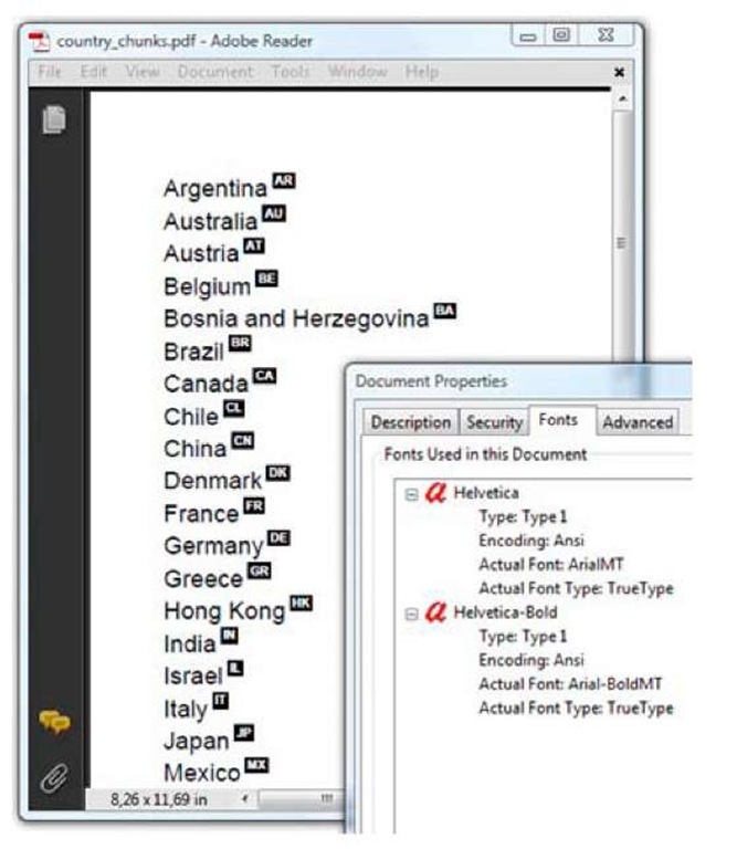
Figure 2.3 shows the PDF created by listing 2.2. You can see all the fonts that are present in the document by choosing File > Properties > Fonts.
The document properties reveal that two fonts were used: Helvetica and Helvetica-Bold. These fonts weren’t embedded. When I open the file on Windows, Adobe Reader replaces Helvetica with ArialMT and Helvetica-Bold with ArialBoldMT. These fonts look very similar, but nevertheless, there’s a difference!
The first font in the list in figure 2.3 is the default font used for the Chunks created in listing 2.2 C.
FAQ What is the default font used in iText, and can I change it? The default font in iText is Helvetica with size 12 pt. There’s no way to change this. If you need objects with another default font, just create a factory class that produces objects with the font of your choice.
In D, you specify a different font from the same family: Helvetica with style Bold. You define a different font size (6 pt) and set the font color to white. It would be difficult to read white text on a white page, so you also change one of the many attributes of the Chunk object: the background color Q. The setBackground() method draws a colored rectangle behind the text contained in the Chunk. The extra parameters of the method define extra space (expressed in user units) to the left, bottom, right, and top of the Chunk. In this case, the ID of each country will be printed as white text on a black background.
You use setTextRise() O to print the country ID in superscript. The parameter is the distance from the baseline in user units. A positive value simulates superscript; a negative value simulates subscript. You’ll discover more Chunk attributes as you read on in the topic.
Finally you add Chunk.NEWLINE to make sure that every country name starts on a new line. In the next subsection, we’ll combine Chunks into a Phrase.
Figure 2.3 Country chunks, produced with listing 2.2
The Phrase object: a List of Chunks with leading
When I created iText, I chose the word chunk for the atomic text element because of its first definition in my dictionary: “a solid piece.” A phrase, on the other hand, is defined as “a string of words.” It’s a composed object. Translated to iText and Java, a Phrase is an ArrayList of Chunk objects.
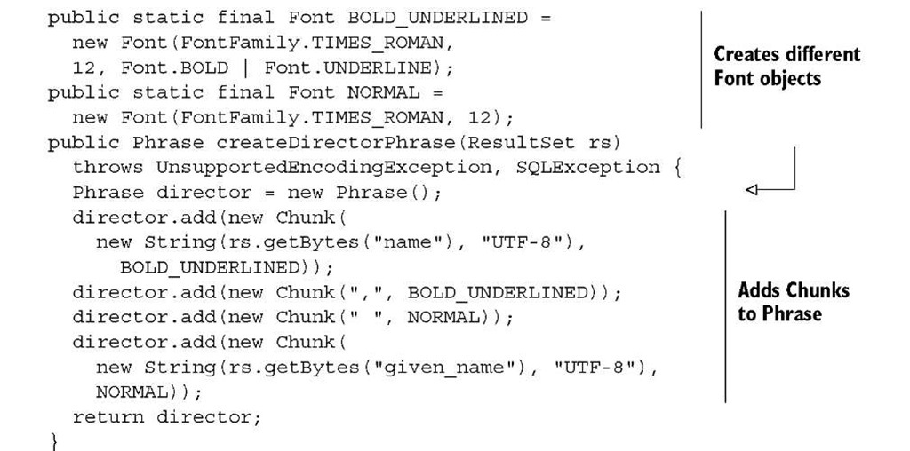
When you create methods that compose Phrase objects using different Chunks, you’ll usually create constants for the different Fonts you’ll use.
Listing 2.3 DirectorPhrases1.java
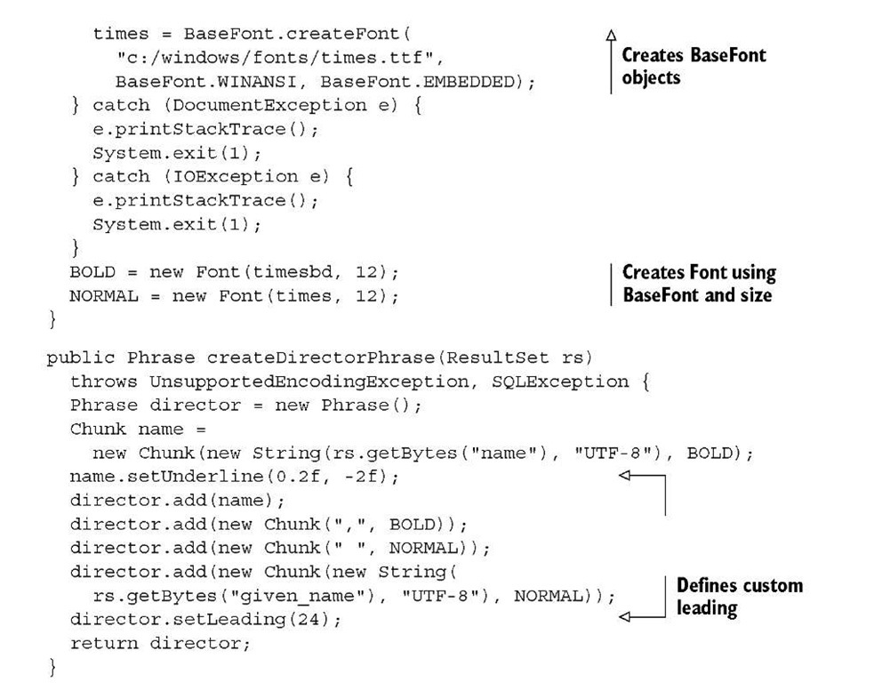
The createDirectorPhrase() method produces the Phrase exactly the way you want it. You’ll use it 80 times to list the 80 directors from the movie database. It’s good practice to create a factory class containing different createObject() methods if you need to create Chunk, Phrase, or other objects in a standardized way.
The method createDirectorPhrase() from listing 2.3 is used in this listing in which you’re repeating the five steps in the PDF creation process.
Listing 2.4 DirectorPhrases1.java
Observe that you no longer need to set the initial leading in step C. Instead, the default leading is used.
FAQ What is the default leading in iText ? If you don’t define a leading, iText looks at the font size of the Phrase or Paragraph that is added to the document, and multiplies it by 1.5. For instance, if you have a Phrase with a font of size 10, the default leading is 15. For the default font—with a default size of 12—the default leading is 18.
In the next example, you’ll change the leading with the setLeading() method.
DATABASE ENCODING VERSUS THE DEFAULT CHARSET USED BY THE JVM
In listing 2.3, some Strings were created using the UTF-8 encoding explicitly:
That’s because the database contains different names with special characters. If you look at the HSQL script filmfestival.script, you’ll find INSERT statements like this:
That’s the record for the director Alejandro Gonzalez Inarritu. The characters a— (char) 22 6—and n— (char) 241—can be stored as one byte each, using the ANSI character encoding, which is a superset of ISO-8859-1, aka Latin-1. HSQL stores them in Unicode using multiple bytes per character. To make sure that the String is created correctly, listing 2.3 uses ResultSet.getBytes() instead of ResultSet.getString().
This isn’t always necessary. In most database systems, you can define the encoding for each table or for the whole database. The JVM uses the platform’s default charset, for instance, in the new String(byte[] bytes) constructor.
FAQ Why is the data I retrieve from my database rendered as gibberish ? This can be caused by an encoding mismatch. The records in your database are encoded using encoding X; but the String objects obtained from your ResultSet assume that they are encoded using your platform’s charset Y. For instance, the name Gonzalez could be rendered as GonzAjlez if the Unicode characters are interpreted as ANSI characters.
Once you’ve created the PDF document correctly, you no longer have to worry about encodings. One of the main reasons why people prefer PDF over any other document format is because PDF, as the name tells us, is a portable document format. A PDF document can be viewed and printed on any platform: UNIX, Macintosh, Windows, Linux, and others, regardless of the encoding or the character set that is used.
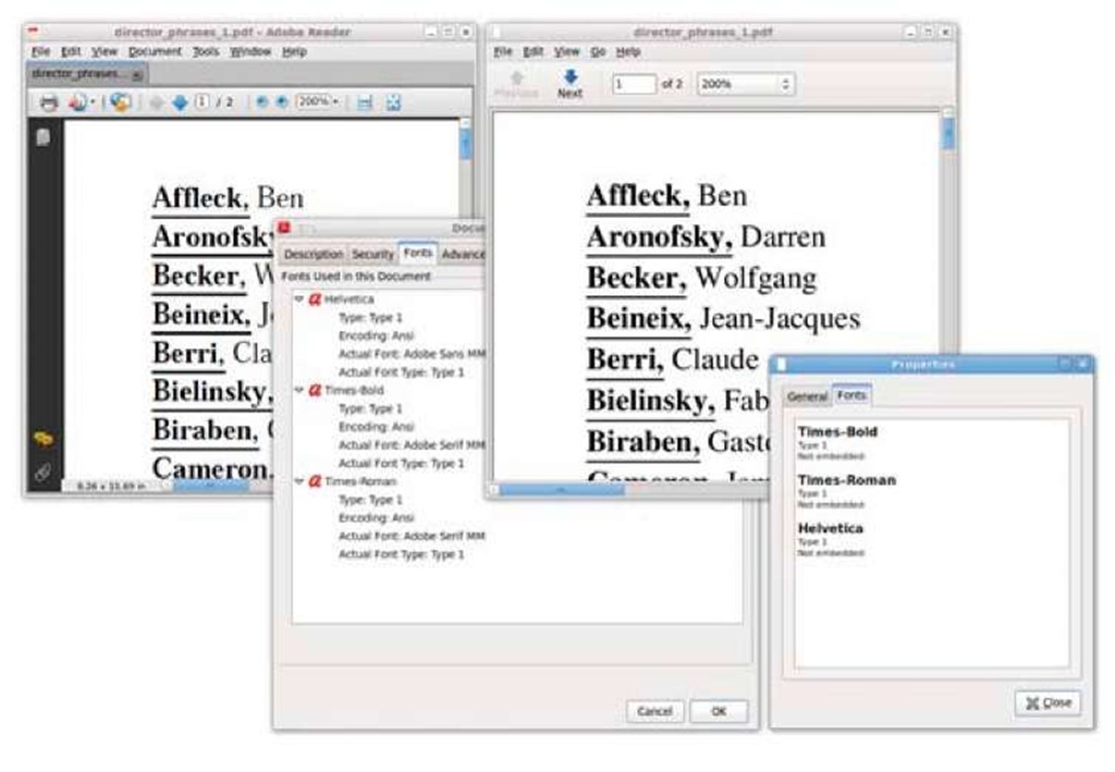
In theory, a PDF document should look the same on any of these platforms, using any viewer available on that platform, but there’s a caveat! If you take a close look at figure 2.4, you can see that this isn’t always true.
FONT SUBSTITUTION FOR NONEMBEDDED FONTS
In figure 2.3, you could see that Helvetica was replaced by ArialMT. Figure 2.4 shows that the choice of the replacement font is completely up to the document viewer.
Adobe Reader on Ubuntu (see the left window in figure 2.4) replaces Helvetica with Adobe Sans MM and Times-Roman with Adobe Serif MM. The MM refers to the fact that these are Multiple Master fonts. Wikipedia tells us that MM fonts are “an extension to Adobe Systems’ Type 1 PostScript fonts … From one MM font, it is conceivable to create a wide gamut of typeface styles of different widths, weights and proportions, without losing the integrity or readability of the character glyphs.”
Adobe Reader for Linux uses a generic font when it encounters a nonembedded font for which it can’t find an exact match. Looking at the output of File > Properties > Fonts in Evince (Ubuntu’s default document viewer; see the right window in figure 2.4), you might have the impression that the actual Times-Bold, Times-Roman, and Helvetica fonts are used, but that’s just Evince fooling you. Helvetica and Times-Roman aren’t present on my Linux distribution; Evince is using other fonts instead. On Ubuntu Linux, you can consult the configuration files in the /etc/fonts directory. I did, and I discovered that on my Linux installation, Times and Helvetica are mapped to Nimbus Roman No9 L and Nimbus Sans—free fonts that can be found in the /usr/share/fonts/type1/gsfonts directory.
Note that we are looking at the same document, on the same OS (Ubuntu Linux), yet the names of the directors in the document look slightly different because different fonts were used. We were very lucky that the names were legible.
Figure 2.4 A PDF file opened in Adobe Reader and Evince on Ubuntu
FAQ Why are the special characters missing in my PDF document? This isn’t an iText problem. You could be using a character that has a description for the corresponding glyph on your system, but if you don’t embed the font, that glyph can be missing on an end user’s system. If the PDF viewer on that system can’t find a substitution font, it won’t be able to display the glyph. The solution is to embed the font. But even if you embed the font, some glyphs can be missing because they weren’t present in the font you tried to embed. The solution here is to use a different font that does have the appropriate glyph descriptions. This will be discussed in great detail in topic 11.
Not embedding fonts is always a risk, especially if you need special glyphs in your document. Not every font has the descriptions for every possible glyph.
NOTE Characters in a file are rendered on screen or on paper as glyphs. ISO-32000-1, section 9.2.1, states: “A character is an abstract symbol, whereas a glyph is a specific graphical rendering of a character. For example: The glyphs A, A, and A are renderings of the abstract ‘A’ character. Glyphs are organized into fonts. A font defines glyphs for a particular character set.”
In the next example, you’ll see how to avoid possible problems caused by font substitution by embedding the font.
EMBEDDING FONTS
Up until now, you’ve created font objects using nothing but the Font class. The fonts available in this class are often referred to as the standard Type 1 fonts. These fonts aren’t embedded by iText.
NOTE The standard Type 1 fonts used to be called built-in fonts or Base 14 fonts. The font programs for fourteen fonts—four styles of Helvetica, Times-Roman, and Courier, plus Symbol and ZapfDingbats—used to be shipped with the PDF viewer. This is no longer the case; most viewers replace these fonts. It’s important to understand that these fonts have no support for anything other than American/Western-European character sets. As soon as you want to add text with foreign characters, you’ll need to use another font program.
The next example is a variation on the previous one. You don’t have to change listing 2.4; you only have to replace listing 2.3 with this one.
Listing 2.5 DirectorPhrases2.java
You tell iText where to find the font programs for Times New Roman (times.ttf) and Times New Roman Bold (timesbd.ttf) by creating a BaseFont object. You ask iText to embed the characters (BaseFont.EMBEDDED versus BaseFont.NOT_EMBEDDED) using the ANSI character set (BaseFont.WINANSI). You’ll learn more about the BaseFont object in topic 11. For now, it’s sufficient to know that you can create a Font instance using a BaseFont object and a float value for the font size.
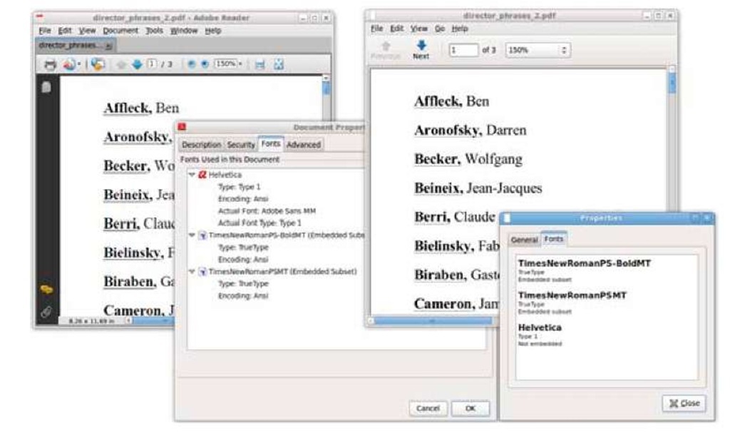
Figure 2.5 looks very similar to figure 2.4; only now the PDF file is rendered the same way in both viewers.
Figure 2.5 A PDF file opened in Adobe Reader and Evince on Ubuntu
Observe that there’s more space between the names in this version because listing 2.5 used setLeading() to change the leading. The names of the directors are also underlined differently compared to the previous example, because you don’t define the underlining as a property of the Font, but as an attribute of the Chunk.
With the Chunk.setUnderline() method, you can set the line thickness (in the example, 0.2 pt) and a Y position (in the example, 2 pt below the baseline). The parameter that sets the Y position allows you to use the same method to strike a line through a Chunk. There’s also a variant of the method that accepts six parameters:
■ A BaseColor, which makes the line a different color than the text.
■ The absolute thickness.
■ A thickness multiplication factor that will adapt the line width based on the font size.
■ An absolute Y position.
■ A position multiplication factor that will adapt the Y position based on the font size.
■ The end line cap, defining what the extremities of the line should look like. Allowed values are PdfContentByte.LINE_CAP_BUTT (the default value), Pdf-ContentByte.LINE_CAP_ROUND, and PdfContentByte.LINE_CAP_PROJECTING_ SQUARE. The meaning of these options will be explained in table 14.6.
One thing may look peculiar when you look at figure 2.5. Why do both viewers still list Helvetica? You won’t find any explicit reference to it in listings 2.4 and 2.5, but it’s added implicitly in this line:
Chunk.NEWLINE contains a newline character in the default font; and the default font is Helvetica. You could have avoided this by replacing that line with this one:
But an even better solution would be to use a Paragraph object instead of a Phrase.
Paragraph object: a Phrase with extra properties and a newline
Although the analogy isn’t entirely correct, I often compare the difference between a Phrase and a Paragraph in iText with the difference between <span> and <div> in HTML. If you had used a Paragraph instead of a Phrase in the previous examples, it wouldn’t have been necessary to add a newline.
Listing 2.6 MovieTitles.java
The Paragraph class is derived from the Phrase class. You can create instances of Paragraph exactly the same way as you’ve been creating Phrase objects, but there’s more: you can also define the alignment of the text, different indentations, and the spacing before and after the paragraph. EXPERIMENTING WITH PARAGRAPHS
Let’s experiment with these Paragraph features in some examples. Listing 2.7 shows two helper methods that create Paragraphs:
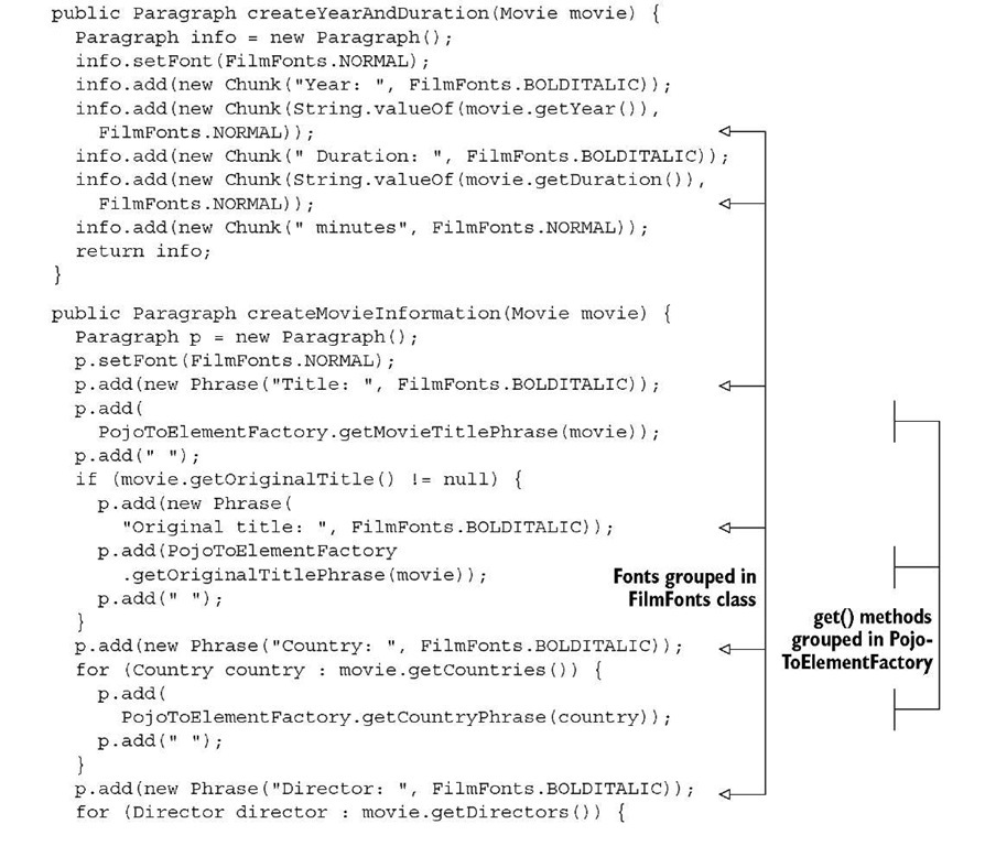
■ createYearAndDuration() creates a Paragraph that is composed of Chunk objects.
createMovieInformation() does the same using Phrase objects and one Paragraph object that is treated as if it were a Phrase.
These methods are convenience methods that will be reused in different examples.
Listing 2.7 MovieParagraphs1
Note that you’re already introducing rationalizations that will keep your code maintainable as the application grows.
RATIONALIZATIONS
You’re using Font objects that are grouped in the FilmFonts class. Generic names NORMAL, BOLD, ITALIC, and BOLDITALIC are chosen, so that you don’t need to refactor the names if your employer doesn’t like the font family you’ve chosen. If he wants you to switch from Helvetica to Times, you have to change your code in only one place. The createMovieInformation() method from listing 2.7 is used here.
Listing 2.8 MovieParagraphs1
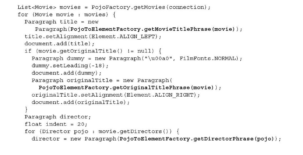
Next, you’ll convert POJOs into Phrase objects using a PojoToElementFactory. As your application grows, you’ll benefit from reusing methods such as getMovieTitle-Phrase() and getDirectorPhrase() that are grouped in such a separate factory.
Listing 2.9 MovieParagraphs2
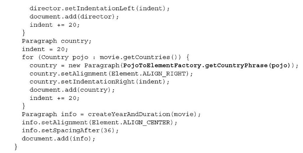
The resulting PDFs list all the movie titles in the database, including their original title (if any), director, countries where they were produced, production year, and run length. These documents probably won’t win an Oscar for best layout, but the examples illustrate a series of interesting Paragraph methods.
You can tune the layout by changing several Paragraph properties.
In listing 2.8, the alignment was set to Element.ALIGN_JUSTIFIED with the setAlign-ment() method. This causes iText to change the spaces between words and characters— depending on the space/character ratio—in order to make the text align with both the left and right margins. Listing 2.9 shows the alternative alignments: Element.LEFT, Ele-ment.ALIGN_CENTER, and Element.RIGHT. Element.ALIGN_JUSTIFIED_ALL is similar to Element.ALIGN_JUSTIFIED; the difference is that the last line is aligned too. If you don’t define an alignment, the text is left aligned.
There are three methods for changing the indentation:
■ setIndentationLeft()—Changes the indentation to the left. A positive value will be added to the left margin of the document; a negative value will be subtracted.
■ setIndentationRight()—Does the same as setIndentationLeft(), but with the right margin.
■ setFirstLineIndent() —Changes the left indentation of the first line, which is interesting if you want to provide an extra visual hint to the reader that a new Paragraph has started.
In listing 2.8, a positive indentation of 18 pt (valid for the whole paragraph) was defined. The negative indentation of 18 pt for the first line will be subtracted from the left indentation, causing the first line of each paragraph to start at the left margin. Every extra line in the same Paragraph will be indented a quarter of an inch.
Another way to distinguish different paragraphs is to add extra spacing before or after the paragraph. In listing 2.9, you used setSpacingAfter() to separate the details of two different movies with a blank line that is half an inch high. There’s also a set-SpacingBefore() method that can produce similar results.
Finally, listing 2.9 does something it shouldn’t: it uses a workaround to write the English and the original title on the same line, with the English title aligned to the left and the original title aligned to the right. It achieves this by introducing a dummy Paragraph with a negative leading, causing the current position on the page to move one line up. While this works out more or less fine in this example, it will fail in other examples. For instance, if the previous line causes a page break, you won’t be able to move back to the previous page. Also, if the English and the original title don’t fit on one line, the text will overlap. You’ll learn how to fix these layout problems in section 2.2.6.
In the next section, we’ll have a look at what happens when the end of a line is reached.
