Using the Polar Coordinate System
So far we have been discussing plotting routines that make use of the Cartesian coordinate system. MATLAB also provides functions that plot data in the polar coordinates of magnitude and angle, commonly referred to as rho and theta respectively. Here we will discuss the MATLAB commands compass, polar, rose, and a modified version of the function polar called polardb.
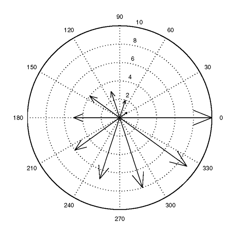
Although the compass function takes its inputs in Cartesian format, it works its way into this discussion because of its polar coordinate output. The compass function is similar to the feather function in that each arrow’s length corresponds to the magnitude of a data element and its pointing direction indicates the angle of the complex data. However, whereas feather creates a linear plot, the compass function will create arrows that emanate from the origin of the axes in a polar coordinate system. As with the earlier functions, compass can be called with either compass(z) or compass(u,v) where the latter method is equivalent to compass(u+i*v). To demonstrate this function, let’s create a set of arrows that increase in size from arrow to arrow in a counterclockwise manner.
This will produce the plot shown in Figure 3.54.
Figure 3.54 A compass plot of complex data.
As with the feather function, passing a character string as an additional argument to compass changes the style and color used for the arrows.
The polar function will create a polar plot from angle and magnitude data. It takes the forms polar(theta,rho) or polar(theta,rho, linetype_string) where theta corresponds to the angle (in radians) and rho corresponds to the magnitude. As with the functions we’ve seen earlier, linetype_string is a character string defining the line type that is used in the plot. The variables theta and rho must be identically sized vectors or matrices. If they are matrices the columns of theta will be plotted versus the columns of rho. As an example, we can create the limacon with an inner loop shown in Figure 3.55 with the following code.
Figure 3.55 Using polar.
If the default polar axis limits are not suitable, you may need to modify the polar function so that it provides you with what you want. Changing the axis limits with the axis command is not exactly straightforward. For instance, you can’t just use axis([min_theta max_theta min_angle max_angle]) as you did with plot, because the polar coordinate system is created with plot commands that define the concentric rings and spokes; the Cartesian x- and y-axes are hidden but can be made visible by using axis(‘on’).
Often when we deal with data in a polar format, we are interested in units of relative gain or power, i.e., decibels (dB), such as with the case of an antenna gain pattern. If you need to create a polar plot with the radial units in decibels (10log10), you can download from the web site a version of the polar function that we have created called polardb. This function will also allow you to specify the line style by passing a string with polardb(theta,rho,linetype_string). With this function you can specify the rho axis limits by passing yet another 2-element vector that defines the minimum and maximum dB values (i.e., polardb(theta,rho,linetype_string, [min_rho_dB max_rho_dB])). The following code creates some data and illustrates using this polar plotting function. The resulting plot is shown in Figure 3.56.
Figure 3.56 Creating a polar plot with radial units in decibels.
The function polardb was created by modifying MATLAB’s polar function. Many MATLAB functions are available as editable M-files. As you dig deeper into MATLAB graphics, you may find it useful to look at and use code from existing MATLAB functions when developing your own specialized graphics capabilities.
The last polar plot on our list is the rose function. With rose you can create angle histograms that are drawn in polar coordinates. By using rose(angle_data), the function will determine how many of the angles (which are assumed to be in radians) fall within a given angular bin. By default there are 20 evenly spaced bins between 0 and 2π. The number of bins can be changed by using rose(angle_data_vector, number_of_bins), where the variable number_of_bins is a scalar specifying the number of bins that should be spaced between 0 and 2π. You can also specify the centers of the bins by passing a vector, bin_centers, to the rose function (i.e., rose(angle_data,bin_centers)). If for some reason you do not want the angle histogram to be created at the time the rose command is issued, you may specify two output arguments using any of the valid rose synopses (e.g., [t,r] = rose(angle_data_vector)). Then at some later time, you can create the plot by passing these two arguments to the polar function (e.g., polar(t,r)). The following code will produce a rose plot of data which is normally distributed in angle about 90°. The resulting plot is shown in Figure 3.57.
Figure 3.57 An angle histogram created with rose.
Plotting Functions with MATLAB
In the previous examples we have created functions to generate the data used in our plots by first defining a variable to cover the range we are interested in, e.g., x = -2*pi:.1:2*pi, and then coding the function we want, e.g., sin(x). The function fplot provides an alternative method of plotting functions to the method of evaluating and plotting a function at a number of defined sample points. It can be especially useful for plotting functions whose rate of change varies rapidly for certain ranges of inputs as this function adaptively determines what the required sampling rate is based on the function’s rate of change.
To use fplot the function you pass to it must be either the name of an M-file function or a string with variable x that may be passed to eval function. This string can contain any combination of legal MATLAB commands or functions that you have created which resemble the form y = f(x), where f(x) is the string that you create. This function must either return a vector that is the same size as x or a matrix with columns that have as many elements as the vector x has.
The fplot function was designed to use adaptive step control, concentrating its evaluation in regions where the function’s rate of change is the greatest. So, you use fplot when you don’t want to determine how fine you need to sample a function. For example, y = sin(x) cos(2x), can be plotted using
to generate the top graph in Figure 3.58. The plots beneath were done with plot where the step size was specified as indicated, demonstrating the effect of varying step size.
Figure 3.58 Comparing fplot to plot.
You also have the option of passing two additional arguments; one of them is a line style string and the other is a tolerance factor. The tolerance factor is by default set to 2*10-3 and is used to determine how much sampling is required. Sampling is increased until the function and linearly interpolated value between two sampled points is less than the tolerance.
If you are really impatient and don’t even want to specify a range for a function, MATLAB provides you with a convenient function called ezplot that will plot your function over the range -2π to +2π and place a title above it. Here is how you would use it with function from the previous example.
The title is the string representation of the function. Also notice that we did not have to implicitly define the function, i.e., the periods weren’t required before the * operators. With ezplot it is assumed that operations are element by element. Figure 3.59 shows the result of using ezplot.
Figure 3.59 Plotting a function with ezplot.
We should point out that you could use other ranges with ezplot by providing a vector of the form [min, max] in which case it will perform like fplot but will title your plot.
Creating Filled Plots and Shapes
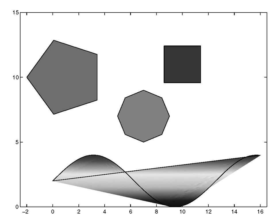
Aside from the pie charts and bar charts, our plots have been made up of lines. Although you can change the color and style of the lines, and later you will learn how to change the thickness too, MATLAB gives you a simple function called fill for creating 2-dimensional figures that have shapes that are filled in with a solid color. Consider the following example, plotted in Figure 3.60, that will create several different shapes with different colored faces by specifying the coordinates of their vertices. Then we’ll fill, scale, and translate them.
Figure 3.60 Filling shapes with the fill function.
This example illustrates several features of the fill function. You use fill by specifying fill(x,y,c), where the pairs of elements from the x and y variables specify the vertices of the shape, and c specifies the color. The color can be specified as a string (see the line color information in Table 3.3.1) or as a red-green-blue vector, [R G B]. Red-green-blue vectors specify the respective fractions of red, green, and blue content making up the color (e.g., [1 0 0] is equivalent to ‘red’, [0 0 0] = ‘black’, [1 1 1] = ‘white’). In addition, as we see with the "wavy" shape, the color variable, c, is a vector with the same number of elements as vectors x and y. The elements of c are scaled to indices of the figure’s "color map," or list of RGB combinations. If the vertices have different color map indices, the color within the shape will be bilinearly interpolated between the vertices.
In this example each shape was created with its own fill function. We could have put this into one long fill function and eliminated the need for the hold on command.
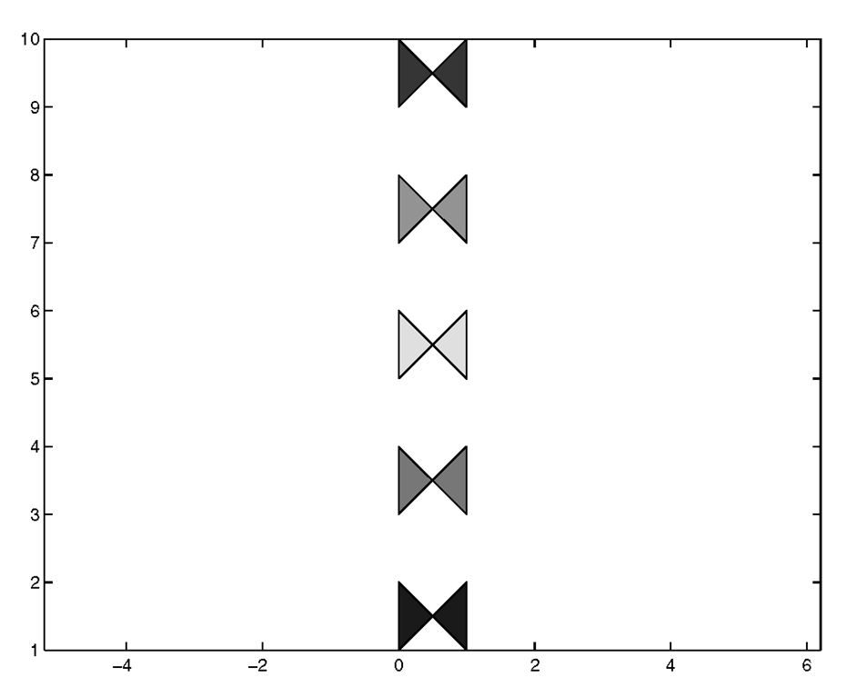
You should know that fill(x,y,c) supports the use of matrices and vector-matrix combinations with the x and y variables. If both are matrices, a polygon is drawn for each column. The colors of these polygons will be a single color if c is a row vector, and interpolated if c is a matrix. If either the x or y variable is a vector and the other is a matrix, the vector will be paired up with either the columns or rows of the matrix depending on whether the length of the vector matches up with the length of the columns or rows of the matrix. If the matrix is square, the columns will be used. This might sound a little confusing at first, so an example should clear things up; the following code will create a set of colored bow ties.
Figure 3.61 Using fill with matrices.
![tmp8414267_thumb[2][2]_thumb tmp8414267_thumb[2][2]_thumb](http://what-when-how.com/wp-content/uploads/2012/06/tmp8414267_thumb22_thumb_thumb.png)

![tmp8414269_thumb[2][2][2] tmp8414269_thumb[2][2][2]](http://what-when-how.com/wp-content/uploads/2012/06/tmp8414269_thumb222_thumb.png)

![tmp8414271_thumb[2][2][2] tmp8414271_thumb[2][2][2]](http://what-when-how.com/wp-content/uploads/2012/06/tmp8414271_thumb222_thumb.png)

![tmp8414273_thumb[2][2][2] tmp8414273_thumb[2][2][2]](http://what-when-how.com/wp-content/uploads/2012/06/tmp8414273_thumb222_thumb.png)


![tmp8414277_thumb[2][2][2] tmp8414277_thumb[2][2][2]](http://what-when-how.com/wp-content/uploads/2012/06/tmp8414277_thumb222_thumb.png)

![tmp8414279_thumb[2][2][2] tmp8414279_thumb[2][2][2]](http://what-when-how.com/wp-content/uploads/2012/06/tmp8414279_thumb222_thumb.png)
![tmp8414280_thumb[2][2][2] tmp8414280_thumb[2][2][2]](http://what-when-how.com/wp-content/uploads/2012/06/tmp8414280_thumb222_thumb.png)

![tmp8414282_thumb[2][2][2] tmp8414282_thumb[2][2][2]](http://what-when-how.com/wp-content/uploads/2012/06/tmp8414282_thumb222_thumb.png)
![tmp8414283_thumb[2][2][2] tmp8414283_thumb[2][2][2]](http://what-when-how.com/wp-content/uploads/2012/06/tmp8414283_thumb222_thumb.png)

