Stairstep Graphs
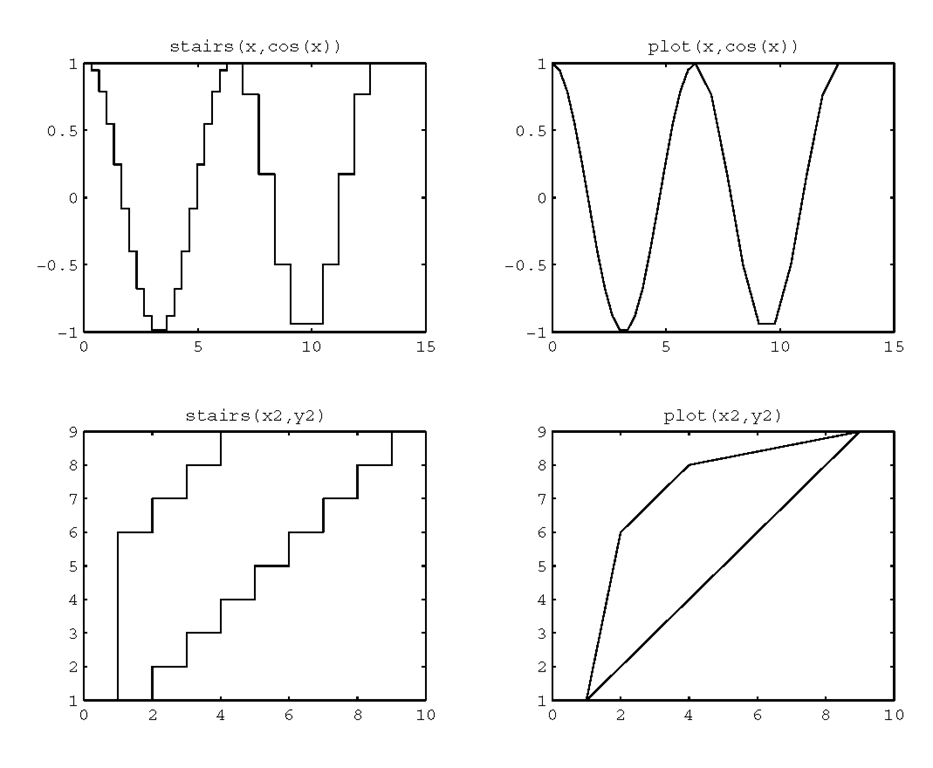
Instead of creating lines that directly connect your data, if you so choose you can create a plot that emphasizes the discrete nature of the data. MATLAB provides a function that will create a stairstep graph of your data. You can use stairs(y) or stairs(x,y) to draw horizontal lines at the level specified by the elements of y. This level will be held constant over the period between the values specified by the index numbers when using stairs(y) or the elements in x when using stairs(x,y). The stairstep plot is similar to a bar graph with the exception that the vertical lines are not dropped down all the way to the zero value point on the y-axis. In addition, the x values do not necessarily need to be spaced equally or in ascending order. To illustrate the use of stairs and to show the difference in results with respect to the plot function, we generate the four subplots shown in Figure 3.40 with the following code.
Figure 3.40 Comparing the stairs and plot functions.
As with bar and hist, you can suppress the creation of the graph by using
You can then use
to will produce a stairstep graph from the vectors xs and ys.
Stem Plots
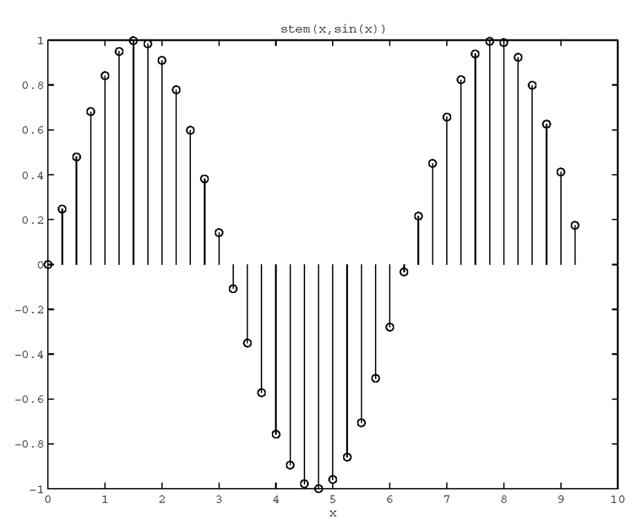
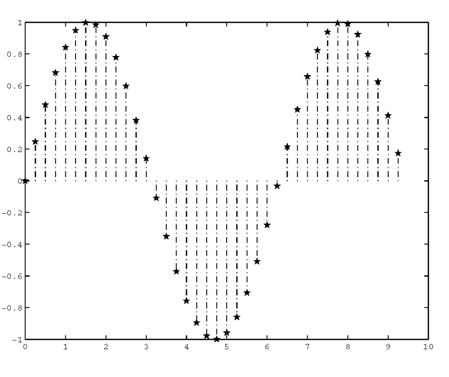
Stem plots provide yet another method of visualizing discrete data sequences, such as sampled time series data. In these types of graphs, vertical lines terminating with a symbol such as a circle are drawn from the zero value point on the y-axis to the values of the elements in the vector passed along with the command, stem(y). If you want spacing other than that provided by the element index number, you can use stem(x,y), where x specifies where the line is drawn along the x-axis. Figure 3.41 is an example that can be produced with the following code.
Figure 3.41 Visualizing discrete data with stem.
You can tell MATLAB to use any of the line styles and to terminate your stem plots with any of the marker types that are in Table 3.3.1. Additionally, these terminators can be either filled or unfilled. This line of code,
will generate a stem plot in which the lines are dash-dotted and the terminating symbol is a filled five-pointed star as shown in Figure 3.42.
Figure 3.42 A stem plot with filled terminators and dash-dotted lines.
Plots with Error Bars
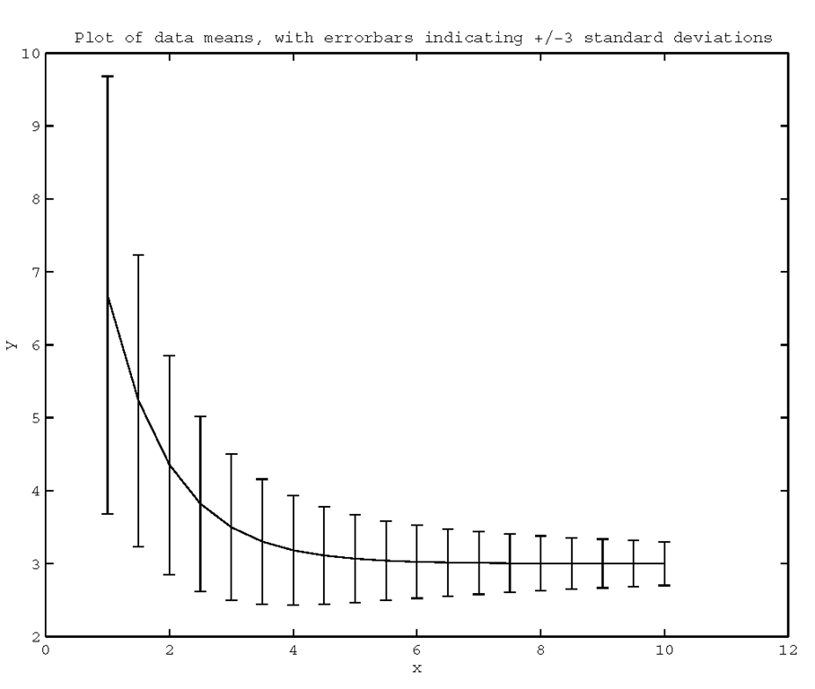
Error bars are used to show uncertainty in the accuracy of plotted values. With the errorbar(x,y,e) function, MATLAB will plot a line which passes through the set of (x,y) points with vertical lines that are called error bars centered about the (x,y) points that have lengths corresponding to twice the elements of the error vector e. When x, y, and e are same sized matrices lines with their error bars will be drawn on a per column basis. This type of plot can be useful if you are plotting data mean values, yet you wish to convey the range over which values may have fallen. If, for example, you run a simulation and want to see the effect of some input parameter, you can run the simulation many times for each value of the input parameter, so that you could determine a mean and standard deviation of the resulting output. To illustrate, the following code will generate some mean and standard deviation data and plot it with error bars that indicate the range of values that are within three standard deviations of the mean. The result is shown in Figure 3.43.
Figure 3.43 Using error bars to show deviation from a mean.
Pie Charts
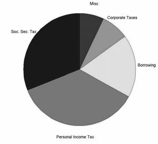
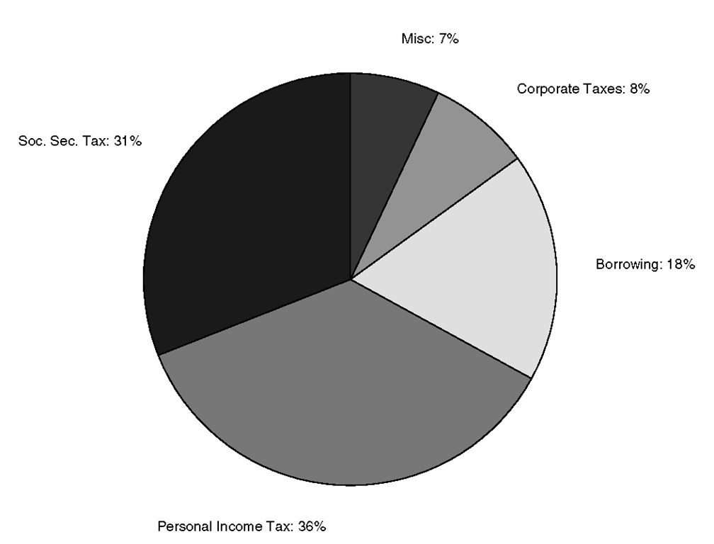
In MATLAB pie charts display the percentage that each element in a vector or matrix contributes to the sum of all elements. They are useful when you want to show the relative proportion of data elements to one another. For example, let’s say you have some data representing where government revenues come from, specifically Soc.Sec. Tax = 31%, Personal Income Tax = 36%, Borrowing = 18%, Corporate Taxes = 8%, Misc. = 7%. The pie function will create a pie chart of this data as shown in Figure 3.44.
Figure 3.44 Creating a pie chart with pie.
The pie function will let you label each section of the pie chart, unfortunately it will replace the values that are printed. To do this, use the pie function passing a cell array containing the desired labels. The cell array must be the same size as the data and must only contain strings. To demonstrate this, consider the previous code with specified labels.
The result is shown in Figure 3.45. Although there are labels for each slice o the pie, we no longer have the numerical values.
Figure 3.45 Labeling with pie omits numerical values.
We could just include the data values as text in our strings, but that is not a very elegant method and could become tedious if we had much to do. What is preferable is to have MATLAB simply add our labels to the numerical values. Unfortunately, it is not straightforward to add supporting text to pie charts; to do so requires the use of handle graphics.However, if all you would like to do is quickly add labels to each pie section, we provide a handy function called pielabel that will do the trick. With pielabel you can generate the pie chart, then add the labels you like. Here is the code that produces the desired result shown in Figure 3.46.
Figure 3.46 A pie chart with labels using pielabel.
As with the pie function, you must be sure that the cell array containing the labels is the same size as the data, otherwise pielable returns an error. Also be aware that since pielabel appends the strings to the data values, if you call it multiple times on the same pie chart you will get additional text appended to the labels.
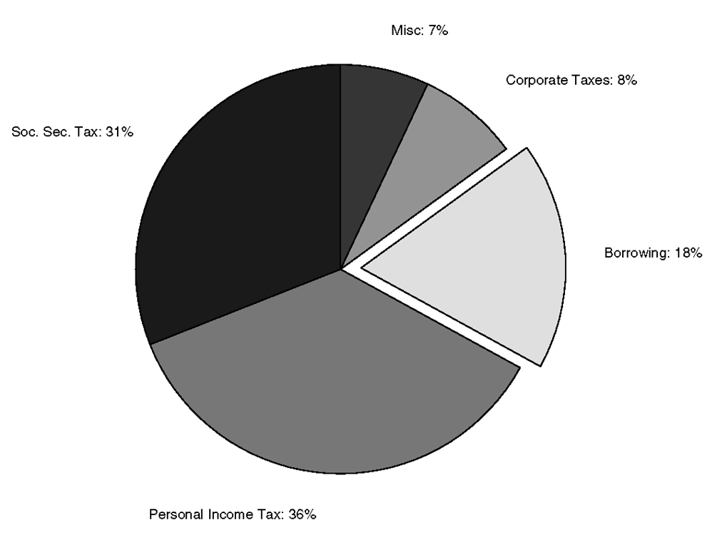
You can emphasize a particular pie slice by "exploding" the piece out from the rest of the pie. To do this you pass one more argument to the pie function. The explode argument is a vector that is the same size as the data vector. Non-zero elements specify that the particular pie slice should be moved. As an example, the "Borrowing" pie piece could be emphasized with
which will produce the pie chart shown in Figure 3.47.
Figure 3.47 An exploded piece piechart.
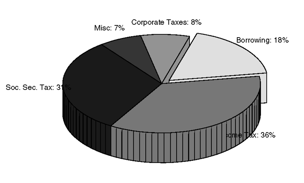
Just like the 3-D looking bar chart we saw earlier, MATLAB provided a 3-D looking pie chart function called pie3. The pie3 function is used in exactly the same manner as the pie function. If you repeat the following examples substituting pie3 for pie you will get the result shown in Figure 3.48.
Figure 3.48 An exploded 3-D looking piechart.
![tmp8414236_thumb[2] tmp8414236_thumb[2]](http://what-when-how.com/wp-content/uploads/2012/06/tmp8414236_thumb2_thumb.png)
![tmp8414238_thumb[2] tmp8414238_thumb[2]](http://what-when-how.com/wp-content/uploads/2012/06/tmp8414238_thumb2_thumb.png)
![tmp8414239_thumb[2] tmp8414239_thumb[2]](http://what-when-how.com/wp-content/uploads/2012/06/tmp8414239_thumb2_thumb.png)
![tmp8414240_thumb[2] tmp8414240_thumb[2]](http://what-when-how.com/wp-content/uploads/2012/06/tmp8414240_thumb2_thumb.png)
![tmp8414244_thumb[2] tmp8414244_thumb[2]](http://what-when-how.com/wp-content/uploads/2012/06/tmp8414244_thumb2.png)
![tmp8414246_thumb[2] tmp8414246_thumb[2]](http://what-when-how.com/wp-content/uploads/2012/06/tmp8414246_thumb2_thumb.png)

![tmp8414248_thumb[2] tmp8414248_thumb[2]](http://what-when-how.com/wp-content/uploads/2012/06/tmp8414248_thumb2_thumb.png)
![tmp8414250_thumb[2] tmp8414250_thumb[2]](http://what-when-how.com/wp-content/uploads/2012/06/tmp8414250_thumb2_thumb.png)
![tmp8414252_thumb[2] tmp8414252_thumb[2]](http://what-when-how.com/wp-content/uploads/2012/06/tmp8414252_thumb2_thumb.png)
