MATLAB provides several high-level plotting routines to facilitate the creation of some of the more common types of graphs and certain special or application specific graphs. Some of these routines are similar to those typically found in plotting packages or spreadsheet applications. This section will make you aware of the types of specialized plots that are available and how they are used. We will start with the common types of graphs such as the bar graph and histogram type plots. Then we will look at plots that help show statistical distributions of data or discrete data and how to generate plots in other coordinate systems. Finally this section will touch on plotting complex data and how to generate a polygon of your own creation.
Bar Graphs
A bar graph can quickly be created with the bar command. The bar function can be used to plot bars with heights specified by the variable argument, bar_height_vector, versus the index number of that variable by using
If instead of the index to the variable, you want to plot bars versus another variable, you can use bar(x,y), where x and y are equal length vectors, and vector x contains values which are both in ascending order and evenly spaced. If x is not evenly spaced or in ascending order, the routine will do the best it can do, but the results will most likely not be what you wanted.
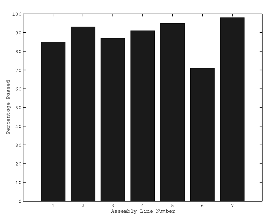
If, for example, you want to create a bar graph of the percentage of widgets that passed quality tests versus the assembly line number, you can type
which will produce the plot shown in Figure 3.34.
Figure 3.34 Using the bar function.
When you plot bar graphs, you may wish to have labels other than the numeric ones that automatically appear on your x-axis. In these cases, the simplest way to plot your bar graph is with the bar(bar_height_vector) format.
You also have the option of passing a string argument to define the color and line style of the bars with
or
The string, line_style_string, takes on the same format as the string used in the plot command. The bar function can also be used to create the data which defines the lines making up the bars. This is done by requesting that the bar function return two output variables with either
or
In this mode of operation, the bar function does not draw anything. However, these output variables, x_line_data and y_line_data, can be used with the plot command (e.g., plot(x_line_data,y_line_data)) to generate the bar graph.
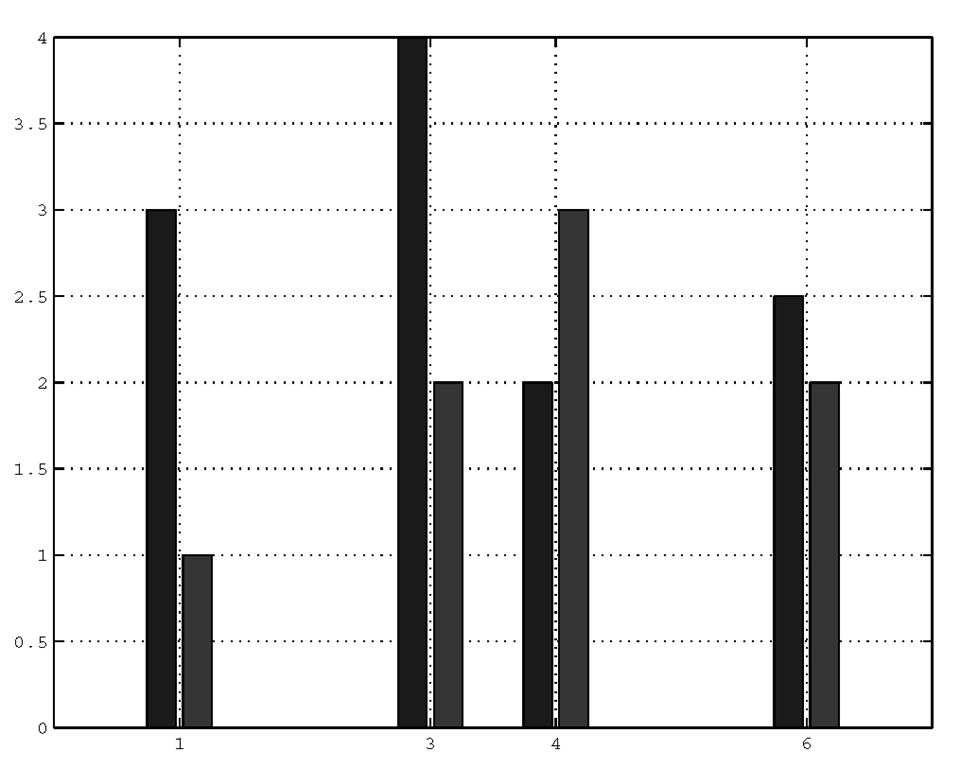
The bar plotting function has the ability of clustering multiple data sets, stacking and generating horizontal bar plots. When you pass a matrix to the bar function, a bar will be generated for each element of the matrix. The bars associated with the elements in a specific row will be clustered together, while at the same time maintaining color properties for the bars generated from the matrix elements in a specific column. For example, if we have a 2-by-4 matrix, there will be 4 groups of 2 bars clustered around each x-axis data point associated with a row element in the matrix as shown in Figure 3.35.
If we did not provide the x-axis data points such as by using bar(Y), MATLAB would have used the row number and the four clusters would have been evenly spaced.
Figure 3.35 Clustered bar graph.
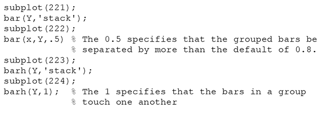
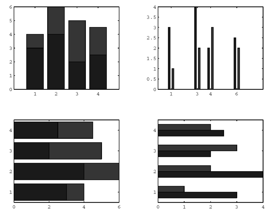
In the next example, several variations of the same data set (the x and Y used in the previous example) are generated in the four subplots with bar and barh. (The barh function is essentially identical to bar except that the bars are plotted horizontally.) The stacked bar plots are created by specifying the ‘stack’ bar style (‘group’ is the default). A bar’s width and the relative amount of separation between bars within a clustered group can be specified by providing a scalar argument; the default value for this scalar is 0.8. A value less than 1 makes the bars thinner and separates them more, a value of 1 makes the bars in a group touch one another, and a value greater than 1 makes the bars overlap. The plots are shown in Figure 3.36.
Figure 3.36 Using various combinations of the bar and barh functions.
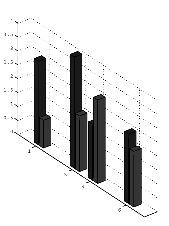
The examples done here can be repeated using MATLAB’s bar3 and bar3h commands to give the plots a 3-D look. Just repeat the examples and substitute bar3 for bar and bar3h for barh. The only other thing you have to know is that the default style for 2-D bar graphs is grouped while the default style for 3-D bar graphs is ‘detached’. Therefore, when the style is not explicitly stated in the example, you will have to provide the ‘grouped’ style to get the 3-D counterpart. For example, the 3-D counterpart to the plot shown in Figure 3-32, is created with
and is shown in Figure 3.37.
Figure 3.37 3-D version of Figure 3.35.
Histograms
Histograms are essentially a kind of bar graph that is created by first specifying the number bins that specify a range of values, and then counting the number of occurrences of a data set that fall within each bin. One of the most common uses of the histogram is in image processing where we are often interested in the spectrum of the color (or gray-scale) of an image. For a 16-color image, we could indicate on the x-axis 4 bins, each covering four of the colors, and plot the number of pixels that fall into each bin on the y-axis. There are many uses of the histogram and it is frequently used to give insight into the occurrence of events relative to some categories of interest.
The MATLAB hist function can be used to automatically create a histogram of the data you pass to it. If you use hist(y), the function will create a histogram with 10 equally spaced bins that cover the range of values between the minimum and maximum values of the variable y. In addition, you may specify either the number of bins or the centers of the bins by respectively passing a scalar or vector as a second argument to the hist function. The hist function makes use of the bar function to plot the histogram, and therefore, when you pass bin centers as a vector argument, you should pass points that are equally spaced and in ascending order. If the centers are not equally spaced or in order, you may not get the results you expect. Just as with the bar function, you may suppress the plotting of the histogram by having the function return two output variables. For example,
will return two vectors. The variable n is a vector containing the number of occurrences that correspond to the bins with centers specified in the variable x.
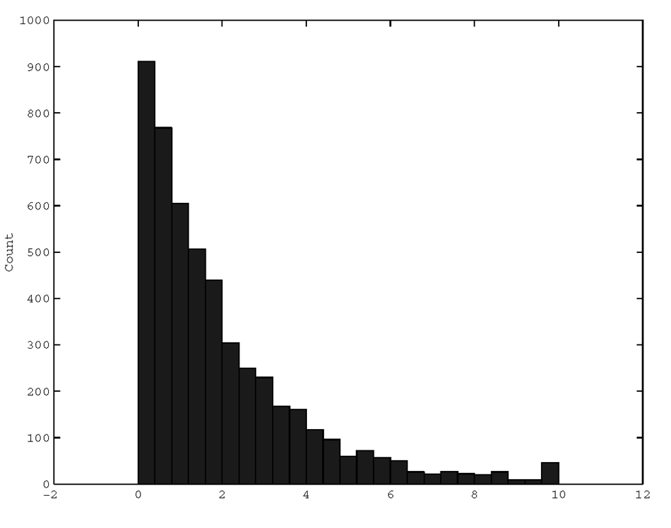
As an example, let’s create exponentially distributed data and plot the histogram as shown in Figure 3.38.
Figure 3.38 A histogram of exponentially distributed samples.
To plot the percentage of data points that fall within a particular bin on the y-axis instead of the count, we could use
and we would get the plot shown in Figure 3.39.
Figure 3.39 Showing percentage of occurrence with the hist function.


