So making a simple plot is easy enough with the plot command. In fact, you can see how attractive MATLAB might be for making quick plots and easily adding axis labels and titles. There’s lots more you can do and that is what we are going to discuss next.
Generating Plots with Multiple Data Sets
As you just learned, you can plot multiple sets of data with a single plot command. However, MATLAB does not restrict you to using a single call to the plot command in order to plot multiple lines in a graph. A command which you might find very useful is the hold command. The hold command allows you to add additional lines to the current graph without erasing what already exists in it. When hold is not used, the plot command will replace the contents of the current graph. The hold command can be used in three different ways:
|
hold on |
tells MATLAB that you want all subsequent lines and surfaces to be added to the current graph. |
|
hold off |
is used to turn off the hold command, setting MATLAB back to the default mode of replacing the current graph with a new one. |
|
hold |
when used by itself will toggle the mode between the hold on and hold off state. |
Here is an example where we will add three lines to a single graph using three plot statements to produce the graph shown in Figure 3.12.
Both the hold on and hold off statements could have been replaced simply with the command hold. In fact, the hold off is not necessary at all. We have used it here to make sure that the graph returns to its default state. This way, if you type in subsequent examples, you will obtain results identical to those shown in the figures which are illustrated in this topic. We also suggest using the on and off arguments in programs so that the hold state is not ambiguous to a person reading the M-file. If you are concerned about inadvertently plotting on an existing graph, you would be, for instance, completely safe from accidentally adding the solid red line, plot(x,sin(x),’-r’), to a previously existing graph, by using the clear figure command clf .
Figure 3.12 Multiple line plot using hold.
Notice that in this example we had to tell the plot command which color to use with each of the lines or else each line would have been plotted in blue, the default first color for MATLAB plots. This is because the plot command starts with the default first color each time it is called. Although hold is on, that fact is completely ignored by the plot command. The hold command simply keeps the current plot while subsequent plot commands are issued.
In some instances you will have data sets that you want to display on the same graph; however, the y-axis data values are not in the same range. MATLAB provides a useful graphics function for just such an occasion. The command plotyy, will help you plot these types of data sets on the same graph. This is best explained with an example.
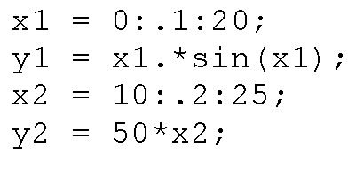
Let’s say you have created the following data sets:
If you plotted them with
As you can see in Figure 3.13 it is difficult to see the y1 values since MATLAB’s auto-scaling is choosing the y-axis limits so as to display all the data points.
Figure 3.13 Using plot to graph data sets with a large range of y-axis values is not always acceptable.
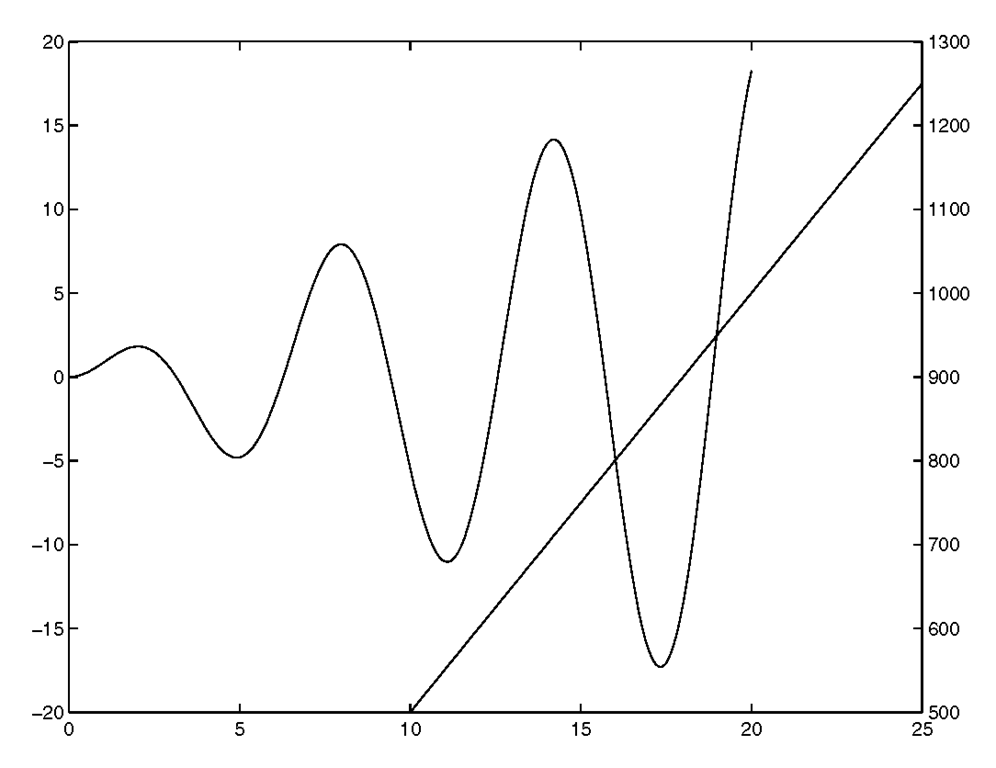
Instead we could use plotyy to plot the data:
which would generate the plot shown in Figure 3.14 .
Figure 3.14 Using the plotyy command.
Observe that the y1 data took the first default color and that the y2 data took the second. Also notice how MATLAB colored the y axis appropriately. Unfortunately, the plotyy command does not allow us to change the color or type of line used in plotting the same way we did with the plot command. Also, using ylabel would only affect the left y-axis and we would not be able to label the right y-axis. However, by making use of MATLAB’s handle graphics we can do exactly what we intend, that is plotting the two sets of data with complete control over the color, line style, and even labeling each axis appropriately.
The following code will do just that:
The handles are used here to give us control over setting the linestyle and color attributes so that we can readily distinguish between the data sets. The plotyy command returns the handles to the graph’s two axes in axeshandles, and the handles to objects from each plot in line1 handle and line2handle. The first element in axeshandles, axeshandles(1), is the left axes and the second, axeshandles(2) is the right axis. The above code sets the appropriate properties and will give the plot shown in Figure 3.15.
Figure 3.15 Using plotyy to show 2 data sets.
Notice how nice our graph looks with each axis labeled appropriately and with our choice of color and line styles! Don’t get overly worried about the use of handles and object properties here.Just keep in mind that to get the greatest control over plots in MATLAB you will need to know about Handle Graphics.
Using Axis to Customize Plots
You probably noticed that MATLAB automatically scales the x-axis and y-axis to encompass the data set or sets that you are plotting. In addition, the axes are automatically labeled and in a standard Cartesian coordinate system with the origin in the lower-left corner. Often you will want to display a different region of the graph than what MATLAB’s default settings have provided. The axis command can be used to manipulate the attributes of a graph’s axes. Table 3.4.1 summarizes the uses of this function with respect to 2-dimensional plots.
|
Function |
Action |
|
axis([xmin xmax ymin ymax]) |
set the minimum and maximum x- and y-axis limits. xmax and/or ymax can be set to Inf to force MATLAB to autoscale the upper x- and y-axis limits. xmin and/or ymin can be set to -Inf to force MATLAB to scale the lower x-and y-axis limits. |
|
axis auto |
returns the axis scaling to its default, automatic mode where, for each dimension, ‘nice’ limits are chosen based on the extents of all lines in the graph. |
|
axis manual |
freezes the scaling at the current limits, so that if hold is turned on, subsequent plots will use the same limits. |
|
axis normal |
puts the axes into the default (automatic) state and restores the current axis box to full size, removing any restrictions on the scaling of the units. This undoes the effects of axis square, and axis equal. |
|
axis square |
forces the axes to have square dimensions. |
|
axis equal |
forces the unit spacing, i.e., the tic marks, on the x- and y- axis to be equal. |
|
axis ij |
puts origin of graph in upper-left corner. The x-axis scale numbering increases from left to right. The y-axis scale numbering increases from top to bottom. |
|
axis xy |
forces the axes to use a standard Cartesian coordinate system with the origin of the graph in the lower-left corner. The x-axis scale numbering increases from left to right. The y-axis scale numbering increases from bottom to top. |
|
axis tight |
forces the x- and y-axes limits to the minimum and maximum data values, i.e., the range of the data. |
|
axis off |
turns off, i.e., hides, the axes labels, tic marks, and box by making them invisible. |
|
axis on |
turns on, i.e., makes visible, the axes labels, tic marks, and box. |
We haven’t said anything about this before, but MATLAB commands also have a functional form. This is called command-function duality. The axis command is as good a command as any to explain this. For instance, you can use the command form by typing
axis square
at the command prompt, or you could use the function form by typing axis(‘square’)
MATLAB treats each method the same. The utility of the command form is that you can compound a couple of these axis manipulations at the same time, such as with
axis equal tight
which will force the unit spacing to be the same on the two axes and force the limits to the ranges provided in the plotted data sets.
Depending on the data used to create your graph, you may decide that only a specific portion of the graph is important or has relevance. You can always determine which elements are of interest and then re-plot only those elements of the data. This is inconvenient, time-consuming, and may still not give you exactly what you want. The axis command provides the easiest and most straightforward way to manually define the x- and y-axis limits.
For instance, if you plot the following data
with
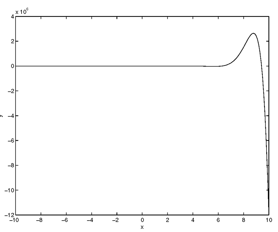
you will obtain the results illustrated in Figure 3.16.
Figure 3.16 Automatic scaling can be misleading.
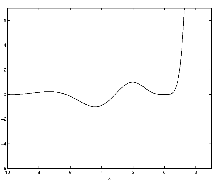
This graph shows all the data, but the graph seems to indicate that the expression for y is flat for x between negative 10 and 3. To see what is going on for these values of x, we can "zoom" in on this region by using the axis command. To use this function, pass a vector containing the minimum and maximum values of the x- and y-axes that you want shown (e.g., axis([xmin xmax ymin ymax])). Let’s say we want the x-axis to run only from negative ten to three and the y-axis to run from negative six to seven. To achieve this, type
which will give the results shown in Figure 3.17.
Figure 3.17 Manually defining the axis reveals details of the data.
Simply typing
axis auto
at the command prompt will plot all the data again in the graph.
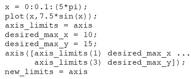
When you write MATLAB M-files that create graphics there will be times when you might need to know the current graph’s axis limits. This is useful for things such as determining how to appropriately redefine them based on their value, or perhaps you are interested in them for some other purpose. To get and put the current axis limits into a variable, use
When the current graph is 2-dimensional, variable_name will be a row vector with 4 elements ([xmin xmax ymin ymax]). The following example illustrates the case in which you want use the minimum limits of the x- and y-axes that MATLAB determines, but want to customize the maximum values for both axes.
The axis limits before redefining them are
and after redefining them, the limits are
Earlier we showed you how by using hold on you can create graphs with multiple lines by separately issuing the plot command for each line. If the data for a particular line exceeds the boundaries of the x- and y-axis limits, MATLAB redefines the axis scales to include the new data. In some instances this may not be desirable. To keep the automatic scaling from occurring, you just need to define the axes limits using axis([xmin xmax ymin ymax]) or axis(axis). By setting the axis limits to something other than ‘auto,’ the axis mode is set into a manual mode instead of automatic. Therefore, any subsequent plots that are added to the current one will not change the axes scales. The axis(axis) method of defining the limits freezes the current axis scaling limits because you are calling the axis function twice. The call that is performed within the parentheses returns a vector of the current axes limits that in turn is passed to the axis function. The axes limits are not changed, but since you have manually defined the axis limits, they will no longer change to accommodate the minimum and maximum values of subsequent data plots.
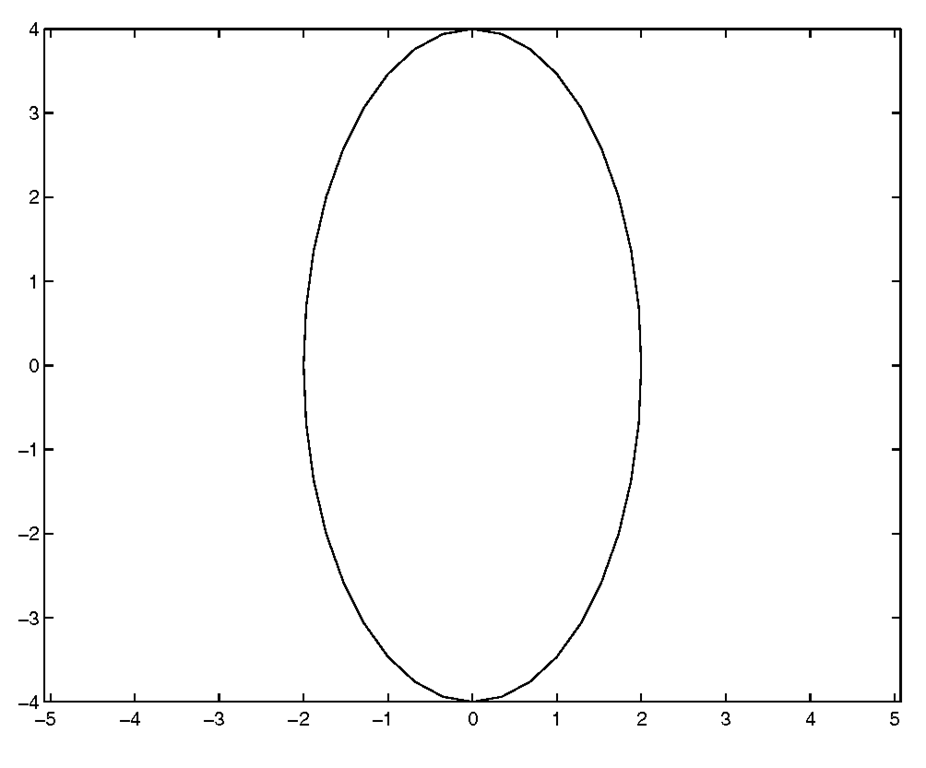
The axis command also provides a quick way to change the aspect ratio of the axes. By default, the axes will size themselves to fill up most of the Figure Window, independent of how you have sized the Figure Window. Depending on the data you have plotted, you may want the axes to be square in their physical dimensions. To illustrate this, create a Figure Window by typing
Then resize this Figure Window so that its dimensions are rectangular. Now let’s create a circle with a radius of two units, using
At this point the circle probably has a slight elliptical shape such as shown in Figure 3.18.
Figure 3.18 Circular data appears elliptical without customizing the axes with the axis command.
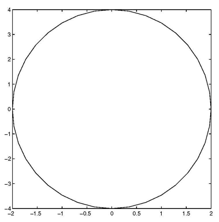
Now we can force the axes size to be that of a square instead of a rectangle with the command
which will result in the plot of Figure 3.19.
Figure 3.19 Using axis(‘square’).
Now this looks more like a circle! But before we can be confident in our use of the axis(‘square’) command, let’s take our understanding a little further by looking at the plot of an ellipse.
Keep in mind that using axis(‘square’) does not necessarily keep the unit spacing on the x-axis the same size as the unit spacing on the y-axis, it merely forces the size of the axes to be a square instead of the default axes size, which tries to make the most of the Figure Window real estate. To illustrate, create an ellipse by typing
which will produce the plot shown in Figure 3.20.
Figure 3.20 Elliptical data looks circular with axis(‘square’).
Now you can clearly see that we have an ellipse that looks like a circle. Such a representation could lead to problems that are merely annoying or potentially devastating.
To insure that you have the correct aspect ratio, use axis(‘equal’). Typing
after the axis(‘square’) command of the previous example will produce the graph shown in Figure 3.21.
Figure 3.21 Using axis(‘equal’) to graph the ellipse.
You can also force the range of the axis limits to adjust to the minimum and maximum data values of the ellipse by using axis(‘tight’). If you do, you will get the plot shown in Figure 3.22.
Figure 3.22 Using axis(‘tight’) to adjust the axes to the ellipse data.
Recall that the default Cartesian axes has its origin in the lower-left corner of the plot. The x-axis lies horizontally along the bottom of the figure with the axis scale values increasing from left to right. The y-axis lies vertically along the left side of the Figure Window with the axis scale values increasing from bottom to top. You can tell MATLAB to locate the origin of the axes in the upper-left corner with the y-axis scale values increasing from top to bottom by using the command axis(‘ij’). To revert back to the default Cartesian axes use axis(‘xy’).
If you think that your data is not correctly proportioned, use axis(‘equal’) to make sure that the scaling of the axis is indeed equal. Also, be aware that the axis(‘auto’) command only assures that the scaling can accommodate all the data in the graph; it will not necessarily undo the ‘square’ and ‘equal’ settings. To be sure you are back in the default mode, use axis(‘normal’).
One last feature of the axis function that we will mention here is that you can make the axes and all labels associated with the axes invisible by typing axis(‘off’). In this mode, the graphics that were plotted in the axes will remain visible. This is useful if all you need is the data. To see the axes and labels again simply type axis(‘on’).


