Contour Plots
Contour plots are an excellent way of visualizing some of your matrices. Contours represent the constant data values with lines called isolines. MATLAB provides both 2-D (top-down view) and 3-D (perspective view) contour plots. We cover both the 2-D and 3-D contour plots in this section since these plots are often associated with 3-D data in some way.
The simplest way to create a 2-D contour plot is to pass your matrix, Z, with contour(Z). MATLAB will automatically choose the number and values at which contour lines are drawn. You can also specify either the number of lines with contour(Z,number_of_lines) or the values at which the contour lines will be drawn with contour(Z,vector_of_data_levels). If you want to plot only a single contour data level, make the vector_of_data_levels a two-element vector with both elements set to the data level you want contoured.
The three methods just mentioned are plotted versus the row and column number of the matrix Z, such that the element Z(1,1) will be located in the lower left-hand corner of the figure. You also have the option of defining the x- and y-axis scaling by passing either vectors or matrices that specify the x-and y-coordinates associated with each element of the matrix Z. If these axis scaling matrices are used, they should be passed as the first two arguments to the contour function, i.e.,
contour(x_scale,y_scale,Z),
contour(x_scale,y_scale,Z,number_of_lines)
contour(x_scale,y_scale,Z,vector_of_data_levels)
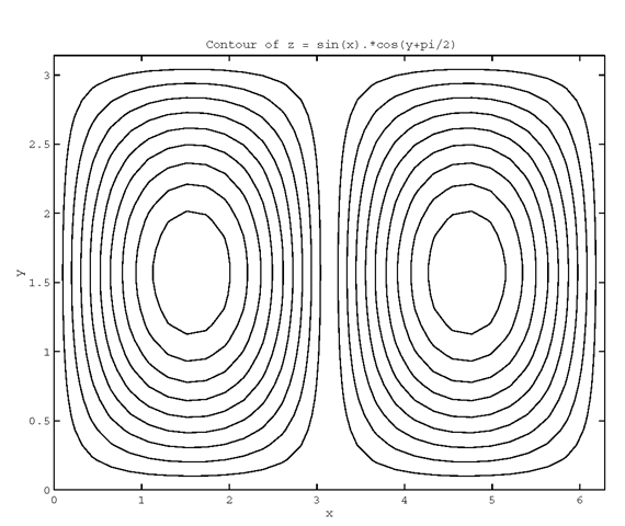
As an example of the contour function, the following code will generate some data and create a contour plot as shown in Figure 4.14.
Figure 4.14 A simple 2-D contour plot.
Notice that the color of the contours is chosen in the same manner as colors are chosen when creating multiple lines with the plot command. In addition, in Figure 4.14 it is impossible to tell what value the data levels correspond to or whether there are two hills, two valleys or one hill and one valley. Fortunately, there are two options to remedy this problem; the first is to use the function clabel, which will attach a numeric text string to each line, the second is to create a 3-D contour plot by passing the same arguments to the function contour3 instead of contour.
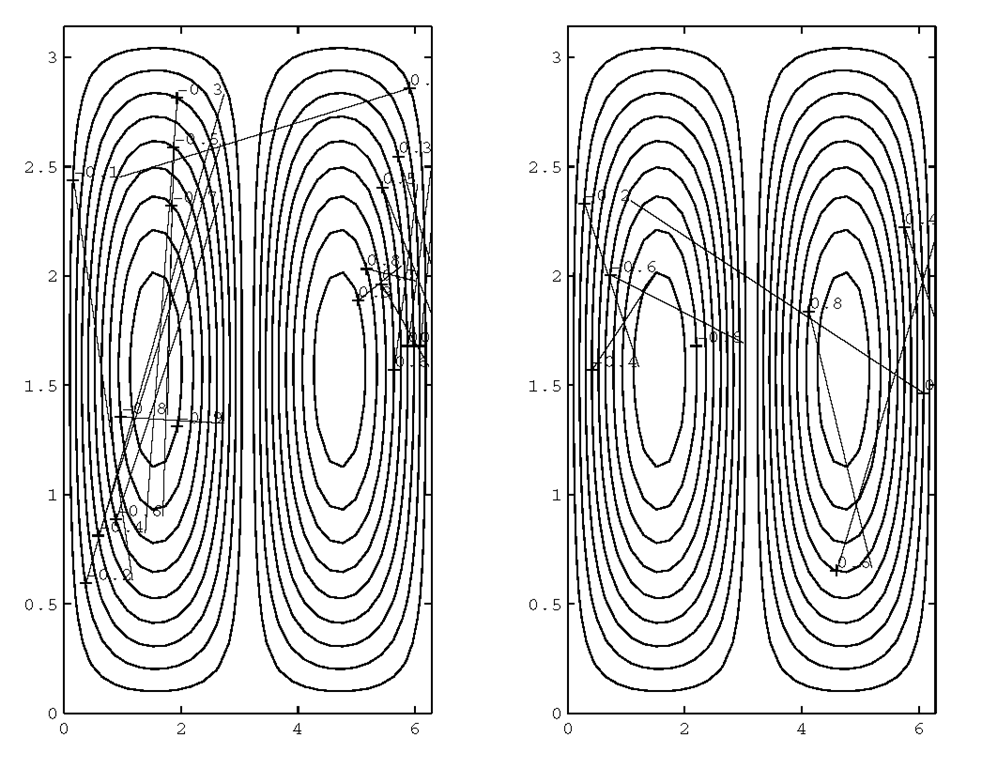
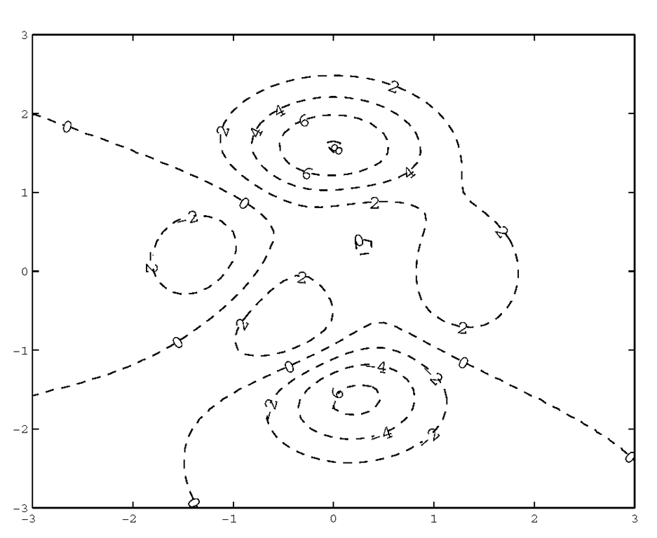
The left half of Figure 4.1 5 shows how to use clabel with the data from the previous example with:
The right half shows how to specify which contour lines are labeled by passing an additional argument to clabel as follows:
Note that in both cases the location of the text is randomly assigned.
Figure 4.15 Using clabel to label contour plots.
You can also elect to manually select which contour lines are to be labeled and at the same time specify the location of the text by using clabel(c,’manual’). After you enter this command, a crosshair will appear instead of the normal mouse pointer arrow. Click down on the mouse button (or use the space bar) and a label will be drawn as a plus sign with a height value and attached to the contour line that is the closest to the location you clicked on. When you have labeled as many of the contour lines that you want, press the return key on your keyboard while the cursor is still in the Figure Window to indicate that you have finished.
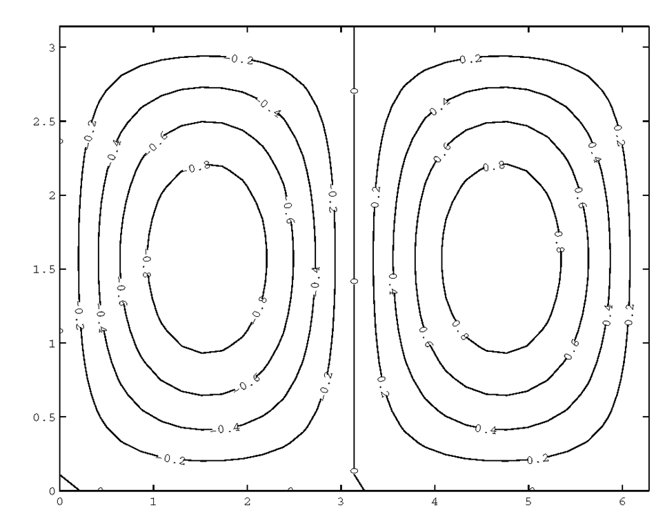
MATLAB also provides an automatic labeling method to generate plots like that shown in Figure 4.1 5. To do this you must call the contour function and retrieve both the contour matrix and the handles of the line objects.For now, you can use the following code to produce the plot in Figure 4.16.
Figure 4.16 Automatic labeling of isolines.
MATLAB uses an algorithm to determine where the labels are to be placed.
As when you used clabel with ‘manual’ before, cross hairs will appear on the figure and follow the mouse pointer. The difference between this manual method and the one without the use of the handles is that this method will not produce a plus sign, but will put the value directly on the isoline.
Additionally, you can have clabel return the graphics handles to labels so that you can specify the properties of the labels, such as the font size or color. For instance, we can create Figure 4.1 7 with,
Figure 4.17 Manipulating contour label properties.
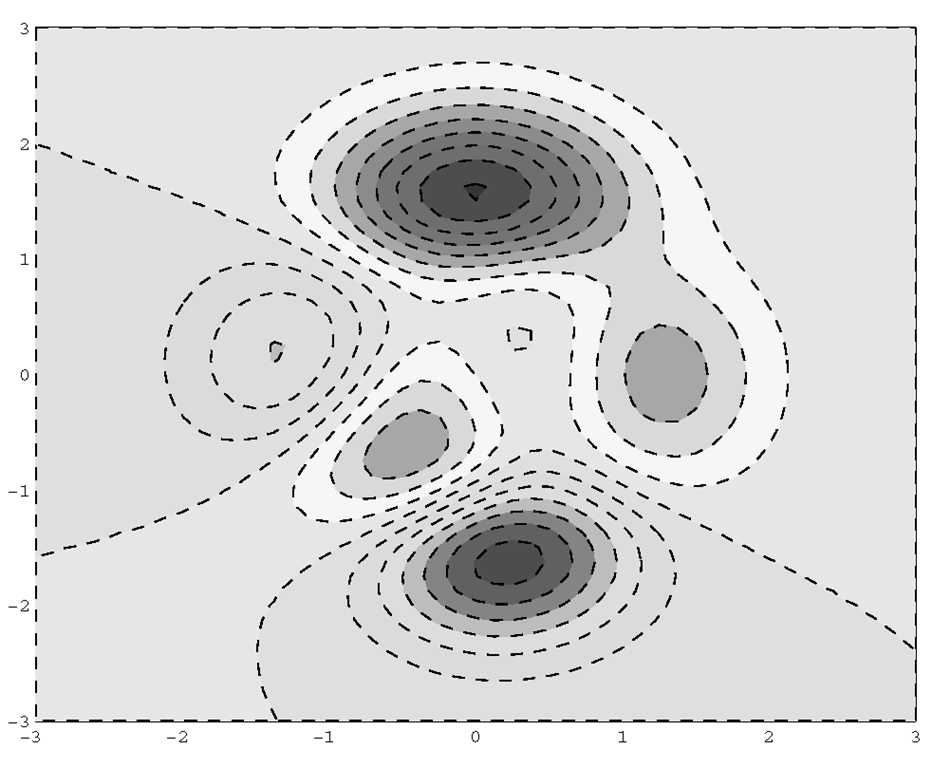
A filled contour plot displays isolines with the areas between filled with a constant color. To create a filled contour plot, use the function contourf. Each level of the contour is filled in with a color from the current color map. The color corresponds to the relative height of the level in the same way that color is chosen to represent the relative height of a surface plot. The following code will recreate the previous example as a filled contour plot.
The result is shown in Figure 4.18.
Figure 4.18 A filled contour plot.
Notice that in this code the vector [-10:10] was passed to the contourf function. The contour plotting functions accept a vector specifying the levels at which to plot contours.
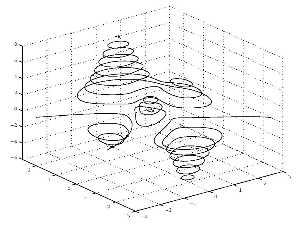
The last contouring function we will consider is the 3-D contour plotting function contour3. This function allows you to see the relative heights of the isolines. As with contour and contourf you can pass a vector specifying the levels you want to plot. The following code produces the plot shown in Figure 4.19.
Figure 4.19 Showing the relative heights of isolines with contour3.
Quiver Plots
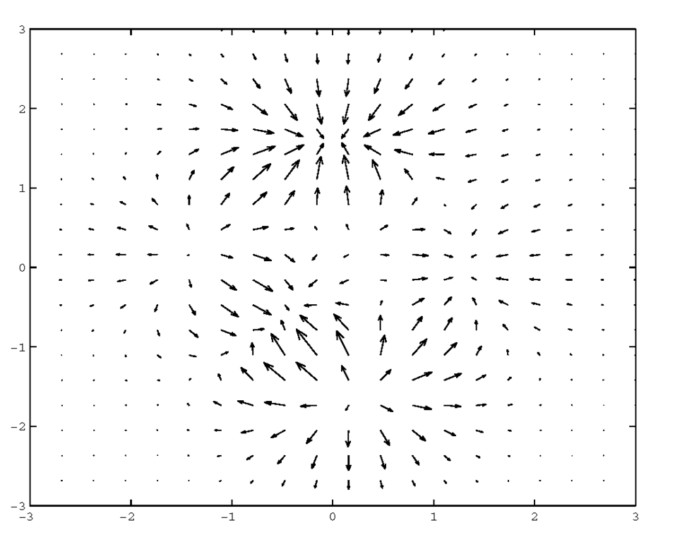
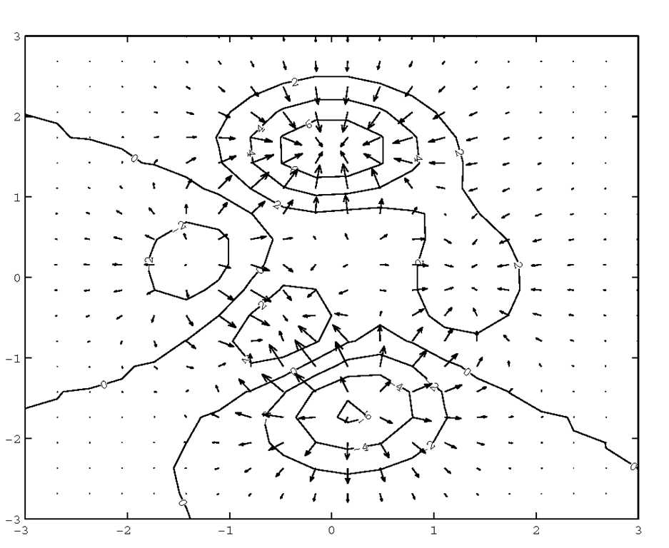
Quiver plots are used to visualize the gradient fields of either mathematical functions or data. For instance, you can plot arrows that point in the direction of increasing or decreasing values in a matrix and that have lengths that indicate the relative slope of the gradient at the particular locations. The graphics function that is used to create this type of plot is quiver. There are several different forms that can be used, but the most general is quiver(X,Y,PX,PY,scale,linetype_string) where the matrices X and Y define the locations of the arrows, PX and PY matrices determine the direction and magnitude of the arrows, the scale variable is used to adjust the length of all arrows by the specified factor, and the linetype_string can be used to specify the color and linestyle as was presented when the plot command was discussed. The partial derivatives (PX and PY) of a given surface can be obtained with the function gradient. To illustrate the quiver plotting function, let’s look at the quiver plot of the peaks function shown in Figure 4.20.
Figure 4.20 A quiver plot of the peaks function.
Figure 4.20 has arrows pointing in the direction of increasing Z. However, to change the direction of the arrows to point in the decreasing Z direction, all that is needed is to type quiver(X,Y,-PX,-PY). The first two arrow location defining matrices can be placed with vectors using quiver(x,y,PX,PY) or quiver(x,y,PX,PY,scale, linetype_string), where the length of x is equal to the number of columns in PX and PY and the length of y is equal to the number of rows in PX and PY. If it is not important to know the x- and y-axis locations of the arrows you can use quiver(PX,PY) or quiver(PX,PY,scale,linetype_string). The scale parameter defaults to a value of 1, indicating that MATLAB will automatically scale the arrow length. A scale value of 0 will plot the arrow length without scaling.
Combination Plots
Perhaps you have been wondering how you can combine different plot types in order to visually correlate the information in your data? Since 2-D and 3-D representations each tend to emphasize different aspects of the information in a plot, the combination of a surface plot with a contour plot, for example, of the same data would present a great deal of information in a compact form. There are a couple of MATLAB functions that will create useful combination plots, but it is very easy to create your own functions to produce just the combination plots you want. However, before you can design a truly custom combination plot, you will need to learn a little more about graphics objects and their properties so that you can manipulate them to your liking. Once you see how easily creating your own graphics functions can be accomplished, you will only be limited by your imagination with regard to adding new functionality in your repertoire of M-files.
If it hasn’t occurred to you yet, you have already looked at some simple combination plots when we used the hold function to overlay line plots within the same figure. The same can be done with any of the other graphics creating functions. For example, in many cases the information provided by a flat quiver plot can be made easier to comprehend by overlaying a contour plot. Let’s take the quiver plot example shown in Figure 4.20, and overlay the corresponding contour. First, create the contour with
and create the contour overlay with
which will produce the result shown in Figure 4.21. This plot is much more informative than the plot that either quiver or contour could have provided by themselves.
Figure 4.21 A quiver and contour combination plot.
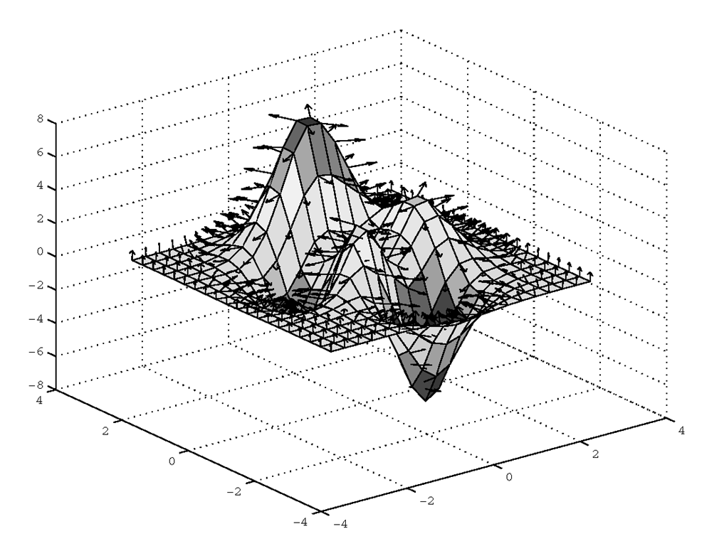
As another example, we can create a three-dimensional quiver plot combined with a surface plot. The 3-D quiver plot can be created using MATLAB’s quiver3 function. Using the peaks function as in the previous example the following code will create the data and plot it as shown in Figure 4.22.
Figure 4.22 A combined 3-D quiver and surface plot.
As the previous examples show, combining different plot types can provide significant insight into data. In these cases, the plots were of the same dimension. The MATLAB plot axes are designed to allow any type of plot to be combined with any other. As such, you can readily combine 2-D and 3-D plots.
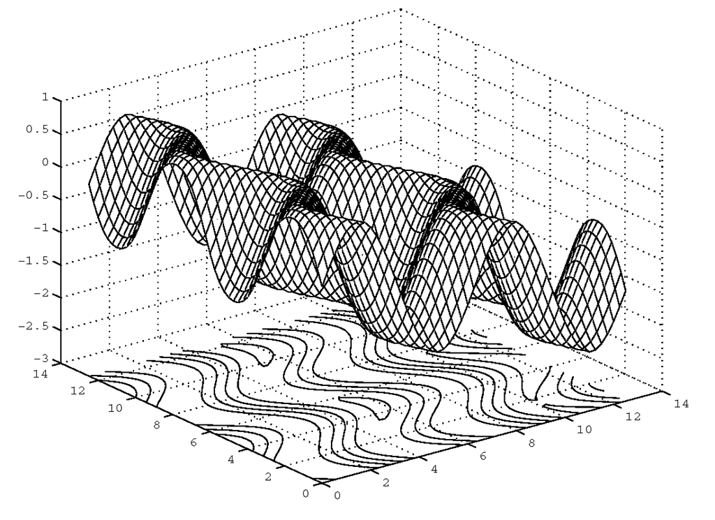
As you have seen, the hold function allows different plots in the same axes. In addition to using hold, MATLAB provides two specific combination plots that combine a contour plot with either a mesh or surface plot. The first function meshc will create a mesh plot with a contour plot directly below it. The following example will help you better understand how this type of plot might be used. Consider the surface defined by the equation z = sin(x + sin(y)) – x/10. The first step is to create the surface over some values of x and y.
The plot shown in Figure 4.23 and Plate 4 is achieved by simply plotting the surface with
Figure 4.23 Using meshc to create a mesh – contour combination plot.
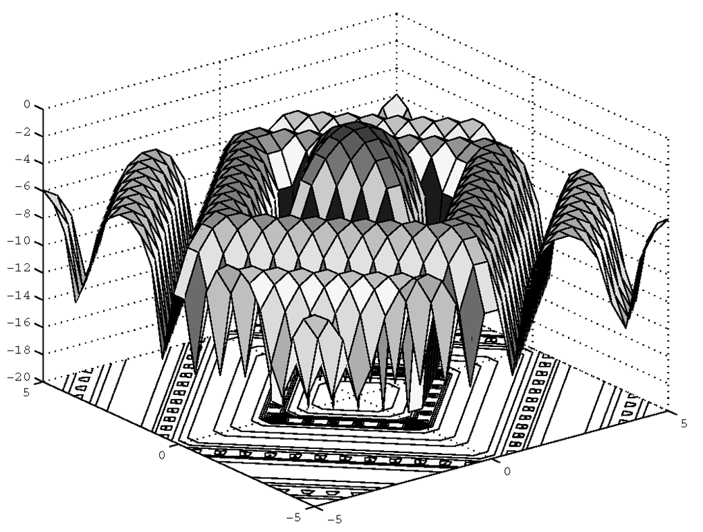
In a similar manner, a combination surface and contour plot can be created with the command surfc. As an example, we can use besselj (the bessel function) to generate some data in the following example which is plotted in Figure 4.24 (see also Plate 5).
Figure 4.24 A surface – contour combination plot made with surfc.
As you experiment with the surfc and the meshc functions you will notice that the contour is always plotted at the lowest z-axis limit that appears in the figure. In many cases this is simply unacceptable since the contour can be easily obscured by the surface or mesh plot. If you are lucky enough to choose a function that shows you enough of the contour when using these two functions, then great! But if you are not so lucky, and generally speaking you won’t be, it does not mean that these combination plot functions will be useless. One rather obvious work around is to simply use the view axis tool in the Figure Window, or to use the function view. The default perspective sets the observer at -37.5° azimuth and 30° elevation (i.e., view([-37.5 30])). You could just lower the elevation so as to peek under the surface a bit more, perhaps with view([-37.5 1 5]). The problem with this is that the perspective of the plot is changed, likely making it difficult to extract information from the contour lines or the surface plot, and therefore may not be desirable for some data sets. The real solution lies in using a little Handle Graphics.In the meantime, you can merely resort to this technique as it is, and dig under the surface of what is going on later.
Our best solution is to relocate the contour plot, i.e., offset it, to a level where the surface or mesh plots cannot obscure it. Simple enough in concept, but how is this accomplished?Later you will learn that everything in MATLAB is an object and every object has properties, and you can change the value of those properties. Without further explanation, the process here requires two steps. First we must get "handles" to the part of the plot we want to affect, in this case the contour plot lines.
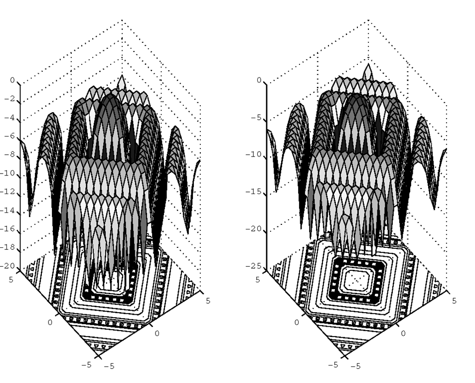
Second, we will use the handles to the plot lines to access the z-axis data and add an offset to it. Consider again the plot shown in Figure 4.24. Calling surfc as shown here will not only plot the data, but will also return the "handles" to what we want in H.
In this case, the first handle returned in H belongs to the surface; the remaining handles belong to the contours we want to change. We can lower the contour plane, by subtracting 5 (adding an offset of -5) from the value of each z coordinate of each contour line. Here is the code that does it.
Figure 4.25 shows the "before and after" of offsetting the contour plot from the surface plot.
Figure 4.25 Before and after contour plot shifting.
We can’t just simply subtract 5 from z since that would alter the surface portion of the plot. The solution shown here preserves the original data.
![tmp8414326_thumb[2][2] tmp8414326_thumb[2][2]](http://what-when-how.com/wp-content/uploads/2012/06/tmp8414326_thumb22_thumb.png)
![tmp8414328_thumb[2][2] tmp8414328_thumb[2][2]](http://what-when-how.com/wp-content/uploads/2012/06/tmp8414328_thumb22_thumb.png)
![tmp8414329_thumb[2][2] tmp8414329_thumb[2][2]](http://what-when-how.com/wp-content/uploads/2012/06/tmp8414329_thumb22_thumb.png)
![tmp8414331_thumb[2][2] tmp8414331_thumb[2][2]](http://what-when-how.com/wp-content/uploads/2012/06/tmp8414331_thumb22_thumb.png)
![tmp8414333_thumb[2][2] tmp8414333_thumb[2][2]](http://what-when-how.com/wp-content/uploads/2012/06/tmp8414333_thumb22_thumb.png)
![tmp8414337_thumb[2][2] tmp8414337_thumb[2][2]](http://what-when-how.com/wp-content/uploads/2012/06/tmp8414337_thumb22_thumb.png)
![tmp8414339_thumb[2][2] tmp8414339_thumb[2][2]](http://what-when-how.com/wp-content/uploads/2012/06/tmp8414339_thumb22_thumb.png)
![tmp8414341_thumb[2][2] tmp8414341_thumb[2][2]](http://what-when-how.com/wp-content/uploads/2012/06/tmp8414341_thumb22_thumb.png)
![tmp8414342_thumb[2][2] tmp8414342_thumb[2][2]](http://what-when-how.com/wp-content/uploads/2012/06/tmp8414342_thumb22_thumb.png)
![tmp8414344_thumb[2][2] tmp8414344_thumb[2][2]](http://what-when-how.com/wp-content/uploads/2012/06/tmp8414344_thumb22_thumb.png)
![tmp8414346_thumb[2][2] tmp8414346_thumb[2][2]](http://what-when-how.com/wp-content/uploads/2012/06/tmp8414346_thumb22_thumb.png)
![tmp8414347_thumb[2][2] tmp8414347_thumb[2][2]](http://what-when-how.com/wp-content/uploads/2012/06/tmp8414347_thumb22_thumb.png)
![tmp8414349_thumb[2][2] tmp8414349_thumb[2][2]](http://what-when-how.com/wp-content/uploads/2012/06/tmp8414349_thumb22_thumb.png)
![tmp8414351_thumb[2][2] tmp8414351_thumb[2][2]](http://what-when-how.com/wp-content/uploads/2012/06/tmp8414351_thumb22_thumb.png)
![tmp8414352_thumb[2][2] tmp8414352_thumb[2][2]](http://what-when-how.com/wp-content/uploads/2012/06/tmp8414352_thumb22_thumb.png)
