Example: Tessellations and Youth Violence
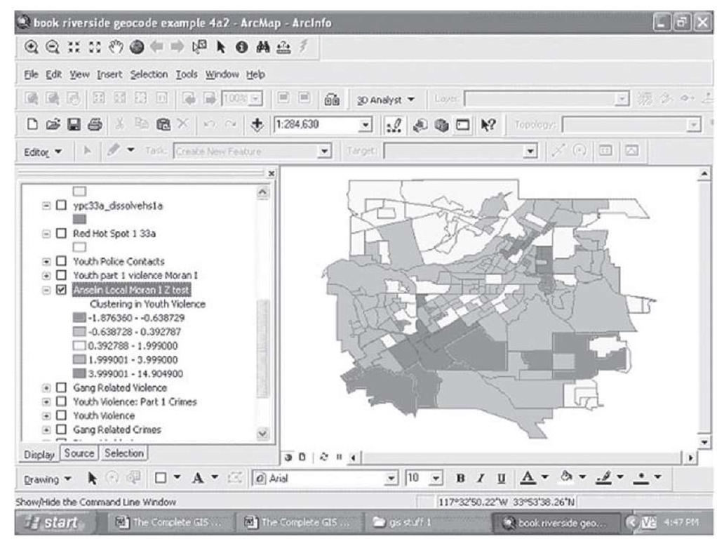
ArcGIS has implemented Anselin’s Local Moran I to analyze the clustering of events within and across unit boundaries (see Anselin, 1995). Although a topic to be discussed in detail in Section 3 of this topic, Moran’s I is the standard measure for the degree of spatial patterns or geographic similarity in the pattern of events in geographic locations. In group data like those being analyzed here, Moran’s I provides a general measure of how much spatial correlation across units there is in these data arrayed as we find them on this map. The local Moran’s I is a test of the degree to which the points in one unit are similarly distributed to the points in an adjacent unit. What is shown in Figure 2.34 is the significance of a Z test based on the values of the local Moran I for the block groups in Riverside with regard to youth violent incidents known to the police; black (red) indicates that there is highly similar distribution of points in units nearby that are also significant and thus black (red) in color. On the other hand, the darker gray (dark green) are places that show very different distribution from unit to unit as one crosses the boundaries from one unit to its neighboring units.
FIGURE 2.34 Anselin’s Local Moran I and clusters of youth violent incidents (Z scores)
Comparing this figure to the map in Figure 2.31, which is based on the actual distribution of these events, shows a somewhat altered pattern, indicating that significant clustering has been detected in these data. For example, in the lower left portion of the map in Figure 2.31, there is one block group shaded black (red), indicating an area of a large number of violent events, and this area is surrounded by four block groups shaded in dark gray (orange), indicating a fewer number of incidents. In Figure 2.34, however, this unit is surrounded by four units that are similarly shaded black (red), indicating significant clustering among these units—as if they were not distinct areas but really part of a larger continuous area. This makes sense if we consider that the youth committing these violent acts have no idea that there are boundaries that divide up their neighborhood into the block groups that we analyze. The clustering test is telling us that these neighboring units show similar patterns of events inside each one, and this would be logical grounds for combining them into a single large unit that divides the space over which these events are distributed by the nature of the distribution of these events.
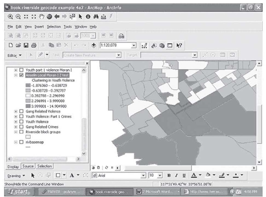
In the detailed view shown in Figure 2.35, the original hot spot in the lower left portion of the map is shown outlined (in blue) with the Local Moran Z tests plotted and the surrounding similarly clustered units shaded in black (red).
FIGURE 2.35 Detailed view of clustering patterns
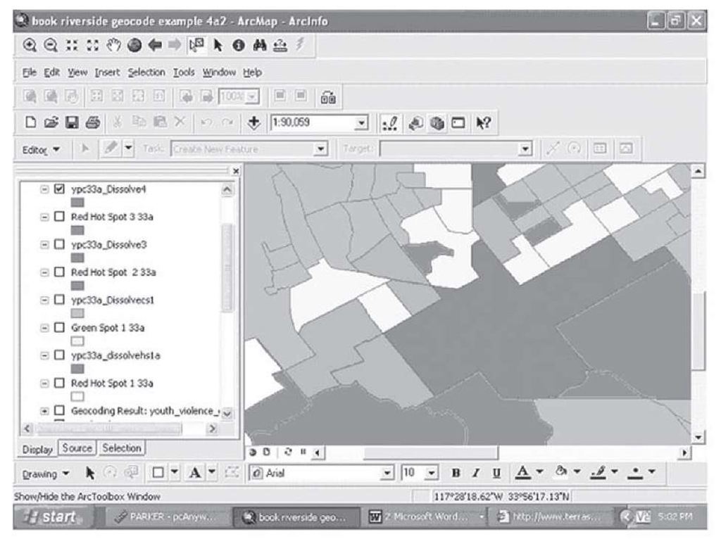
We can create a new unit which combines the events occurring in all four of the units shown in black (red) here to form a new tessellation based on the clustering the events we are mapping show, as seen in Figure 2.36.
FIGURE 2.36 A tessellation based on the clustering of events in four block groups
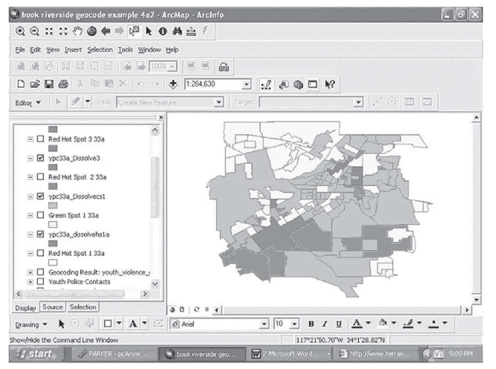
You can continue to build these new areas by combining block groups that have similar Z scores on the Local Moran’s I, thus creating a map which divides the space these events occur in not according to arbitrary units devised for some other purpose, but on the basis of the events and their patterns across the space being studied. Several more such tessellations are shown in Figure 2.37.
Figure 2.37 More tessellations based on clustering
In this map, three areas of highly significant clusters have been joined, and two areas of gray (light green), areas of sparse occurrence of violent events, have also been joined, including a giant "super" tessellation combining 33 block groups in the middle right of the map. You can also see in Figure 2.37 that a light gray (yellow) super tessellation could be made in the upper left portion of the map involving 15 or more block groups; several other possibilities emerge from studying this map.
Now we are in a position to examine the problem raised earlier—How do we find population data, for example, to normalize the crime counts and create rates of youth violence in these newly created tessellations? Let’s examine the details of one of the significant tessellations, within which the statistical analysis showed a hot spot, or dense clustering that was similar across several block groups. We can also display the pin map showing the actual locations of the events as shown in Figure 2.38.
Figure 2.38 One hot spot of youth violence as a tessellation
Although the statistical analysis shows that these four block groups have similar clustering in the events, you can see that the pattern is not evenly distributed across the space. For example, a large number of events cluster along the main streets that form the borders of the original block groups; in the lower right-hand portion of the black shaded area, there are almost no incidents. Suppose we just wanted to sum the population from these four original block groups to use for a denominator for population at risk in a rate—Would just summing across all four populations be a good estimate of the population at risk? Suppose you wanted to compute rates by ethnicity, to see if Latino involvement was higher or lower than Anglo involvement, and the vast majority of the Latinos lived in that lower right-hand section with almost no youth violent events. If that section of the area had a large Latino population, you might find a significant rate of Latino involvement if you simply took all the events in the tessellation and divided it by all the Latino population. You would be making an assumption that could be false—these youth violent events would have happened in places with few Latinos, yet the rate of Latino youth violence would seem to be large.
This example shows how when you create tessellations based on the clustering of one event, other characteristics of the space that may be related to the event in question may have different distributions—you cannot assume a uniform distribution across the space in one factor any more than you can in another, like these violent incidents. The best approach is to analyze geographic units as small as possible, in the same way that a raster image with smaller cells per unit of space is a better representation of a polygon or geographic shape. The smaller units bring you a more fine-grained picture to work with. As you will learn in Section 3, the use of these arbitrary units brings difficulties in the analysis of these data, but there are statistical models and corrections that can be used to overcome such problems. Ultimately there is no free lunch in geospatial analysis—the choices you make about how to conceptualize and map your data have an impact on the kinds of information you generate and the results you will get from any analysis. The best strategy may be tessellations in one case, and arbitrary but small units in another, depending on the nature of your data and the objectives of your map and analysis. One of the objectives here is to show you both sides of this important issue so that you know the implications for choices you make in your GIS work.
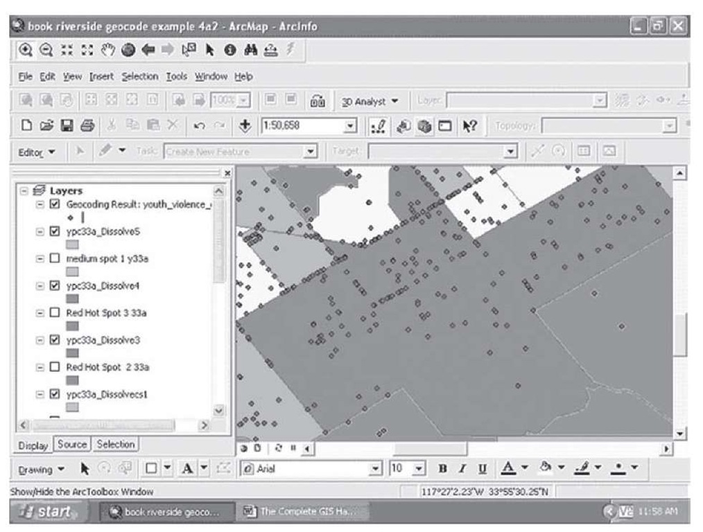
How were these maps produced? The same procedures already demonstrated in this topic for the production of pin and thematic maps were used to construct the base maps for Figures 2.31 to 2.38. The two new wrinkles used to produce these maps were the use of Anselin’s Local Moran I to plot statistically based hot spots and the use of a geoprocessing tool for "dissolving" the boundaries between similarly clustered block groups.
To compute and plot the Local Moran’s I, the following steps were used.
Step 1 Open the toolbox by clicking on the toolbox icon in the main tool bar.
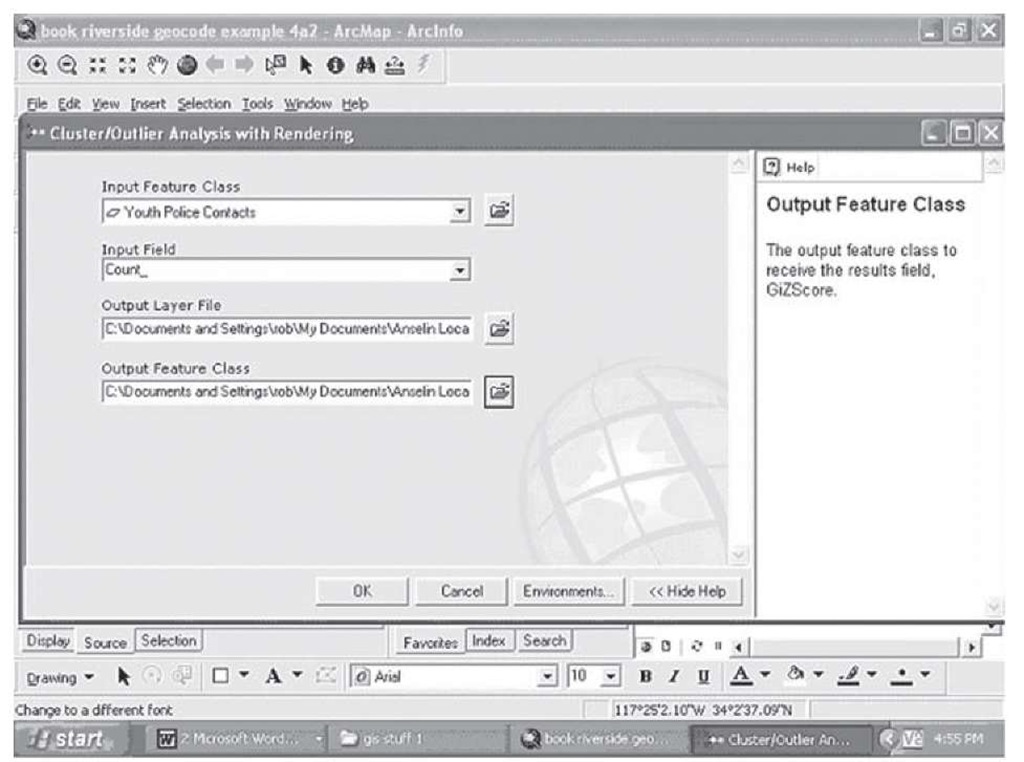
Step 2 Navigate down to the final line, Spatial Statistics Tools, and double-click; select the Cluster/Outlier Analysis with Rendering and double-click.
Step 3 The submenu appears; select the layer you wish to conduct the clustering analysis on.
Step 4 Select the field you wish to conduct the clustering analysis on.
Step 5 Create an output layer you wish to save the results of the clustering analysis in. Click on the browse folders button to the right to make sure you save the layer where you want to on your hard drive; when you type in the name and click on Save, the full path will be reflected on the submenu.
Step 6 Create a feature class to save the results of the clustering analysis in. The feature class will hold the combination of the data from the original attribute table and two new columns at the end of the new attribute table, for the Local Moran I and the Z test of its statistical significance; this map and associated attribute table will automatically be added to your display table of contents once the cluster analysis is complete. Your submenu should look like that in Figure 2.39.
FIGURE 2.39 Setup for the cluster analysis
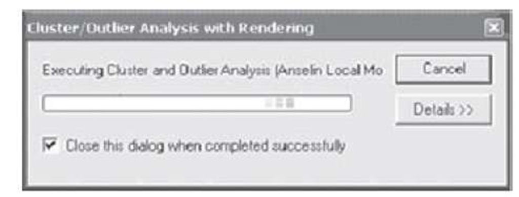
Step 7 Click OK and a box appears showing you the progress of the analysis; depending on the size of your data, this could take a few minutes.
Step 8 When the box shows that the analysis is completed, close it, and the new map will appear. Double-click on the new map and follow the steps shown in the previous section to make a thematic map of the Lmzinvdst variable which has been added as the last column in the attribute table, and your results should resemble Figure 2.40.
FIGURE 2.40 Cluster analysis in progress
The other technique used in this example is using the Dissolve function to create the tessellations starting in Figures 2.36, 2.37, and 2.38. This can be accomplished with the following steps.
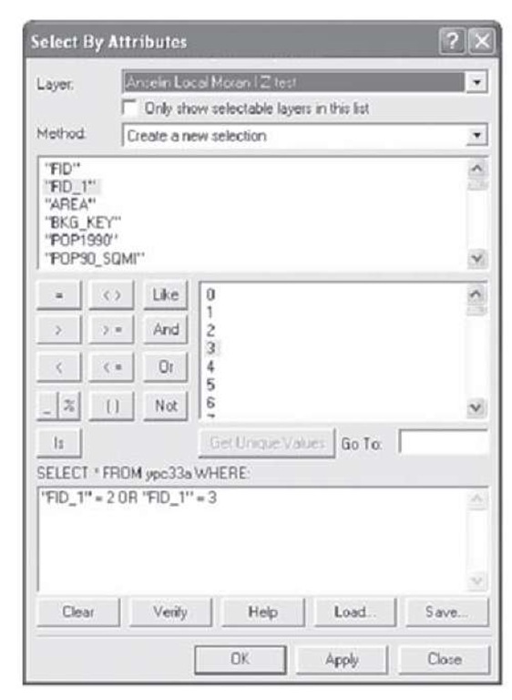
Step 1 Select the units you wish to combine into a tessellation. Start by opening the selection drop down from the main toolbar and open the Select by Attributes submenu.
Step 2 Select the layer you wish to use to make the selection from, and make sure the method box shows "Create a new selection."
Step 3 All the fields in the selected attribute table will appear in the box below method; navigate down until you see the field you want to select on. This field should have a unique identifier for each unit or block group.
Step 4 Double-click on the field, and if you are unsure of the exact id numbers or codes you need, click on the Get Unique Values box; all the possible values for the field will appear in the box to the right.
Step 5 Click on an operator next, usually the equal sign, and then find a value you want to select for and double-click on it; the operator and the value will appear below in the formula box.
Step 6 You can string together a large number of selection statements with the "OR" operator in between them, but they each must have the same structure: "FID_1" = 2 OR "FID_1" = 3 is correct; "FID_1" = 2 OR 3 and "FID_1" = 2 OR = 3 are not correct.
Step 7 Once you have all the units you want to select in the formula box, click on Verify; this will tell you if there are logical errors in your formula, but it will not tell you if you will select the proper units. A statement can be logically correct and still not select any units. When you have verified your formula successfully, click on OK to execute the selection. Your submenu will look something like Figure 2.41.
Figure 2.41 Selection by attributes for tessellation formation
Step 8 When the window closes, left-click on the map you selected from, navigate to selection, then click on Create Layer from Selected Features; a new layer will be added to the display with the same name as the original layer with the word selection added at the end. Display this new layer on the map window to make sure you have selected the proper units.
Step 9 Open the toolbox and navigate to Data Management Tools; click on Generalization (not to be confused with General, above it in the list), and double-click on Dissolve.
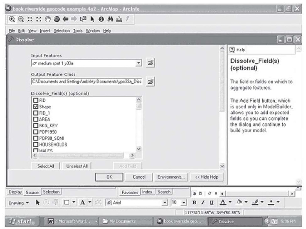
Step 10 The Dissolve submenu opens. Select the new layer you just created with the selected units and select the field you want to dissolve; this will usually be the shape of the unit as you wish to dissolve the individual units into one larger shape. The submenu looks like that in Figure 2.42. Navigate down to the lower portion of the submenu. Here you can select a field that you wish to aggregate and have as an attribute of the new tessellation; this is an option, but in this case you might want to have the number of events aggregated from the individual units as an attribute of the new unit. You may also want to have the number of youth at risk for an event so you can calculate a rate for thematic display. You can add a number of fields here to be aggregated and select the type of aggregation you wish to perform.
FIGURE 2.42 The upper portion of the Dissolve submenu
Step 11 Select any fields to aggregate and click on the "statistic type" box opposite each field you select to indicate the type of aggregation—in this case, you should select sum so that the number of events and the youth population can be aggregated and be attributes of your new tessellation.
Step 12 You are ready to dissolve the subunits and create your tessellation.
Since we have already selected contiguous units, the multipart option is irrelevant for our purposes (under some circumstances you may create a new unit that is one unit but physically separated on the map—this is a multipart unit). Click OK and a new layer is added to the display, containing your new tessellation unit. You can show it over the original map and you will see the new unit displayed with the remaining old units as in Figures 2.36, 2.37, and 2.38.
Step 13 Continue to experiment with different groupings to form tessellations you see appropriate. When you have finished exploring, you can save your work and close the map.
