Example: Racial Profiling Thematic Map
Let’s discuss an example of the use of GIS with more complex data and analyses. The topic of racial profiling is one that is widely studied by sociologists and criminologists in the United States. The concept of racial profiling represents the notion that law enforcement officers use visual signs of ethnicity to target certain ethnic groups for traffic stops and other kinds of arrests. Theorists argue that it is the disproportionate number of stops and arrests for certain ethnic groups that accounts for the disproportionate representation of different ethnic groups in jail or prison in the United States, rather than a disproportionate amount of criminal behavior by members of certain ethnic groups. Studies on racial profiling show statistically significant differences between the number of police detainments for African Americans and Whites in several major U.S. cities (Harris, 1997; Ramirez et al., 2000; Warren et al., 2006). In these studies, African Americans were consistently more likely to be detained by police than Whites in the same geographic areas.
One study in particular presented a GIS analysis of the racial profiling phenomenon to make a clear presentation of the differences in the rates of tickets issued to different ethnic groups within the same geographic location.The results revealed significant differences in the likelihood of different racial groups receiving a disproportionate number of traffic citations relative to their representation in the local population. The study showed that African Americans were the most likely of all ethnic groups to receive traffic citations in the city of Riverside regardless of the socioeconomic characteristics of the neighborhood in which they were stopped. Results of this nature are of great interest to the scientific community, law enforcement agencies, and the general public.
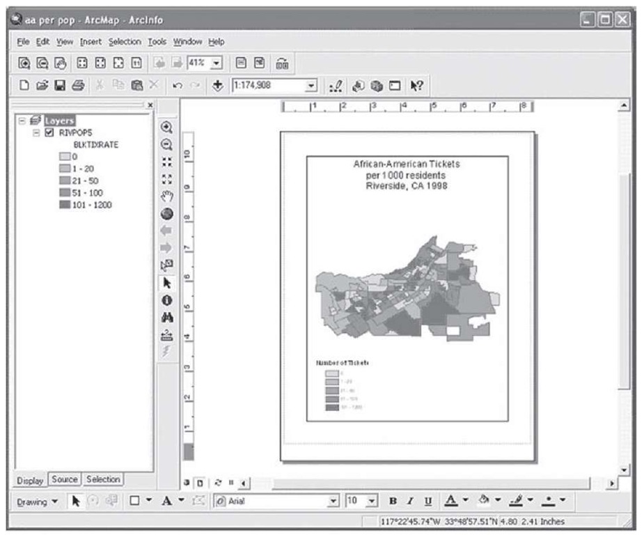
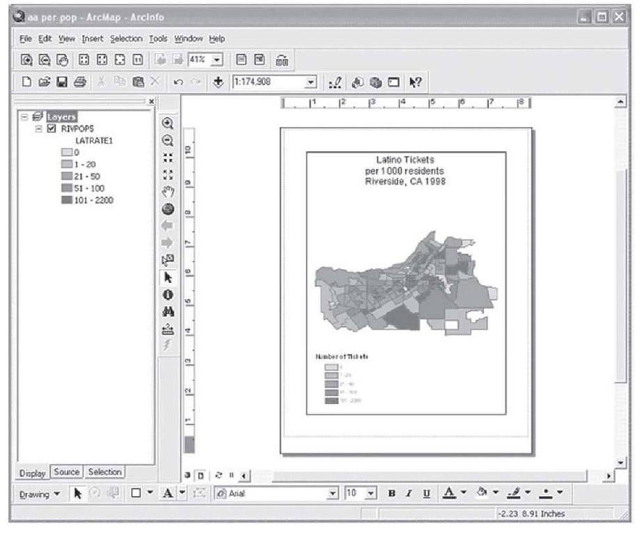
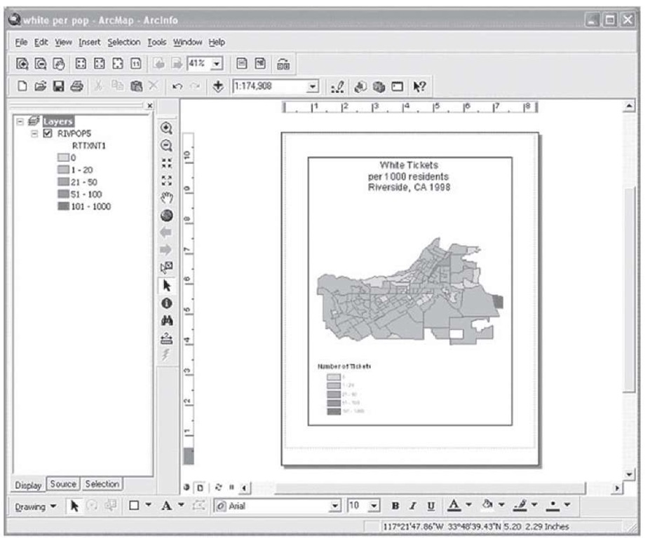
Thematic mapping offers a useful way for researchers to present such findings about racial profiling in a straightforward manner such that individuals of all levels of knowledge and interest can gain a clear understanding of the data presented. The examples below are thematic maps that illustrate the rate of traffic citations issued to African Americans per 1000 residents, Latinos per 1000 residents, and Whites per 1000 residents in the city of Riverside, CA, in 1998. Take a minute to look over the maps and compare the results of each.
FIGURE 1.73 Tickets given to African-American drivers
FIGURE 1.74 Tickets given to Latino drivers
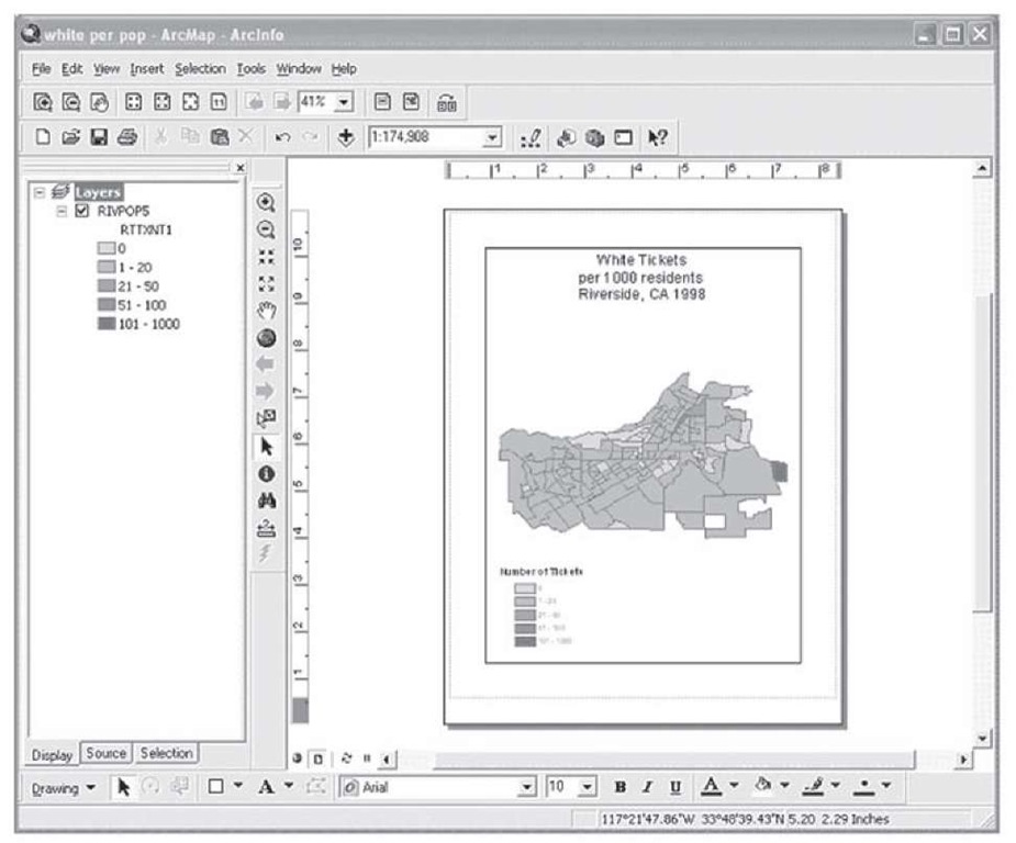
FIGURE 1.75 Tickets given to White drivers
The graduated color scheme used to symbolize the ticket rates for Riverside, CA, in 1998 clearly illustrates that African Americans were more likely to receive tickets than both Latinos and Whites. Further, Latinos were far more likely than Whites to receive tickets. This is despite the fact that according to the census data for Riverside at the time of the study only 6.9 percent of the population was African American, 24.1 percent Latino, and 66.7 percent White. With the knowledge of the ethnic breakdown of the population (also contained in the map data) at the time of the study it is easy to conclude from the ticket distributions reported in the maps that African Americans and Latinos received a disproportionate number of traffic citations during this period.
Before exploring these data in detail, a discussion of the data mining necessary to obtain and prepare these data for GIS is appropriate.The story of how these data were obtained is an interesting one, full of twists and turns—and it shows that in order to get data for GIS analysis that is really important for the social sciences, one sometimes has to be persistent and opportunistic.
The interest for the examination of traffic stops by race and ethnicity in Riverside came out of the reaction of the community and the city to a terrible tragedy and a great offense against people of color in Riverside. The incident was the traffic death of a young African-American woman named Tyisha Mille; she was 19 years old at the time of her death. She was killed by four police officers who fired 27 times into her car; she was struck 12 times from four different angles. The police officers, all employed by the Riverside Police Department, were either Anglo or Latino, and none of them had very much experience on the job (see Pitchford and Hill, 2002).
The reaction of the community and the city of Riverside was, after the initial shock, to empower a commission to investigate the circumstances of this incident and what might be the causes, with an eye towards coming up with policy changes that might prevent such violence in the future. One of the recommendations of the commission was to conduct a study of racial profiling in police practice to see if profiling was occurring and, if so, to gain some insight into how to reduce or prevent racial profiling.The draft was suddenly withdrawn with no explanation, although some speculation was that the victim’s family had sued the city for damages and the city’s legal council had objected to the study because it might be used against the city in such a legal case.
The editor talked about data-based journalism, and it transpired that there was a long history of the newspaper asking for data from the city government, the city refusing to provide the information, the newspaper suing the city, and the city losing in court and having to pay legal costs as well as hand over the data. So the city was prepared to hand over the traffic ticket data, and avoid the legal contest this time. A deal was made; this was just the beginning of the data mining.
The city had agreed to cooperate, but did not have the support of the police department in this, so the cooperation was tepid at best. Months and months of delays, then came a delivery of boxes of badly Xeroxed hardly legible copies of the traffic tickets in random order.As they were in random order, they had to be sorted three times in order to establish a sampling frame for selecting a random sample; not all numbers in the sequences were included, so the sampling had to be repeated random sampling with replacement. We finally selected a 1 in 5 sample for about 4000 tickets. These had to be read, and decisions made about interpreting faded copy, then coded and entered into the computer, and organized into a GIS-compatible spreadsheet; tasks that took more than two years. This was a most challenging data mining experience.
First, data from the city’s police department were collected regarding all traffic citations issued in the City of Riverside for 1998. Data from the citations included the ethnicity of the driver as perceived by the officer issuing the ticket. Additionally, the type and severity of offense were recorded. The data were entered into a spreadsheet format such that they could be converted to many other file formats for analysis. ArcGIS is compatible with many file types including but not limited to .xls, .dbf, and .csv.
Next, researchers obtained reference data to serve as the base map for the geographic location. For this particular analysis, sample data provided with Arc-GIS were used to create the base map. Researchers selected the sub-area of the city of Riverside, CA, from the larger street map of the United States and saved it as a separate file. This file was subsequently used as the reference data for this project. The citation data file was joined to the basemap data file to create a single data file "RIVPOP5" containing both the attributes of the map of Riverside, including census block group boundaries, and the attributes of the traffic citation data set. Using this single data file researchers were easily able to create thematic maps representing the differences in the number of traffic citations issued to the different ethnic groups in Riverside as shown in Figures 1.73, 1.74, and 1.75.
Now we will use the basic steps learned to re-create the U.S. population by Census 2000 map (Figure 1.72) in the previous example to re-create the analytical map of the difference in the rates of traffic citations issued to the different ethnic groups in Riverside for 1998. As you work through this example, you will notice that some of the steps are left open for you to use the knowledge gained from the previous example to fill in on your own.
Step 1 Start ArcMap with a new, empty map.
Step 2 Use the Add Data button and browse to the location where the topic data is stored. Add the file called "RIVPOP5."
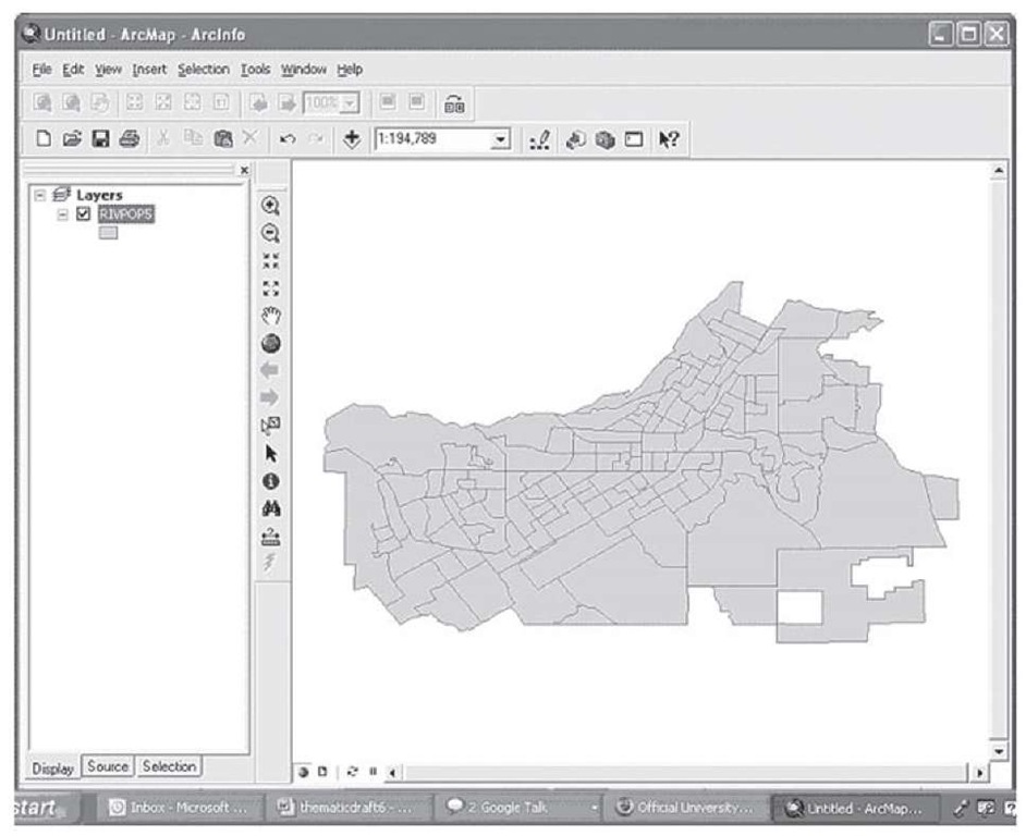
The following map, showing the city of Riverside, CA, and its census block group boundaries should appear in your ArcMap dataframe, as shown in Figure 1.76.
FIGURE 1.76 U.S. Census block groups, Riverside
Right-click on the layer name "RIVPOP" and open the attribute table for these data. Scroll through the table to see what type of information is available. The data contain fields from the 1990 U.S. Census (the most current census data available at the time of the study), as well as the data input from the traffic citations issued by the Riverside Police Department. Any of the fields contained in the table can be used on its own or in combination with other fields to represent different characteristics about this region. As with any type of data analyses, knowing what information is available within the data set is helpful in deciding what type of thematic map to create.
Before we can create the maps shown in the three examples (Figures 1.73, 1.74, and 1.75), we must calculate the rates of tickets issued per ethnic group by population. We can use ArcGIS to calculate this rate directly within the RIVPOP5 data layer. Use the following steps:
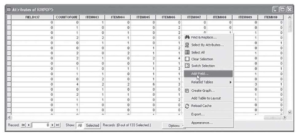
Step 1 Use the options button on the bottom right of the attribute table and choose Add Field, as shown in Figure 1.77.
FIGURE 1.77 Attribute table for "RIVPOP5"
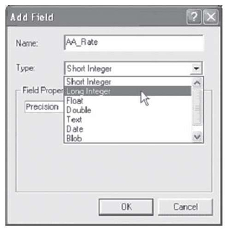
Step 2 In the Add Field dialog type "AA_Rate" for the Name, and select Long Integer for the Type and click OK (Figure 1.78).
FIGURE 1.78 Adding a field (column) to an attribute table
View the attribute table to find that your newly added field "AA_Rate" now appears at the end of the table. Now we can populate the AA_Rate field with the rate of traffic citations issued to African Americans in Riverside, CA, in 1998.
Step 3 Right-click on the AA_Rate field and select Calculate Values.
Step 4 In the message box from the Field Calculator warning that edits performed outside of an edit session can be undone, click Yes (Figure 1.79).
FIGURE 1.79 Warning message about calculation methods in ArcMap
Although edits cannot be "undone" when editing with this method, you can delete a field and re-create it if necessary. You also have the option of adding more new fields as needed.
You should now see the Field Calculator window on your screen. We will use the calculator to compute the values for the AA_Rate field. Since we are interested in the rate of tickets issued to African Americans per 1000 African-American residents in Riverside, CA, in 1998, we will need to combine fields from the U.S. Census data with fields from the traffic citation data.
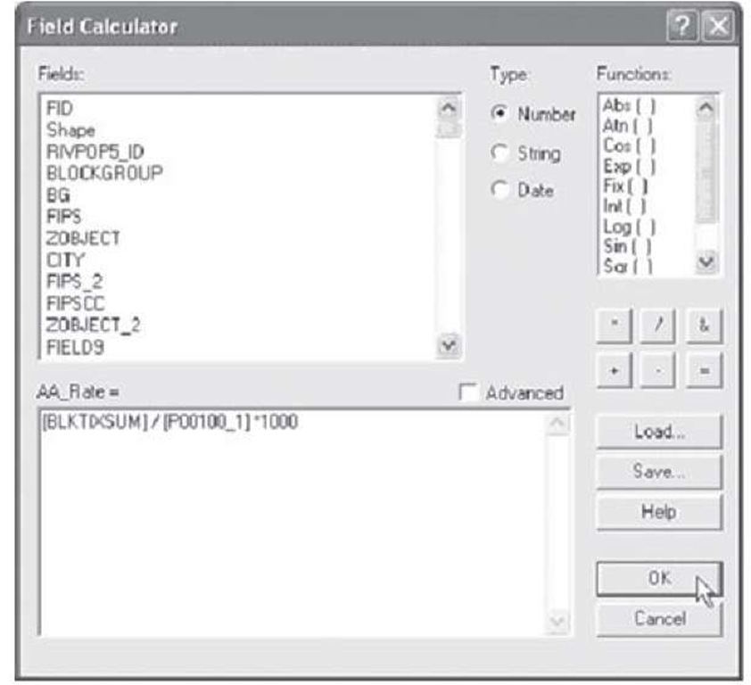
Step 5 Use the mouse to select the appropriate fields (reference codebook) and calculations in the Field Calculator so that ArcGIS can calculate and populate the values accordingly. In order to get the rate of tickets issued to African Americans per 1000 residents in Riverside, CA, we will need to divide the number of tickets issued to African Americans by the number of residents, and multiply this result by 1000. The Field Calculator will appear as in Figure 1.80 if you have entered the calculation correctly.
FIGURE 1.80 Field Calculator screen
Once you have populated the calculator with the above expression, click OK. Note that the Field Calculator provides options for loading previously saved syntax files, and also has the ability to process VBA code for more advanced calculations. The AA_Rate field should now be populated. The attributes contained in the field represent the rate of tickets issued to African Americans per 1000 residents in the city of Riverside in 1998.
Now you will use the steps to create and populate the rate of African-American tickets from above to create and populate the rates of Latino tickets and White tickets per 1000 residents. Use the previous model and replace the "BLKTIXSUM" field with the corresponding "TOTLAT1" to create the Latino rate, and "CNTWHT1 " to create the rate for Whites. When you have finished creating the additional fields scroll down the table to view the differences in the rates of traffic citations issued between these three ethnic categories, then close the table.
The data are now ready for you to re-create the three maps presented at the beginning of this section. First, you will create the map showing the rate of African-American tickets issued per 1000 residents.
Step 6 Open the Layer Properties dialog and select Quantities > Graduated colors. If you have trouble remembering how to accomplish this, refer to steps 5 and 6 from the U.S. Census 2000 example.
Step 7 Use the pulldown menu to select the desired color ramp. Selecting an appropriate color ramp often depends on your data structure. In this case, since the characteristic of primary interest are the "hot spots," or areas where many tickets are being issued, the authors suggest using a "hot" color such as red (darker shade here) to represent the areas where the most tickets are issued. You may choose to represent the data with any colors you wish, but using the color scheme to represent the theoretical logic adds to the clarity of the presentation.
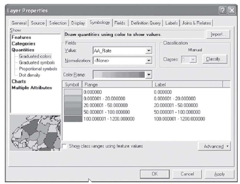
Step 8 Use the pulldown to populate the Field Value box with the AA_Rate field.
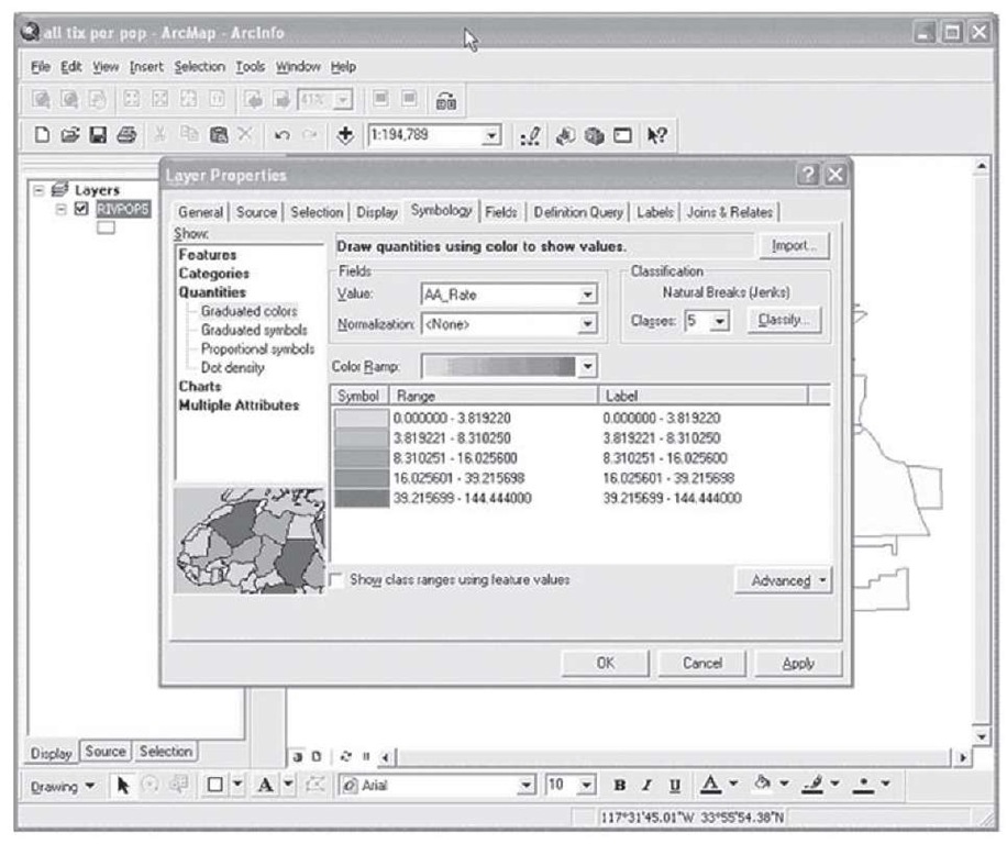
You should see the results as in Figure 1.81.
FIGURE 1.81 Symbology tab
In order to maintain consistency between the different maps you are going to create, you will need to customize the symbol ranges and labels. For this example, we are going to use the same symbology scheme for each map. However, there may be cases where a different symbology strategy provides more meaning to your audience. This will have to be a judgment call on the part of the researcher. You can change symbology values manually by clicking the mouse in the appropriate area of the range column and typing in the desired values.
Step 9 Use the manual entry method described above to populate the Symbology tab as shown in Figure 1.82.
FIGURE 1.82 Creating the thematic map
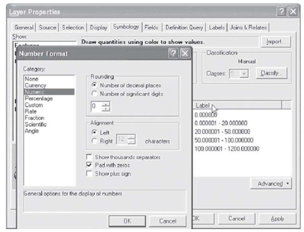
To change the number format for the labels you can left-click the mouse on the Label button and specify the number of significant digits as well as other properties about how the label should appear, as shown in Figure 1.83.
Figure 1.83 Selecting details for labeling a thematic map
Step 10 Click Apply. Click OK.
Congratulations! You have successfully created a map showing the rate of tickets issued to African Americans in Riverside, CA, in 1998.
Now, you need to add a legend and a title for clarity.
Step 11 Go to the layout view in ArcMap. (Hint: use the button on the bottom left corner.)
Step 12 Use the Insert menu in the layout view to insert a legend with an acceptable style.
Step 13 Use the Insert menu in the layout view to insert the title "African-American tickets per 1000 residents in Riverside, CA 1998."
If you cannot remember how to accomplish these tasks, please refer to steps 10-14 of the previous example for detailed instructions.
Step 14 Once the legend and title are created use the File > Save As option to save your newly created map as "African-American tickets 1998" to a location on disk for retrieval and use at a later time.
The exact same steps you used to create the map representing the rate of traffic citations issued to African-American drivers in Riverside, CA, in 1998 can be used to create the additional maps showing the rate of traffic citations issued to Latino and White drivers in Riverside during 1998. The only change will be the variable used to symbolize the data in the map.
Step 1 Use the button on the bottom left corner of the dataframe to switch back to the data view in ArcMap.
Step 2 Double-click on the layer name to open the Layer Properties dialog and select the Symbology tab.
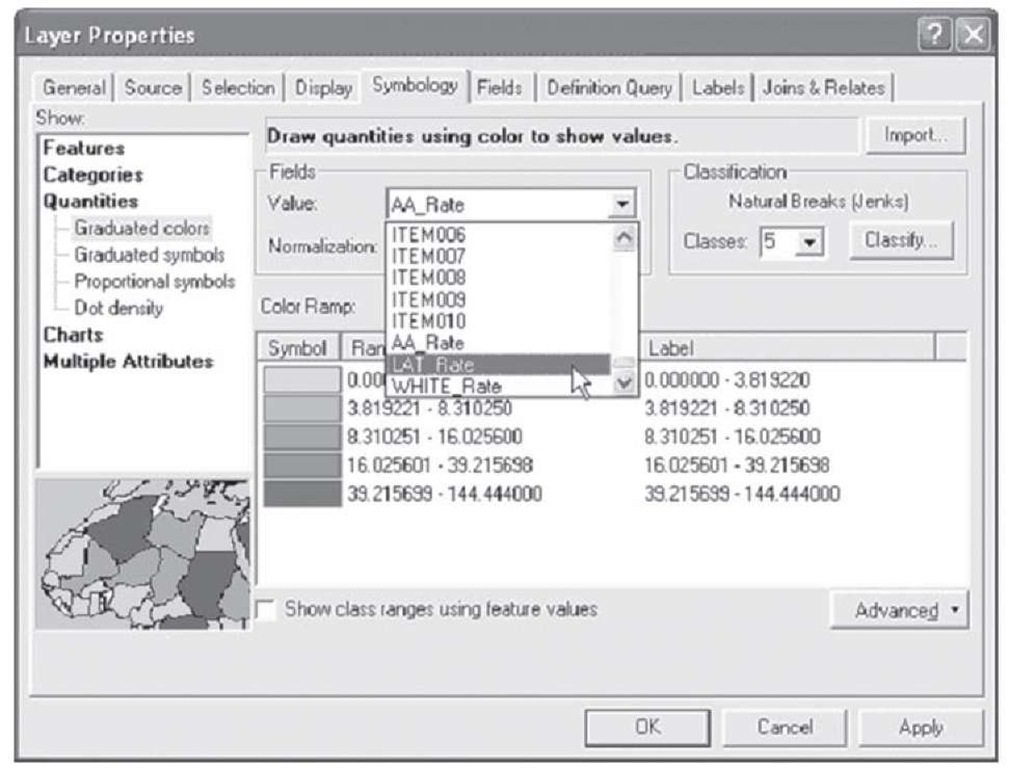
Step 3 Use the value pulldown menu to specify that values should be symbolized using the field Lat_Rate instead of AA_Rate, as shown in Figure 1.84.
Figure 1.84 Selecting a variable for a thematic map
Step 4 Click Apply.
You will notice the map behind the layer properties changing slightly to reflect the newly specified symbology. Next, you need to specify a symbol range that is the same as the range used for the map showing the rate of tickets issued to African-American drivers for a more meaningful comparison across maps.
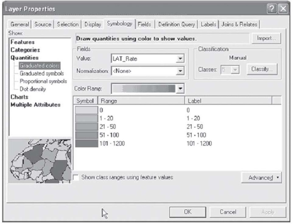
Step 5 Use the procedure discussed in the above example (steps 8-9) to manually populate the symbol range column and display zero significant digits as shown in Figure 1.85.
FIGURE 1.85 Constructing another thematic map
Step 6 Click Apply, then OK.
The map display will update to reflect your changes and show the rate of tickets issued to Latino drivers in Riverside during 1998. You have just created another thematic map. Next are the finishing touches of the legend and title.
Step 7 Switch to the layout view of ArcMap. You will notice that since you did not close the previous .mxd file showing the rate of tickets issued to African-American drivers, the legend and the title remain in the layout view. This makes your job easier. Notice that the legend has updated itself to reflect the new symbol range (max is now 1200 instead of 200 as in the previous example). This is due to the live link between the ArcMap data view and layout view. Since the legend is already in place, we only need to change the title to reflect the current map and save the file.
Step 8 Double-click on the title in the ArcMap layout to bring up the properties in an editable window. Replace the existing title with "Latino tickets per 1000 residents in Riverside, CA 1998."
Step 9 Click Apply and notice the title update on the screen.
Step 10 Use the File > Save As option to save the file with an appropriate name to a location on disk for use later.
Now you will create the last map in the series for this example on your own using the steps presented in the previous two map examples. Use the steps for creating the maps of the rate of citations issued to African-American and Latino drivers in Riverside during 1998 to create the map showing the rate of citations issued to White drivers in Riverside during 1998. When you complete this map, be sure to save it as you did with the previous maps. Your final product should look like the map shown in Figure 1.86.
FIGURE 1.86 Layout view of thematic map with legend
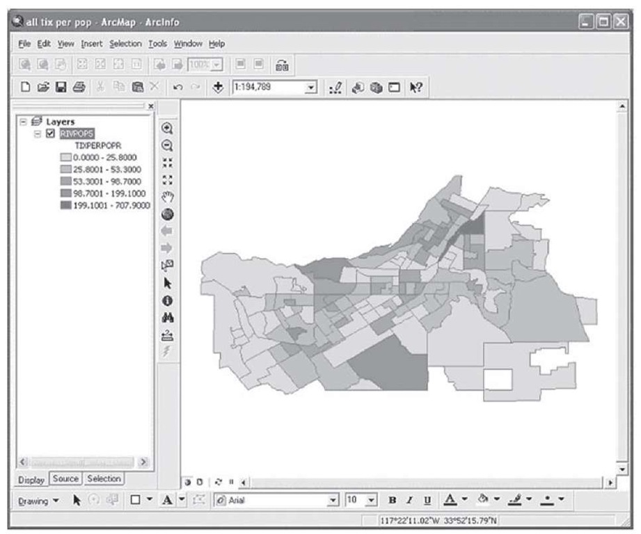
Now, as an exercise, you will create one more example using the same data from the racial profiling example on your own. Suppose researchers want to report to the general public the total number of traffic citations per 1000 residents issued to drivers of all ethnic groups who were stopped for traffic violations in Riverside in 1998 by census block group. Recall our previous examples and the options available for creating thematic maps in ArcGIS. With these options in mind, which variable/s from the RIVPOP5 data set could we use to create a thematic map that represents the number of citations issued in total per 1000 residents in Riverside in 1998? Write your answer down and then read below to see if you are correct. Try using the knowledge you gained from the previous section to create the resulting thematic map in ArcGIS; your results should look similar to Figure 1.87.
FIGURE 1.87 Using the rate of getting a ticket to display relationships in a map
Now, add a legend and a title to this map in the layout view and save the results as "All Tickets per 1000 Residents." Refer to the steps in the previous examples if you need to refresh your memory about how to add the legend and the title to your map. Once you complete this map, save the results with an appropriate name to a location on disk. (Answer: to create the thematic map above you needed to use the variable called "TIXPERPOP" from the RIVPOP5 data set.)
In the previous section of this topic, you learned the steps involved in the process of geocoding addresses to create what is known as a "pin map." Thematic mapping can take a geocoded map one step further in creating a detailed visual representation of the characteristics of interest in a given geographic region. Recall the example from the previous section in which addresses indicating instances of juvenile crime in Riverside, CA, were geocoded to create a pin map. Using this same geocoded map you will now create a thematic map indicating differences in crime rates between census block groups in Riverside, CA.
