Using Three Dimensions to Show Socioeconomic Conditions
Although the economic system of the United States, based on capitalism and free enterprise, has been very successful at creating prosperity and economic status that is the envy of many of the world’s nations and individuals, the system is also very good at creating inequality and poverty, especially when compared to other advanced industrial nations. There are many and complex reasons for this, but one of the ways to increase understanding of these issues is to use the power of 3D GIS to visualize these differences and to reveal new and different aspects of them. In this example, data on average rents in the city of Riverside will be shown in a 3D visualization that might help prospective residents of the city decide where to look for housing and how to match their search to their budget but still understand all the options available to them in different parts of the city.
Example: Socioeconomic Conditions in 3D
Figure 2.82 shows a 2D map of the median rent in each block group in the city of Riverside in 2000. There is a great deal of information in this map and it is somewhat hard to interpret. Again, the power of the 3D visualization can help; if we make median rent in the block group the height or elevation on the map, the picture is somewhat clearer, as we see in Figure 2.83
FIGURE 2.82 Median rents by block groups, Riverside, 2000
FIGURE 2.83 TIN map of median rent, Riverside, 2000
There are clearly areas of high and low rents that are very near to one another, given all the dramatic valleys and mountains in the TIN representation. Perhaps we can use the block group boundaries and a feature of the 3D system in ArcScene to help interpret this information.
Suppose we could impose another map of the block groups that was elevated all at the same height, that height being the median rental value for the entire city of Riverside. This would allow us to see the places with below median rents, and with the above median rents rising above, as it were, a level plain set at the overall median value of the city’s rental units.
Using the same color scheme and number of categories, this layer is imposed on the TIN map in Figure 2.84. Now we can see much more clearly the differences in rents across the neighborhoods of the city: where the high points are, and the areas of more modest rent nearby, and, in the valley floor, the places of very low rents (shown in blue and purple). Some of these areas may have a low value because very little rental property exists or because they are really awful places to live, places with factories and warehouses, utility and railroad yards, but some of the places with median rents or just above that are near areas of very high rents and may be very nice places to live. Such a map could help city housing officials plan their programs and activities, as well as help prospective renters decide how to narrow their search given their budget.
FIGURE 2.84 Floor of "valley" set at median rent for city, $623.00, 2000
To construct this map, the same techniques as in the previous 3D example were used. Once the 3D TIN map was constructed, the 2D map of the median rents was copied from ArcMap to ArcScene, and the following steps were used to create the median rent floor effect.
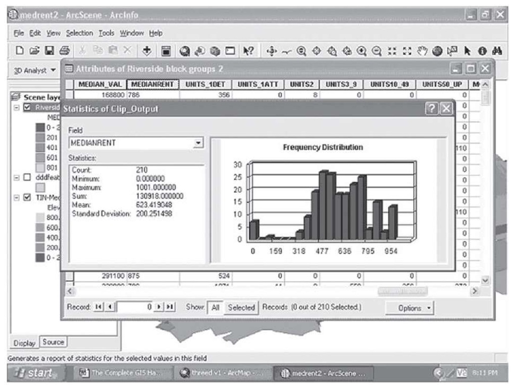
Step 1 Calculate the approximate median rent for the city by averaging the median rents for the 210 block groups in the map. Open the attribute table and right-click on the field name of Median rent; select Statistics from the popup menu, and a summary appears; the mean is given at $623.41. The histogram also shows that the median should lie somewhere near this value (see Figure 2.85).
FIGURE 2.85 Median rent calculation
Step 2 Open the Layer Properties submenu for the 2D layer; because this is ArcScene, there are more options showing on the tabs. Select Base heights.
Step 3 At the bottom of this tab is a box labeled, "Add an offset using a constant or an expression"; type in 623 and click OK.
Step 4 Click this layer on in the display contents and the valley floor will show, and using the same color scheme for the symbology as the TIN map will preserve the information about rents below or at the median value, while allowing the higher rent areas to become clearly visible, as in Figure 2.84.
We have seen the power of multiple variables, graphics and charts, and finally 3D visualization for conveying complex information in a powerful and insightful way. In the next and final part of Section 2, we will take you through some specific illustrations of how many of the techniques you have learned thus far can be used in specific policy-related areas of great concern to cities, countries, governments, and citizens alike to inform and facilitate planning and decision making. Communities and their leaders are faced with many difficult and vexing problems, and always with limited resources; GIS can be harnessed to help these leaders make better decisions and use resources more effectively in a variety of policy areas.


