In a previous example (Figure 2.2), we displayed two variables as a combined rate on the map, so in a sense we were only, in the end, displaying one "variable." GIS allows for the display of multiple variables in different formats in order to convey more complex information. For example, Figure 2.47 shows a version of a map you may have seen in newspapers in the aftermath of Hurricane Katrina’s impact on the city of New Orleans.
FIGURE 2.47 New Orleans: persistence of poverty and flood depth from Hurricane Katrina
This map is focused on the city center of New Orleans, with the Mississippi River winding through the city at the bottom of the map, and out of sight just at the top of the map is Lake Pontchartrain, the source of much of the flooding that occurred in the aftermath of the storm. What you see is the result of seven variables being displayed simultaneously to show a relationship that only became apparent after the disaster, and it helps to explain why it was that so many poor people were unable to leave the city when they were asked to evacuate ahead of the storm, and hence the terrible scenes on the TV news about the Superdome, and all the people stranded in the city after the storm hit.
The pie graphs show the rate of African-American population living in each census tract (the units on this map) in each year of the Census that were poor, that is living in a household below the poverty line as defined at the time by the Federal government. Each color represents a proportion of the total summed over the four Census points. The graphs are constructed this way to show the stability or lack thereof in poverty rates for African Americans in New Orleans over this period. If the pie graph shows four equal slices in each color, it means that poverty among this population has been at the same rate over time—we do not know for certain that these are the same people, but given that most people in New Orleans have lived there most of their lives, it is likely that the same households that were poor in 1970 are also poor in 2000—suggesting long-term poverty in these areas. If the graph shows fewer than four slices or a lopsided set of slices, it means there has been significant change in the rate of African-American poverty in these areas over time.
The background display is a thematic map of the flood depth in the aftermath of Katrina, based on data gathered by C&C Technologies (www.cctechnol.com) as of September 19, 2005. The data show depth in inches, and these are approximations of the average depth over the area in question. What the map shows is that in the places with the heaviest flooding (darkest gray (blue) in the background), poverty among African Americans was a persistent condition across 30 years—the people living there just did not have the resources to evacuate on their own, as they were expected to do in the plan that the city had to work with. Being poor for that long means you have no access to a private car, you have no savings to draw out to sustain you in a new community; you have no knowledge of how to travel and where to go in such an emergency. Thus, the pictures and events involving people of color being abandoned and without help at the Superdome and elsewhere in the aftermath of this storm. This map also suggests that in planning for the next storm, or in other cities that face this kind of possibility, understanding the circumstances of the people in each area of the city will help to devise a better evacuation plan—What resources do residents have, and what do they lack?
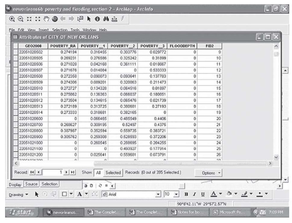
How was this map constructed? First, we obtained data from the 1970, 1980, 1990, and 2000 Censuses on the poverty rates for African-American residents in each of the tracts; the tracts were adjusted for the fact that census tracts change over time so that a consistent definition of the tract was used across the four data points.
FIGURE 2.48 Attribute table showing African-American poverty data, 1970, 1980, 1990, and 2000
To construct the final map, the following steps were taken.
Step 1 Add a field to the attribute table for the flood depth data. Click on Options in the attribute table, to bring up the display shown in Figure 2.49.
FIGURE 2.49 Attribute table Options menu
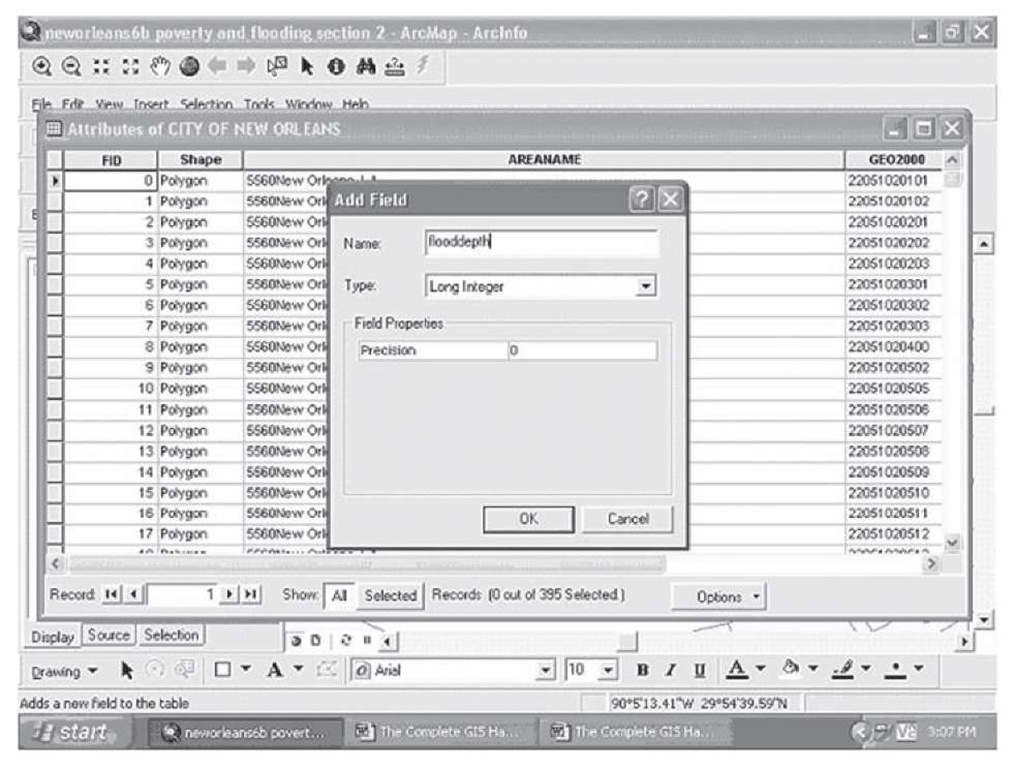
Step 2 Select Add Field and bring up the submenu as shown in Figure 2.50.
FIGURE 2.50 Adding a new field to the attribute table
Type in the name for your field (flooddepth; 10 characters maximum), and select a precision for the new variable—in this case, you can leave it at zero, but if the new variable had decimal places to the right of the decimal, you would need to specify how many under precision. The new variable we want to add is in whole inches of water depth. Click OK and your new field will appear in the attribute table.
Step 3 On the main tool bar, click on Editor, and select Start Editing.
Step 4 Open the attribute table, go to the first unit you want to add new data for (not all census tracts in the city of New Orleans were under water after Katrina), and double-click on the cell in the attribute table.
Step 5 Type in the new data and move to the next cell.
When you are finished with all the additional data, minimize the attribute table and click on Editor again.
Step 6 Click on Save Edits, maximize the attribute table, and the flooddepth column will look like that in Figure 2.51.
FIGURE 2.51 Attribute table with new data added for flood depth
To construct the map in Figure 2.47, follow these steps:
Step 1 Open ArcMap and click on Add Data; click on the City of New Orleans layer to bring up the Census tract map as in Figure 2.52.
FIGURE 2.52 Census tract map layer, New Orleans
Step 2 Double-click on the Layer name to bring up the Layer Properties window; click on Symbology. Step 3 Select Charts, and a display will open up with the fields that can be used in your data for a chart, as Figure 2.53.
FIGURE 2.53 Charts submenu on Symbology tab
Step 4 Add each field you want to display in the chart, in this case the four poverty measures from 1970, 1980, 1990, and 2000 (they are in order from 1970 to 2000 in the window and in the attribute table), and adjust the color scheme by double-clicking on each color and selecting the one you want. When you have completed this, your screen will resemble that in Figure 2.54.
FIGURE 2.54 Chart fields and color selection
To complete the chart, you next should select attributes of the chart under properties and size.
Step 5 Select size, and reduce the size of the charts to be displayed to something manageable—in the example shown in Figure 2.55, 12 point.
FIGURE 2.55 Chart size selection
Step 6 Click on Properties, and in this case we clicked off leader lines (lines that connect a chart to the geographic unit it refers to if the drawing of the chart would overlap too much with other features), click off 3D (in this case we do not need it, but in other cases it will be useful), and we selected so-called geographic orientation for the pies as this preserves the time order of the field in a clockwise fashion, making the pies easier to interpret. Unclick the "Prevent chart overlap" box (again, the utility of this feature will vary), and click on Apply, click OK to close the Layer Properties window and each census tract will have a pie displayed within it on the map, as in Figure 2.56.
FIGURE 2.56 Poverty from 1970 to 2000, African Americans, New Orleans
If you want to adjust the title for each field, right-click on each one twice (not a double-click, but two distinct clicks) and type a label you would prefer; this new name will show on the legend when you add it in the layout window (as shown in Figure 1.68). Before moving on to the next step, take some time to play with the options such as adding leader lines, and displaying the symbols in 3D. It is important to know what these options do in case you need to use them in the future.
Step 7 Click on Add Data again to add another copy of the New Orleans census tract map to the window.
Step 8 Double-click the layer name on this new copy to bring up the Layer Properties window and click on Symbology.
Step 9 Create a basic thematic map with the field Flooddepth with five categories, using yellow for the 0 or no flood waters in the tract, with a series of light to dark blue for the next four categories of flood depth. The map will now look very much like the map in Figure 2.47.


