Planning and Projections: "What If" Multiple Variable Maps for Decision Making
We have displayed combinations of variables as rates, and subsets of data as additional maps, but for all intents and purposes the maps thus far have been focused on one set of information. Sometimes one set of information, even a rate, is not sufficient to tell us what the data have to say, and to properly support and inform decision making and planning for the allocation of resources and the planning of growth and change. Many cities have learned the hard way what happens if you do not plan adequately and anticipate the changes, both growth and decline, in the different sections of a city. So many resources that people need to be successful in an urban environment require large-scale capital investments and significant amounts of time to put into place, from schools to hospitals to roads and public transportation. The most effective communities are the ones in which urban and ecological planners use the information available to anticipate growth and change, and to plan the development of neighborhoods and resources in advance of such growth and change. Of course, not all possibilities can be imagined, but the more effort spent in this way the more sustainable the community will be in the long run. Mapping can be a very effective tool for these efforts, as it allows for the asking of "What if" questions. These are questions such as: What if the number of children of school age were to increase by 20 percent in some parts of the city and decline in others? This would have implications for the planning of educational facilities and parks in the various neighborhoods of the city. What if the areas where the younger families with school age children live changes over time in the city? New schools will have to be developed and perhaps some old schools will have to be closed to make effective use of the resources and to deliver the best education the city can muster for its residents. How can mapping help with these issues?
Example: Maps for School Planning
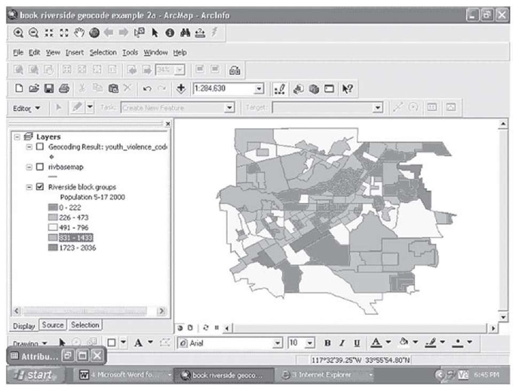
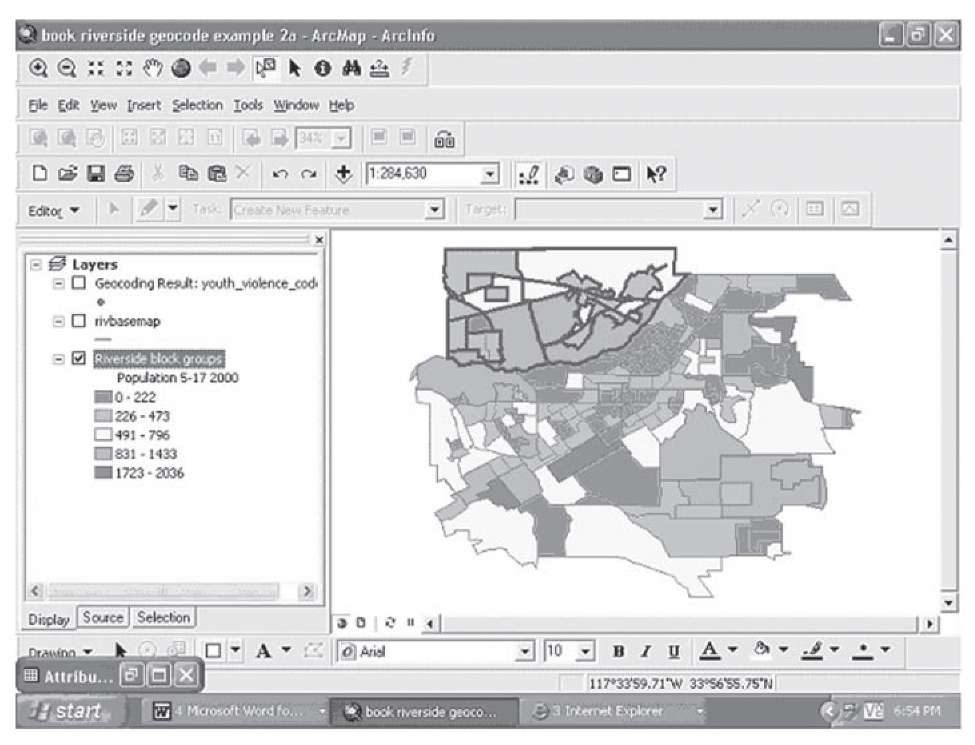
The map in Figure 2.23 shows the number of children by block group in Riverside based on the 2000 Census. The map shows some interesting patterns, such that most of the areas that have the largest numbers of children are towards the edges of the city, in newer neighborhoods that were previously undeveloped for residential housing or were annexed to the city since the 1990 Census. In Figure 2.24, some of these areas, on the northwest side of the city, have been outlined.
FIGURE 2.23 Children aged 5-17, Riverside, 2000
FIGURE 2.24 Outlying area of Riverside with larger numbers of children
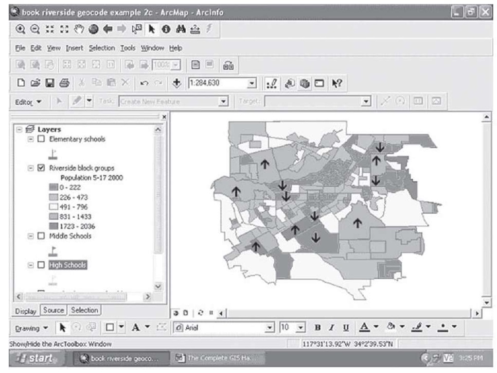
In fact, a very good question to ask would be how much growth and change was there between 1990 and 2000 in this statistic? If we put a symbol in each block group that grew or declined in the numbers of children between 1990 and 2000 by 25 percent or more this would give us some indication of the changing demand for schools and other child-oriented services (not to mention that such information could be very useful for child-oriented businesses planning where to locate new stores that cater to children and their parents), information that would be helpful for planning purposes.
FIGURE 2.25 Areas of rapid growth (T) or Decline (i) in school age children, 1990-2000
Now we have displayed two variables on the map, the number of school age children as a thematic map with the up and down arrows showing the second variable, focusing on where the rates of growth or decline have been 25 percent or more. It would be helpful to see where schools are located now to see if their locations are in sync with the decline and the growth of students in the various parts of the city.
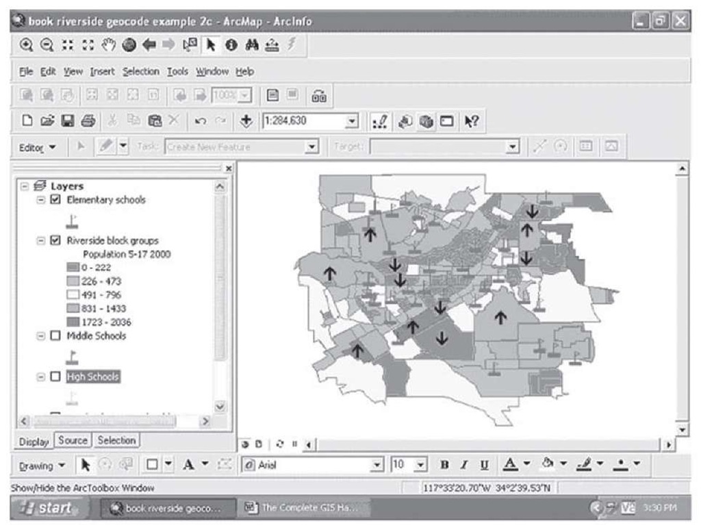
Figure 2.26 shows the location of elementary schools. If we use the magnifying glass tool to focus in on parts of the city, we can begin to see the implications for future school planning of this information. For example, if we focus in on the area on the north of the map that we highlighted in Figure 2.24, we can see that a substantial number of elementary schools are there. If we were to research the dates these schools opened, we would see that many of them had been recently built and opened, as the growth of this section of Riverside was anticipated by the previous generation of school planners.
FIGURE 2.26 Change in school age population and elementary school locations
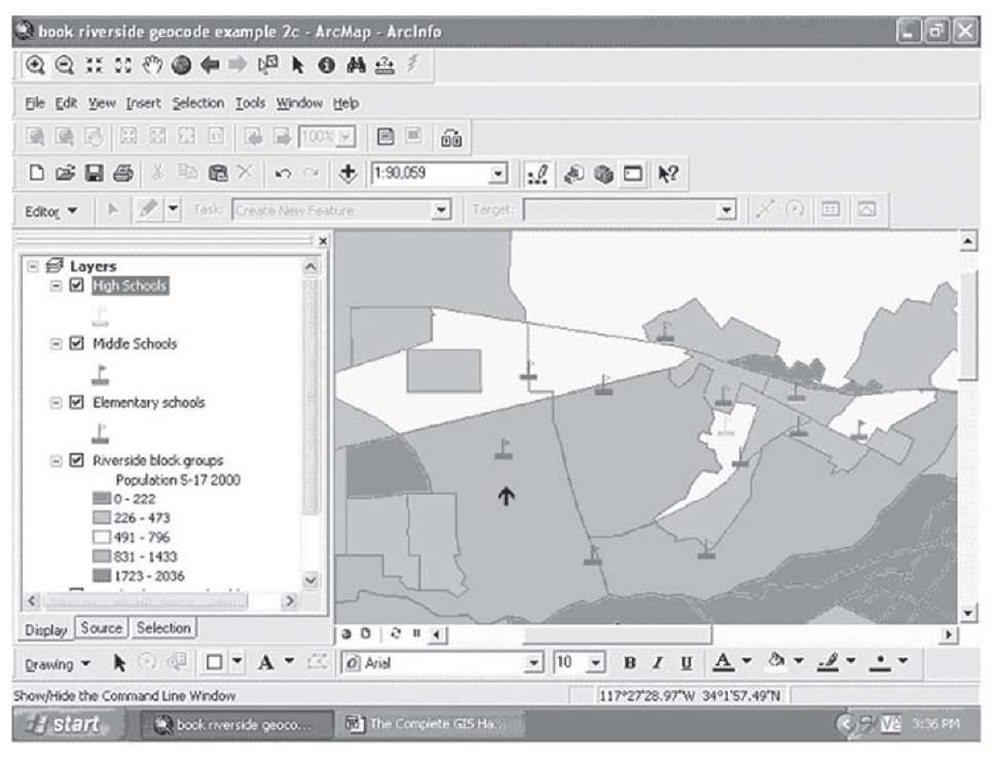
If we add middle and high schools, the situation is displayed in Figure 2.27. You can see in this detailed view that a number of elementary schools are in the areas of recent rapid growth. However, there are only two middle schools (in red, showing black here) and one high school (in green, very light here) in this general area, and these are located in the areas with fewer children and lower rates of growth.
FIGURE 2.27 High, middle, and elementary schools in north Riverside
School planners might want to consider adding a middle and/or high school to the left or western side of this section given the rapid rates of growth in the past. This would especially be the case if those elementary schools in the black (red) areas are experiencing growing enrollment over the last few years.
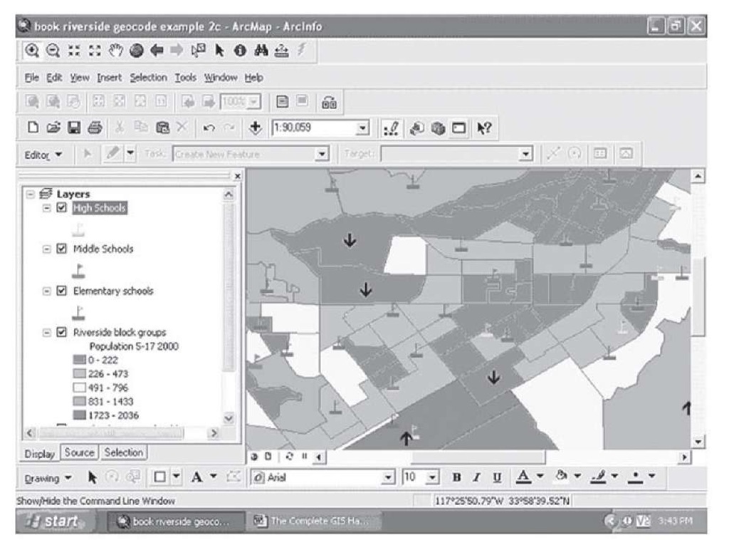
On the other hand, the more central areas of the city have not been growing and have relatively small numbers of school children to begin with (mid-grays or green thematic color), but because of their location in the old downtown and near lying areas, these block groups have large numbers of schools. Given the relative lack of new children in these areas, officials may be faced soon with the need to close some of these schools, especially if their facilities are old and in need of upkeep or remodeling. This is evident in a close-up of the central portion of Riverside as shown in Figure 2.28.
FIGURE 2.28 Slow growth and low populations of students, central Riverside
There are nine elementary schools in this detailed map of the area in mid-gray (green shaded) locations, plus three middle schools and three high schools (one middle school is at the same location as a high school, thus the body of the flag on top of the little school building is black (red) on one of the gray (green) high school symbols in the lower right section of the map). Some fast growing and large population areas are nearby, but some of these schools may be candidates for closure in the next few years.
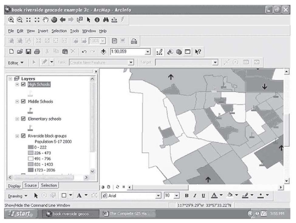
Some of the areas that have large populations and higher growth rates seem to be underserved, and plans to construct schools in these locations should be accelerated if they are not already close to the construction stage. For example, the sections of large population and high growth to the far west of the city have very few schools, yet clearly a number of children live there now and more will be enrolling in school in the future. This can be seen in the close-up map in Figure 2.29.
FIGURE 2.29 Large populations of children, growth, and few schools
This example shows how you can use maps with multiple variables displayed to ask questions about the future and to plan for the future so that needs and important services can be provided for those who need them. Having adequate schools near where the children live is not only valued as a lifestyle and a safety issue, but it can help schools operate more efficiently by saving resources that would have had to be spent on transporting students from where they live to where the schools are. This in turn frees up scarce resources for instruction and extra curricular activities that enhance the quality of schooling and the experiences of the students.
Combining Map Types for Greater Understanding
To produce the map showing school planning information and school age population, maps of different types were combined and displayed together so that the common implications of multiple types of data can be more easily displayed, analyzed, and understood. To produce the map in Figure 2.26, the following procedures were used.
Step 1 Create a thematic map using the number of children aged 5-17 (as a pretty accurate proxy for school enrollment).
Step 2 Using the drawing tool (see Figure 2.8 and subsequent discussion), place a dot in each of the high growth and decline block groups; double-click on each dot, and use the change symbol button on the properties menu that is displayed to put either a down or an up arrow depending on the direction of change.
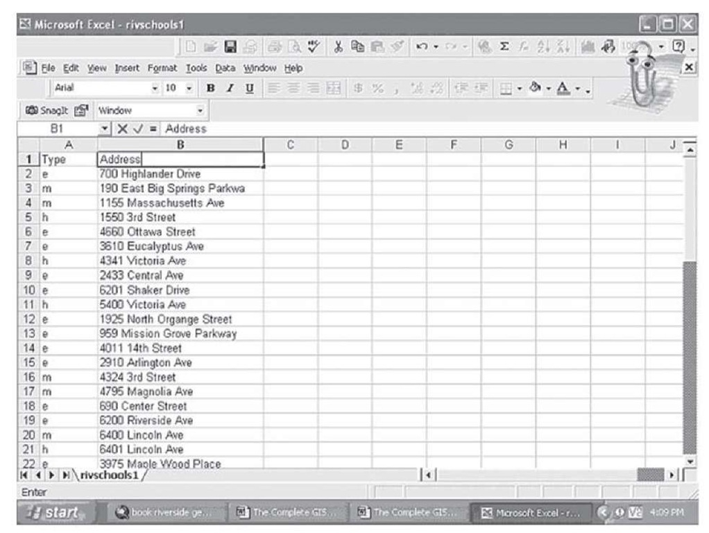
Step 3 Using MapQuest or another online or paper mapping source, locate the addresses of the public schools in Riverside, classifying them into elementary, middle, and high school; enter this information into a spreadsheet program such as Microsoft Excel, and save in dBase format. Figure 2.30 shows part of this spreadsheet.
FIGURE 2.30 Spreadsheet for Riverside school addresses and type of school
Step 4 Add these data to the map by using the Add Data tool (black cross on a light background) to add the dBase table to the display contents.
Step 5 Create an address locator using the toolbox to be used for geocoding the school locations (see Figure 1.15 and subsequent discussion). Geocode the addresses (following the procedures we outlined in Section 1; see Figure 1.21 and subsequent discussion).
Step 6 Using the procedures we have followed previously, subset the school data and create three layers—one for elementary, middle, and high schools, respectively. Right-click on the first school layer, and then select Properties. Click on the large "Symbol" button, and change the symbol to a school house, selecting a different color for each of the three layers, on the Symbol Selector submenu.
The resulting map is a combination of two pin maps (school locations and growth or decline) and a thematic map of the number of school age children. This is one of the basic ways you can combine multiple sources of data to produce more interesting and useful maps. However, you can also ask more fundamental questions about your data and the geographic patterns they display using the power of GIS to address your concerns and increase your knowledge.
