If you have data that allow you to know the number of some event that happened and the population at risk for having such an event, then you can map the rate of that event happening across geographic space in a very straightforward manner. This method of calculation is useful for many different purposes. For example, an urban planner who is designing the layout of a new community may want to know the rate of elementary school age children residing in a given area in order to decide whether or not to place an elementary school in that area. Another useful function for mapping rates is disaster relief planning. In the process of planning an effort to evacuate potential victims of a hurricane it would be useful to know the rate at which hurricanes tend to affect the geographic region in which the evacuation is to occur. Rate mapping is also useful for market analyses. If you are deciding whether or not to open a restaurant franchise at a particular location, it would be helpful to have a map showing the rate at which diners eat out at other restaurants in the vicinity of your potential location.
We will now go through the steps to create a map of rates of divorce.
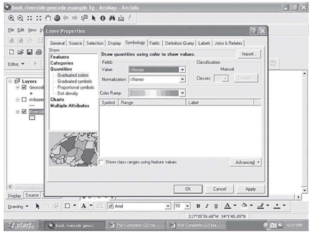
Step 1 Open the Layer Properties menu by double-clicking on the map you are displaying, and select the Symbology tab as in Figure 2.1:
FIGURE 2.1 Layer Properties and Symbology tab
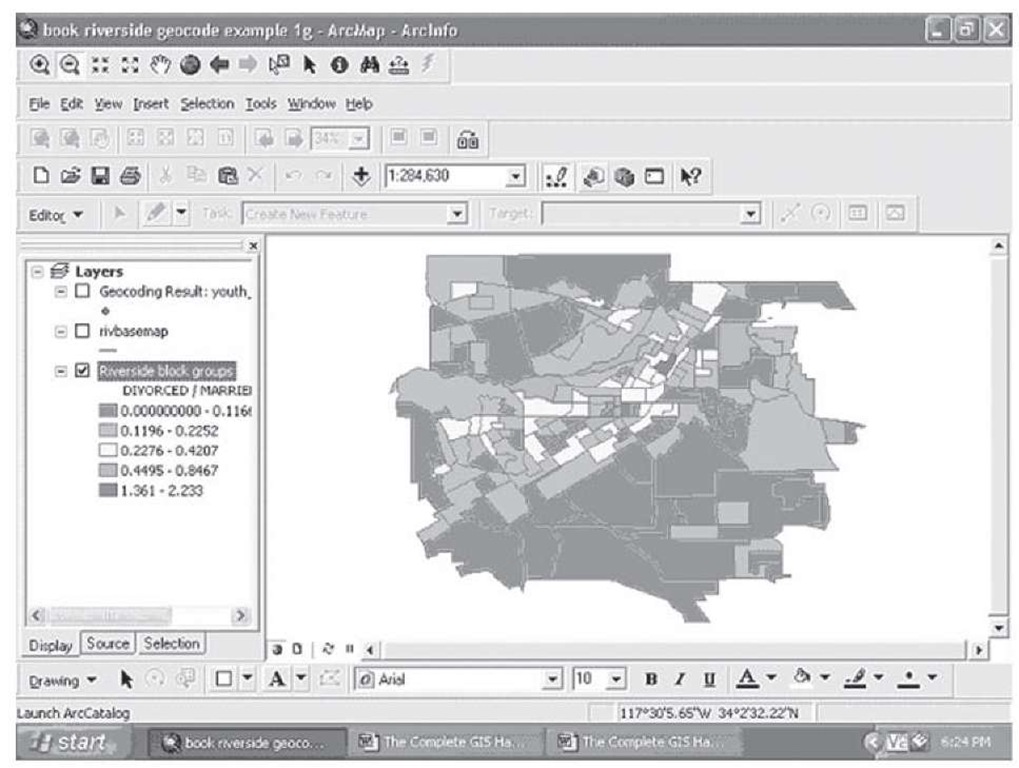
Click on quantities, and notice that the option is given to use a field as the value, and another field as the "normalization"; this is another word for the denominator in a calculation of the rate or relative risk ratio. Click on Value, and put Divorce in the box; click on Normalization and put Married in the box. Click on Apply, and OK at the bottom of the symbology tab, and the map displayed should look like Figure 2.2.
FIGURE 2.2 Divorced residents relative to married residents
Comparing this figure to Figure 1.97 shows a rather different picture—here we can see that in most cases the rate of divorce is very low in Riverside—most places are below 25 percent divorced relative to married individuals. In only a very few places is the number of divorced people greater than the number of married people (the darkest area), with a range above 1.0 for the rate. Demographers will question this calculation, as just using divorced people over married people may not accurately capture the true risk—we need to know when people were married, as we know from experience and the data confirm that people who have been married for many years are less likely to get divorced than relative newly wed couples are. There are a number of alternative ways to better measure the relative risk of divorce than the simple rate we have displayed here.
However, even this simple rate shows that understanding the rate at which something happens relative to the population at risk for this event is a powerful tool for understanding reality and making good decisions about interventions and policies.
Basic Multivariable Maps: Classification and Subsetting
One of the ways in which social and behavioral research has made significant progress in understanding behavioral patterns in social life has been by classifying general and relative common phenomena into smaller, more homogeneous subclasses of patterns and behaviors. These efforts to classify from the more general to the more specific often result in a great deal of new understanding and knowledge, as the goal of classification is to group examples together in subclasses that share the largest number of common traits, traits that serve to distinguish this group of behaviors or actions or opinions from other groups. One researcher recently began to consider the type of rivalries and conflicts in which nations around the world get involved, and the focus here was on one subtype out of all such disagreements and disputes: those that lead to armed conflict or the explicit threat thereof (Schulz, 2006). However, even this classification still leaves a very general category—ranging from a skirmish on the border or increasing military maneuvers on the border to a full-scale invasion of another nation. Can we learn something from classifying these types according to the factors that help to bring about the rivalry in the first place?
Example: Classification of World Armed Rivalries
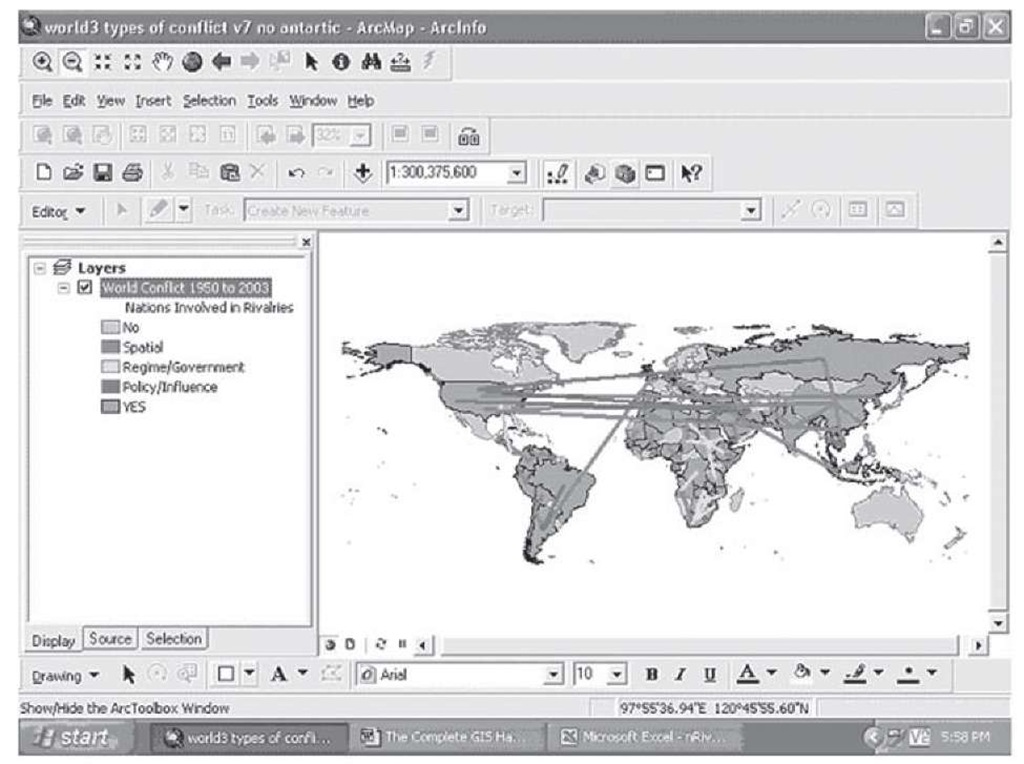
Figure 2.3 shows a classification of rivalries into three types: those based on spatial conflicts, that is those in which the disagreement is about territory, the demarcation of the border, or a disputed island off the coast (the red lines appear as black lines on the map below); those based on the desire on the part of one nation to change or overthrow the regime in power in another nation (green or light-colored lines); and those based on the desire of one rival to change or influence the policies of another nation (blue or mid-colored lines). In addition, the map in Figure 2.3 also shows in the background which nations have been involved in rivalries of these types since 1950 and those who have not.
FIGURE 2.3 World Armed Rivalries, 1950-2003, Classified into Three Types
One of the first interesting things about this map is the location of the patterns in the background colors: gray for those who have been involved in armed rivalries, and light gray (blue) for those who have not. There is a clear regional pattern revealed in this simple two-way classification: Europe, Australia, and North America (with the exception of the United States), have been almost exclusively uninvolved in these types of armed rivalries. Given the long-term history of many of the nations represented in these places, this would not be an obvious conclusion, yet it is striking how consistent this pattern is over the last 50 years.
The three classifications of the causes of these rivalries also reveal significant patterns. For example, it is apparent that conflicts in Asia are almost exclusively about territory—almost every line that ends or starts in Asia is black (red). In addition, with the exception of two conflicts involving the United States and a couple in the Middle East, almost all the rivalries about regime change have occurred in Africa, with two "hot spots" standing out: the Sudan, the site of several major internal and external disputes today, and South Africa, which used to have a very repressive regime under a White minority government, until Nelson Mandela came to power in 1994.
Another pattern that is revealed in Figure 2.3 is that most rivalries are short distance in nature—this makes sense, as if you want to have your army fight with another countries’ army, you need to be close by in order to get the armies to a place where they can fight each other. The one obvious exception to this is the United States. The United States has not had very many wars or armed rivalries with its neighbors (with the exceptions of Cuba and Nicaragua); most of the rivalries the United States has become involved in are with countries a great distance from North America. As the world’s richest nation, perhaps only the United States can afford to send its Armed Services to fight with or threaten other potential superpower and proxy countries thousands of miles from home.
This map is really made up of one basic map of the world displaying whether countries get involved in these rivalries or not, with an overlay of lines coded to show the two nations involved in a particular rivalry and the nature or cause of the rivalry in question. To construct this map, the following steps were used.
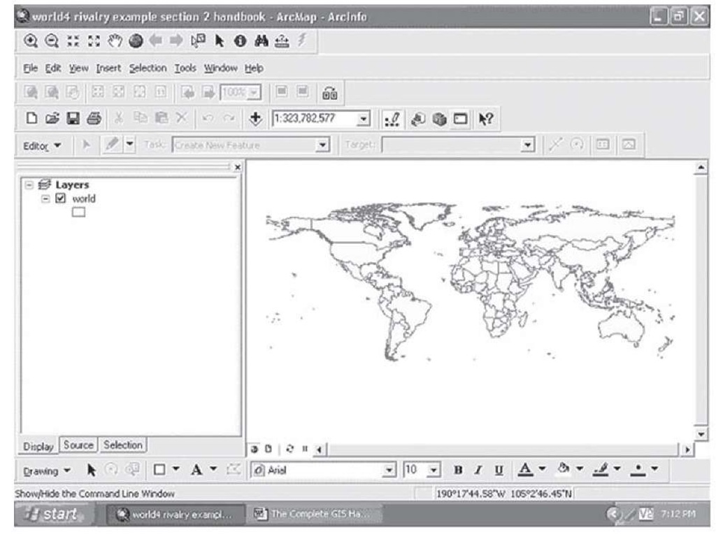
Step 1 Open a basic map of the world with the current national boundaries shown, as in Figure 2.4.
FIGURE 2.4 World map
Note that this map does not display Antarctica; as this continent has no nations, it was excluded here; this can be done simply by opening the attribute table for the map, clicking on the editor, deleting the line in the table for Antarctica, and then saving the edits prior to closing the attribute table.
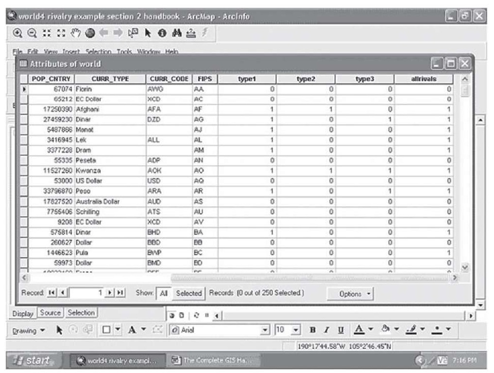
Step 2 Follow the procedures shown elsewhere in this topic to add a field to the attribute table, and type in a 1 in the row for a nation that has been involved in a rivalry and a 0 for those nations that have not; again turn on the editor first, and remember to save your edits prior to closing the attribute table. The new attribute table will look something like the example in Figure 2.5.
FIGURE 2.5 Rivalries among nations
This table also contains fields for the three types of rivalries, although this is not necessary to produce the map shown in Figure 2.3.
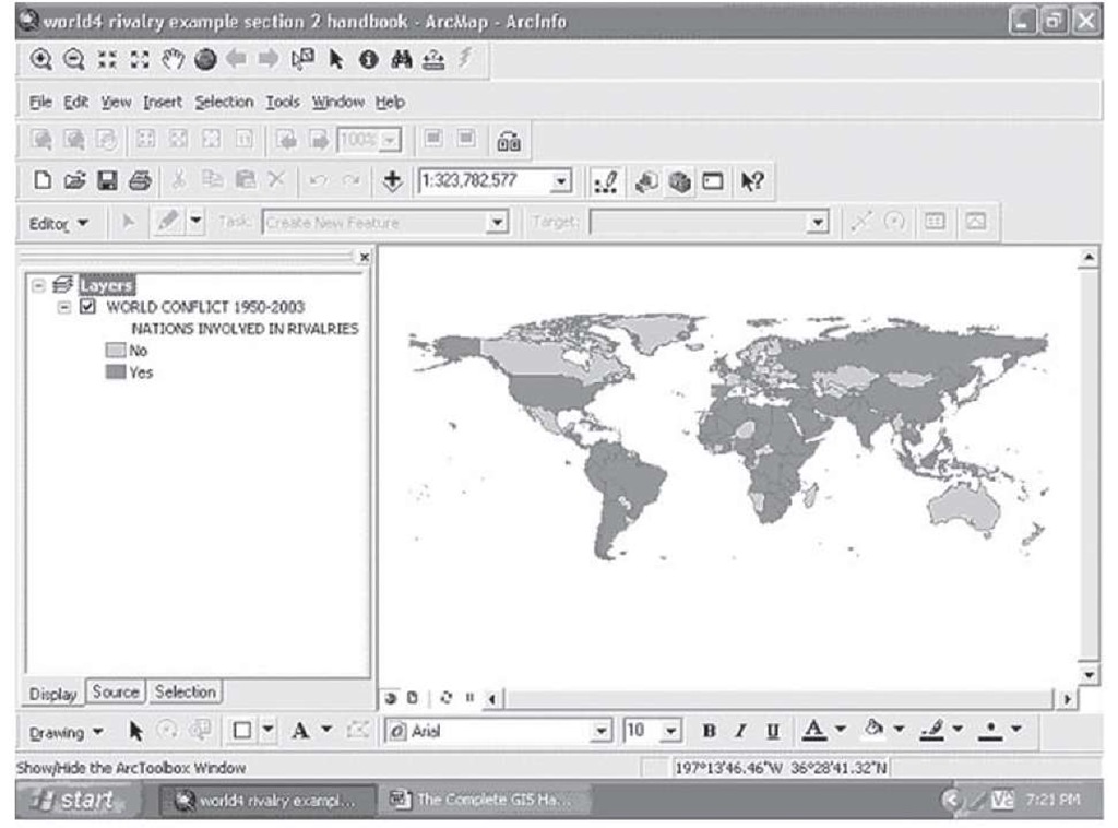
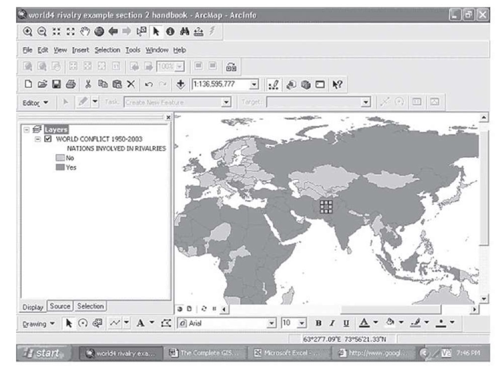
Step 3 Create a thematic map with the field "allrivals" in the attribute table, and select blue and gray colors to show those countries that have not, and have, been involved in these conflicts. Do this using the Categories subfield on the Symbology tab, and select the Unique values. You have already been shown other ways to do this, but using this approach here will prove useful later in the process.
FIGURE 2.6 Nations involved in rivalries, 1950-2003
Step 4 At the bottom of the screen in ArcMap is the drawing tool bar, located on the lower right; click on the drawing style drop down, and select the new line command (see Figure 1.44).
Step 5 Further to the right on the bottom of the screen, select the line color object, and select a red for the first type of rivalry, that based on spatial or territorial disputes.
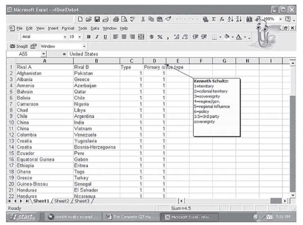
Step 6 When you move the cursor over the map, you will notice a crosshair mark has replaced the cursor. Using the data in the Microsoft Excel spreadsheet in Figure 2.7, look for the first two country pairs that have a Type 1 or spatial rivalry: Afghanistan and Pakistan.
FIGURE 2.7 World rivalry data (Schulz, 2006)
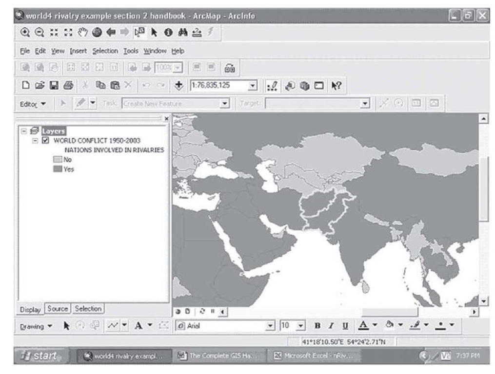
Step 7 Constructing this map will tax your knowledge of world geography. If you are not sure where Afghanistan and Pakistan are, remember you can use the Identify tool (the "i" in a dark circle) to point to potential countries for confirmation. It also helps to use the zoom in magnifying tool to show some of the detail in the map.
FIGURE 2.8 Pakistan and Afghanistan, selected and outlined in light gray (blue) with gray background
Step 8 Activate the drawing tool (by clicking on the new line symbol on the drawing tool bar), and move the crosshair mark over Afghanistan and right-click; move the crosshair into Pakistan, and double-click; a box outlines a black (red) diagonal line connecting the two rivals. Double-click inside the box and a Line Properties menu opens; adjust the thickness of the line to at least 2.0—the line will show on the whole world view more effectively.
Once the map looks like Figure 2.9, hit Escape and the box will disappear, and you will see the black line for a spatial or territorial rivalry. Continue in this manner until you have drawn all the necessary lines, as in Figure 2.3.
FIGURE 2.9 The result of inserting a black (red) line between rivals
Step 9 Open the Layer Properties window and the Symbology tab. Here you can add information for the map key, which will eventually be added to the legend in the layout view. Do this by going to the Categories and Unique values menu you used to create the thematic map in Figure 2.6; hit Add Values, and then manually add values between 0 and 1 (0.3, 0.5, 0.7) so you can have three place holders in the map key. Then, use the approach used previously in this topic to change what is displayed in the key to reflect what each color represents in terms of the three types of rivalries.
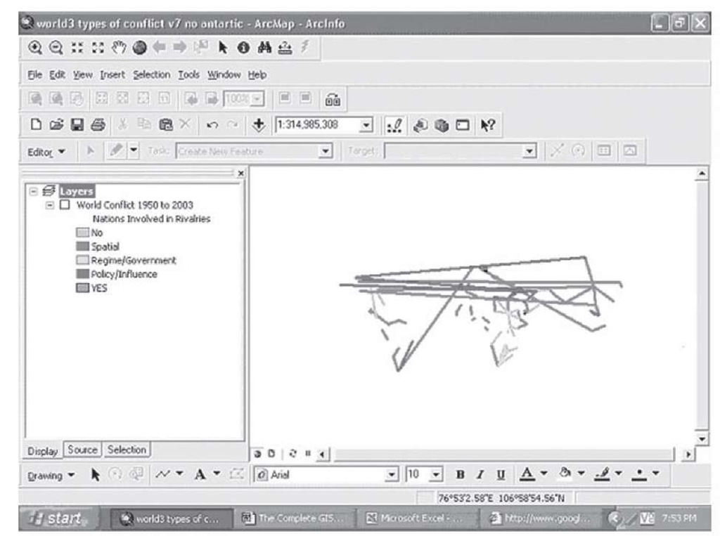
The lines collectively are essentially an overlay onto the thematic rivalry map in Figure 2.6; to see this, go back to Figure 2.3, and click the box next to the title of the layer; the result looks something like Figure 2.10.
FIGURE 2.10 The three types of rivalries without the world background map
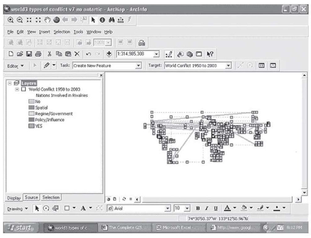
This means you can create variations on the color of the lines for different illustrative purposes. Suppose, for example, you wanted a map that just showed all the pairs of countries involved in rivalries, without first classifying them into types. You could do that here by selecting the arrow cursor, and drawing a box around all the lines. Click on the line color tool, select a gold color, for example, and all the lines will change to that color.
FIGURE 2.11 Selecting and editing drawn lines
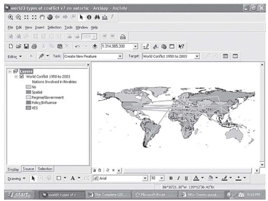
You can then turn the map itself back on by clicking on the box next to the title, and the map would look like that in Figure 2.12.
FIGURE 2.12 All rivalries in world conflict, 1950-2003
You should adjust the key if you were going to export this map for use in a presentation. The drawing tool gives you a powerful set of options to display additional information on any map. You have also seen how classifying your data into types that have distinctive characteristics is also a powerful tool for mapping and understanding your data.
Subsetting your data and creating a set of maps for decision making
As you can see from the world rivalries data and maps, classifying your data into distinctive subtypes is a powerful way to present information and to gain new understandings of the nature of the information you have. Sometimes looking further into the details of the data you are presenting reveals significant new information.
