Color Temperature
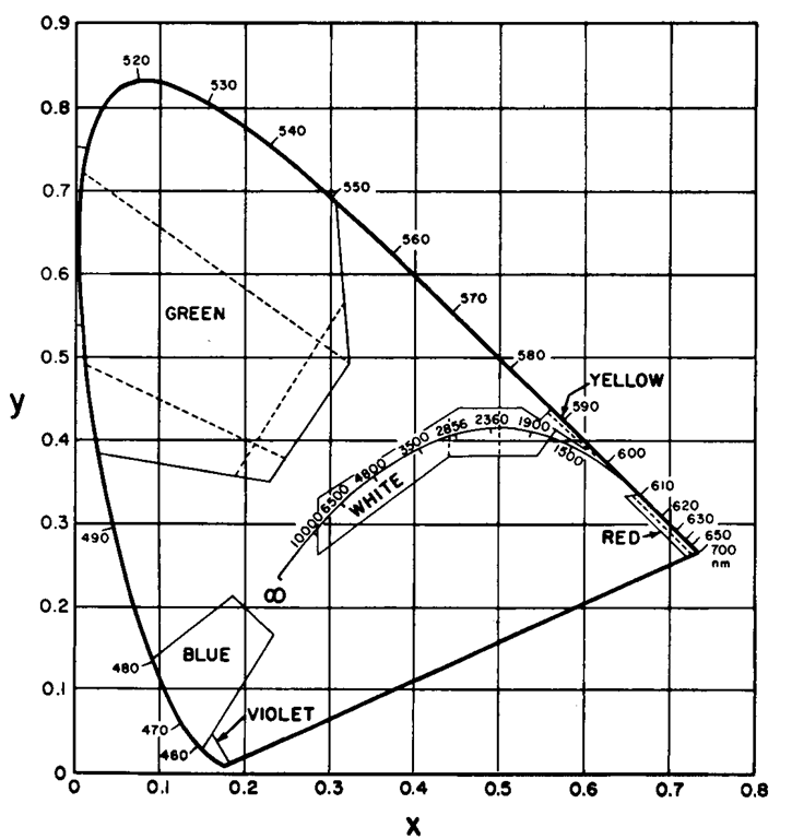
A common means of indicating the characteristic spectral distribution of many light sources is to state their color temperature. The concept of stating color as a temperature comes from the fact that physical bodies radiate energy proportional to their temperature (when this radiation is visible, the object is in a state of incandescence). A black body is a theoretical construct that absorbs all light that falls upon it, and so its color depends completely on such emissions in the visible range. A color temperature, then, is simply the temperature (normally given in degrees Kelvin) at which such a body would be radiating light of a given color, or more precisely of a certain spectral power distribution. This concept is revisited in the next section, but for now we can note that increasing color temperature corresponds roughly to what we know from actual objects heated to incandescence. At the lowest temperatures at which such objects (a heated ingot of metal, for instance) begin to glow, they appear to be a dull “brick” red. As the temperature increases, the color of the object changes through brighter reds, to orange, yellow, and ultimately the object becomes “white hot.” Beyond a certain temperature (somewhere above 30,000-40,000 K, far above the color temperature of any light source commonly encountered in practice), further increases in temperature produce no visible change in color; the black body is already emitting uniformly across the visible range, and appears a very bluish-white. We can plot the various colors that are specified by the color temperature system above onto the CIE xy chart (Figure 3-9). These lie along the line called the black-body locus (or black-body curve), which as expected starts in the very deep red and curves through the orange and yellow regions before passing through the central range of whites. We can now see that even a theoretically “infinite” color temperature still lies in the bluish-white region. It could not become a purer blue, as even an infinitely hot body would still be radiating across the lower-frequency portions of the spectrum.
Color temperature is often used to give at least an approximate idea of the color of a light source, especially to discriminate between the various “white” sources which are commonly encountered. A more precise description of these sources must wait until we have discussed a means for numerically specifying color in general, but we can at this point give some general indication of how color corresponds to the color temperature value. Most artificial light sources, such as incandescent lights and fluorescent tubes, produce a distinctly reddish light, with color temperatures in the range of 2500-4000 K. “Daylight” white, the color of sunlight as reflected from a diffuse, spectrally “flat” surface, is about 6000-6500 K, depending on conditions. This is very close to what we would perceive as a “true” white, an absence of any discernible hue.
Figure 3-9 Color temperature on the CIE xy diagram. The curved line passing through the middle of the space is the black-body curve, which is the locus of points describing the color emitted by a theoretical “black body” at various temperatures. The numbered points along this curve give the corresponding temperature (in degrees Kelvin). Note that the curve ends in the bluish-white region of the color diagram; there is a point at which further increases in the black body’s temperature do not change its radiation characteristics within the visible spectrum.
The sun viewed directly, with an increase in the blue components provided by the scattering effects of the sky, appears as a much bluer white, with a color temperature as high as 10,000-12,000 K. Note that these are given as general ranges only; for most of these sources, there is simply too much dependence on a large number of variable conditions to be able to give a precise value.
Standard Illuminants
Since it is apparent that the color of a given object depends not only on the characteristics of that object itself but also on the light source, it is very helpful to have standards defined that can represent a range of commonly encountered light sources. Such definitions remove one source of variation from calculations or measurements of color, allowing us to focus more on the characteristics of and differences between objects. These definitions are referred to as standard illuminants, and are expressed as power distributions covering the visible light spectrum and sometimes beyond. (Definitions beyond the standard “visible” range are often useful, as energy outside this range – particularly at the high-frequency, or ultraviolet, region – can affect the perceived color of objects through phenomena such as fluorescence.) Standard illuminants have been defined to approximate a number of common real-world light sources, such as sunlight, incandescent lighting, fluorescent tubes, etc.. Besides standardizing the characteristics of sources of illumination, the colors of these sources are also commonly referenced as the standard “white” used in various applications. Some common standard illuminants and their characteristics are shown in Table 3-1.
As might be expected, since these standards are intended to represent common sources such as daylight and incandescent lighting, they are also very commonly associated with a particular color temperature. For example, the most common standard for “daylight white” is Illuminant D65, which is approximately a 6500 K white. But it should be clear that not all colors can be identified through the color temperature system – there is no temperature at which a black body will produce a pure green light, for instance. In order to be able to specify and analyze color objectively, we need a numeric model which is capable of covering all perceivable colors.
Table 3-1 Standard illuminantsa
|
Illuminant |
CIE (x,y) coordinates |
Color temperature |
Comments |
|
|
A |
0.4476 |
0.4075 |
2854 K |
Incandescent (tungsten) light |
|
B |
0.3840 |
0.3516 |
4874 K |
Direct sunlight |
|
C |
0.3101 |
0.3162 |
6774 K |
Indirect noon sunlight |
|
D50 |
0.3457 |
0.3586 |
5000 K |
Common standard for publishing and document editing/preview applications; “paper” white. |
|
D65 |
0.3127 |
0.3297 |
6504 K |
“Daylight” white; common standard white point for video applications. |
|
E |
0.3333 |
0.3333 |
5500 K |
“Equal energy” white point |
a It is important to note that, while each illuminant has a specific perceived color (as given by the color coordinates and color temperature specifications here), the actual specification of the illuminant is given as a standardized spectral power density curve
Color Gamut
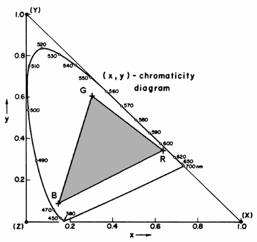
Having a two-dimensional representation of color space such as the xy diagram also permits us to look at the idea of color gamut, which is simply the range of possible colors that may be produced by a given color display device. As mentioned earlier, practically all color displays function by varying the intensities of three primary-color images (for additive-color displays, usually simply red, green, and blue). Plotting the locations of these primary colors on a chromaticity diagram defines a triangular area covering the range of colors which can be produced from that set – the color gamut of the display. An example, using the chromaticity coordinates of a typical set of color CRT primaries, is shown as Figure 3-10. This also demonstrates why is it physically impossible to produce a practical display, based on a finite set of primaries, which can duplicate any color within the range of human vision. It is impossible, due to the curvature of the perimeter of the color space, to locate any three (or even four, five, or six) primaries such that the perimeter they define fully encloses the complete space. The only way to do this would be to locate at least one point outside the limits of the diagram, and the “outside” area represents physically unrealizable, “supersaturated” colors.
Still, the appearance of this color gamut plot, with real-world primaries, is somewhat misleading. When seen on the xy diagram, we are immediately struck by the very large portion of the color space that lies outside of the gamut triangle; these areas represent colors that cannot be produced on this display, and this conflicts with what we expect from our experience with common color displays. Such displays appear to present a very realistic image, and we have to ask how this can be so with so much of the colors of the “real world” unavailable. This is partially due to the eye/brain system’s willingness to accommodate a less than ideal image; in other words, in the absence of a reference for comparison, we “think” we’re seeing an image that is better than objective measurements would indicate. However, in this particular example, the color diagram we’re using is also a part of the problem.
Figure 3-10 Color gamut. The shaded area shows the color gamut, or range of possible colors, for a typical electronic display; this area is defined by the locations within the color space of the three primaries used by the display, labelled here as R, G, and B. (The primary set shown here is that defined by the “sRGB” standard, with chromaticity coordinates of (0.640,0.330) for red, (0.300, 0.600) for green, and (0.150, 0.060) for blue.
Perceptual Uniformity in Color Spaces; the CIE L*u*v* Space
Presenting color gamut information in this manner can be a very useful tool for getting an idea of the relative capabilities of displays or other imaging technologies, such as comparing the gamuts of emissive displays with a reflective/subtractive-color technology such as color printing. However, these plots can be misleading depending on the specific chromaticity coordinate system used. The problem here is that not all spaces, and especially not the Yxy space that we have been discussing, are perceptually uniform, meaning that they are not defined such that equal distances in any direction or in different areas of the space correspond to equal perceived changes in color.
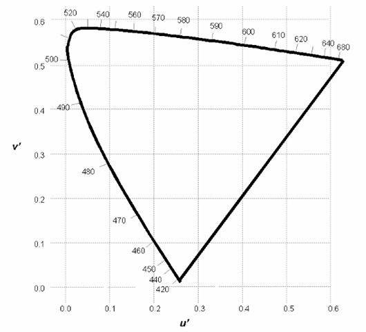
To address this problem, other color spaces have been defined. Among the most popular is the CIE L*u*v* space, defined in 1976 through a rescaling of the xy coordinates and also applying a correction to the Y (luminance) value to produce a more perceptually accurate indicator of “lightness” for the situation being considered. The resulting two-dimensional diagram, corresponding to the original CIE xy chart, is formally referred to as the CIE 1976 Uniform Color Space (UCS) diagram, also known informally by the new axes identifiers, u’ and v’ (Figure 3-11). The u’, v’ coordinates are derived from the x,y coordinates (or the fundamental XYZ tristimulus values), as
The complete L*u*v* space is based on this coordinate system, plus the tristimulus values for an assumed “perfect reflecting diffuser” (a theoretical surface which reflects and diffuses uniformly across the entire spectrum) under the illuminant in question. The space is defined as
where![tmp7ee1-37_thumb[2] tmp7ee1-37_thumb[2]](http://what-when-how.com/wp-content/uploads/2012/06/tmp7ee137_thumb2_thumb.png) are the values from the perfect reflecting diffuser.
are the values from the perfect reflecting diffuser.
Figure 3-11 CIE u’v’ chromaticity diagram. This is again a two-dimensional representation or cross-section of a three-dimensional space, derived from the original xyz coordinate system through a series of transformations which make the space perceptually uniform. This means that, to the standard observer, equal-distance changes within this space correspond to changes in the perceived colors that are of a similar degree.
Since the L*u*v* space is perceptually uniform, it is used as the basis of a very powerful means of expressing color differences and color uniformity, the ΔE* (normally read “delta E star”) specification. ΔE* is calculated as the distance between two points in L*u*v* space as
One of the most powerful uses of the ΔE* metric in the display field is in measuring or specifying display uniformity, as it will permit combination of the traditional separate luminance and color uniformity requirements into a single perceptually accurate specification. If these are kept separate, a given display can quite easily be within specifications in terms of both luminance and color (usually stated as maximum permitted changes in xy coordinates) uniformity, and yet have visually objectionable overall non-uniformity.
All of the above is, of course, based fundamentally on the original 1931 2° Standard Observer definitions and XYZ tristimulus values. Should the 1964 10° Observer values be used, the identifiers are changed to u 10, v 10, etc.
Other perceptually uniform color spaces have also been defined. One of the more common is the CIE L*a*b* space, also defined in 1976 in a manner very similar to the L*u*v* space. However, the L*a*b* system is more commonly used for the specification of the color of objects (i.e., reflected light), rather than for color in light-emitting devices such as electronic displays. It is rarely encountered in display work, where the Yxy and L*u*v* are by far the most common systems.


![tmp7ee1-35_thumb[2] tmp7ee1-35_thumb[2]](http://what-when-how.com/wp-content/uploads/2012/06/tmp7ee135_thumb2_thumb.png)
![tmp7ee1-36_thumb[2] tmp7ee1-36_thumb[2]](http://what-when-how.com/wp-content/uploads/2012/06/tmp7ee136_thumb2_thumb.png)

![tmp7ee1-40_thumb[2] tmp7ee1-40_thumb[2]](http://what-when-how.com/wp-content/uploads/2012/06/tmp7ee140_thumb2_thumb.png)
