Slab Serif
Slab serif fonts have very little difference between strokes. The serifs, however, are very heavy and noticeable as shown in Figure 9.8. The stress is vertical. Examples are Clarendon, Memphis, New Century Schoolbook, and Rockwell.
Slab serif fonts have heavy serifs, vertical stress, and even strokes.
Figure 9.9
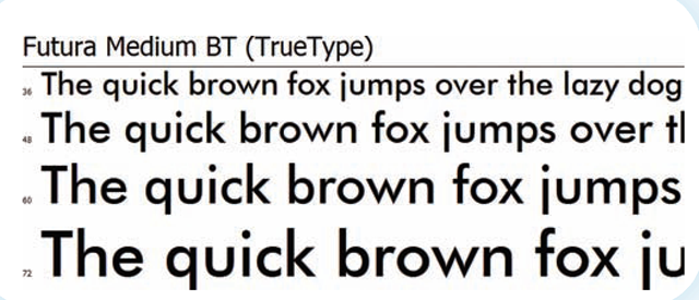
Futura is a classic sans serif with "feet" and very regular lines.
Sans Serif
Sans serif fonts have no serifs and the strokes are usually quite even as seen in Figure 9.9. Because of the evenness of the strokes, there is no visible stress. Examples are Gill Sans, Franklin Gothic, Optima, Futura, Eras Bold, Haettenschweiler, Lucida Console, Tahoma, Verdana, Arial, and Helvetica.
Specialized Fonts
Decorative
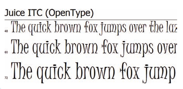
Decorative fonts such as the one shown in Figure 9.10 are generally used for display rather than long passages. They often have unusual shapes and proportions and can be quite dramatic. A decorative font that has been used quite frequently is described as grunge type. This is type that appears to be weathered or misshapen. Some types are actually designated as display type. They are designed to be used in larger font sizes. Examples are Juice, Stencil, Papyrus, and Jokerman.
Decorative fonts are those used for display purposes.
Grunge type is a decorative font that appears to be beat up.
Display type is specifically designed to be used in a large size.
Figure 9.10
Juice is an interesting decorative font because of the curved lines and novel use of serifs.
Figure 9.11
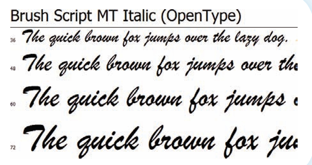
Script fonts such as Brush Script are used to mimic handwriting. This font is attached, making it appear even more like true script.
Script
Script fonts are designed to imitate handwriting (see Figure 9.11). They are very curvy and may or may not have letters that are connected. Often script fonts mimic calligraphy. They can be used in long passages but only for limited purposes. Examples: Brush Script, Zapf Chancery, and Tekton.
Blackletter
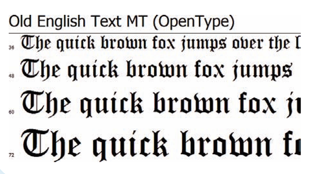
Another font style not often used are blackletter fonts. These are fonts designed to look like early European hand-lettering with its heavy ornate lines. They are decorative fonts that work well for the initial letter of a paragraph (called a drop cap), but are not often used for anything but titles. An example of blackletter type is in Figure 9.12. Examples are Old English Text and Goudy Text.
Script fonts are designed to imitate handwriting.
Blackletter fonts imitate an antique European font.
Be kind to your readers. Just because you have a variety of interesting fonts on your computer, don’t show off. Instead use those fonts that are most readable for the document in which they are used. Decorative fonts are fun to use in a limited number of situations. They often aren’t fun to read if the document has long passages. Ethics is not just about doing right and wrong. It’s also about treating your reader with respect. Creating a document that is intentionally difficult to read is wasting your reader’s time. You are not treating them respectfully and are failing at your obligation.
Figure 9.12
Blackletter fonts such as this Old English one are designed to look like early hand-printed fonts.
Figure 9.13
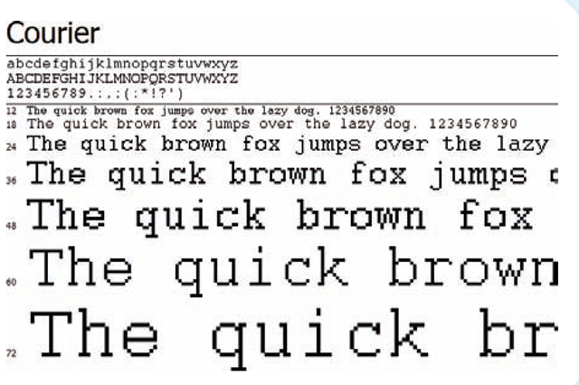
Courier is used when it is important that all letters occupy the same amount of space.
Monospace
Fonts that are not used often in desktop publishing are monospace fonts. This type style can be serif or sans serif. What sets it apart from other fonts is that each letter is spaced exactly the same amount. These fonts duplicate the look of a typewriter. Courier, seen in Figure 9.13, is the most common monospace font.
Monospace fonts are fonts that mimic the spacing produced by a typewriter.
Identifying Fonts
Often fonts are named in such a way that you can identify their style. For example, fonts with "old style" in their name are one of the serif oldstyles. Fonts with "gothic" in their name are often sans serif. Fonts with "brush" in their name are scripts. Those with "typewriter" may be monospace. Those with names such as "Krazy Legs" are probably ornamental.
Mixing Typefaces
It is often tempting for novice desktop publishers to use every interesting typeface that is available to them. While it is great fun to mix several fonts on a page, it is not good design. Page harmony is just as necessary with text as with the rest of your design. Harmonious pages seldom (if ever) have more than three typefaces on a page. Choosing only two is even better. To create interest, you can use different sizes and attributes of the same typefaces.
When mixing two different typefaces, diversity is the key. You do not want to use two faces that are too similar, such as two from the same classification. Your reader will be aware of the slight difference (probably only as a feeling of discordance).
You learned when you were studying alignment on a page that you need to make differences obvious so that they do not appear to be a mistake. Using two very similar font faces will create that same feeling of an error. If you are going to use different fonts, make sure they look different. This is one of the reasons that designers are told to mix serifs with sans serif. You are not limited to these broad categories, though. Instead, you might mix an oldstyle with a modern, or a heavy slab serif with a transitional. If the size of one is significantly larger or smaller, that will make the difference even more apparent.
You want the text on your pages to be readable and legible. One of the ways you do that is to choose typefaces that help you reach that goal.
Don’t rely on what you can see on your screen when completing a desktop published document. Poorly designed (and often inexpensive or free) fonts may not produce the printed text that you anticipate. Proof your printed copy looking for possible font problems. Sometimes characters bump each other in ways that you did not intend. Sometimes they even distort your line length. Proofreading means worrying not just about spelling and punctuation but about the entire look of your document.
Web Fonts
Web designers have far fewer font choices than print designers. In order for a reader to see the font the web designer selected, that font must reside on the reader’s computer, although the use of embedded fonts is being developed. Embedded fonts are those that are built into a web page, allowing anyone to use them. The choice for web pages becomes basically a decision between serif and sans serif.
The fonts found on most PC computers are shown below. Some of these are built into the operating system and others are installed with commonly used software packages from companies such as Adobe or Microsoft. Using these fonts gives you a little more in the way of font choices, but it is still possible that one of these fonts won’t be available to your reader. Until this problem is resolved, web designers must keep in mind the limitations of their design options.
|
Serif Fonts |
Sans Serif Fonts |
|
Times New Roman |
Helvetica |
|
Courier New |
Arial |
|
Geneva |
Arial Black |
|
Georgia |
Verdana |
|
Bookman Old Style |
Tahoma |
|
Book Antiqua |
Century Gothic |
|
Haettenschweiler |
Lucida Console |
|
Garamond |
Lucida Sans Unicode |
|
Trebuchet MS |
|
|
Arial Narrow |
|
|
Comic Sans MS |
|
|
Impact |
|
|
Felix Titling |
SUMMARY
In this topic you learned the difficulties that the combination of computer display and printer created in trying to produce a document. You saw how the use of bitmap fonts solved that problem. You read about the introduction of PostScript and then TrueType and OpenType fonts. You discovered that typefaces are divided into a number of categories based upon their design. And you saw that mixing typefaces requires knowledge of these categories.
KEY TERMS
|
bitmap fonts |
monospace fonts |
scaling |
|
blackletter fonts |
oldstyle fonts |
screen fonts |
|
cross-platform compatibility |
OpenType |
script fonts |
|
outline fonts |
slab serif fonts |
|
|
decorative fonts digitally signed |
page description language |
swash |
|
display type |
pangram |
transitional fonts |
|
grunge type |
PostScript |
TrueType |
|
modern fonts |
printer font |
