Geoscience Reference
In-Depth Information
choice regarding the data to construct a ranked data plot (such as unit/bins for
a histogram or frequency plot). Additionally, a ranked data plot displays every
data point of a time series instead of summary of the data (USEPA, 2006).
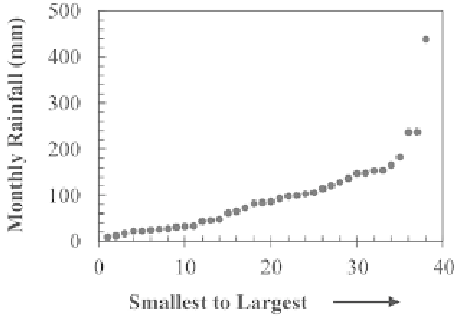
A 'ranked data plot' is a plot of the data arranged in ascending order at
evenly spaced intervals (Fig. 3.5). This plot is very similar to the 'quantile
plot' dealt in Section 3.1.5. Both the 'ranked data plot' and the 'quantile plot'
can be used to determine the density of the data points and to check whether
the data are skewed (USEPA, 2006). However, a ranked data plot is quite
easier to generate than a quantile plot. It should be noted that a quantile plot
contains information on the quartiles of the data, while a 'ranked data plot'
contains information on the data themselves.
Fig. 3.5.
Example of a ranked data plot.
Ranked data plots can be used to determine the density of the data values,
i.e., if all the data values are close to the centre of the data with relatively few
values in the tails or if there is a large amount of values in one tail with the rest
evenly distributed (USEPA, 2006). The density of the data points is displayed
by the slope of the line. Generally, a large amount of data values has a flat
slope, i.e., the graph rises slowly and a small amount of data values has a large
slope, i.e., the graph rises quickly. Thus, the user can decide whether the data
points are either evenly distributed or lie in large clusters of points. It can be
seen from Fig. 3.5 that the graph rises slowly up to a point where the slope
increases and the graph rises relatively quickly. This means that there is a
large amount of small values of the data points and relatively few large values
of the data points.
Moreover, a 'ranked data plot' can be used to determine whether the time
series data are skewed or symmetric (USEPA, 2006). A 'ranked data plot' of
the right-skewed data extends more sharply at the top resulting in a convex
shape of the graph, whereas a 'ranked data plot' of the left-skewed data
increases sharply near the bottom resulting in a concave shape of the graph.
However, if the data are symmetric, the top portion of the graph will stretch
to upper right corner and similarly, the bottom portion of the graph stretches
Search WWH ::

Custom Search