Geoscience Reference
In-Depth Information
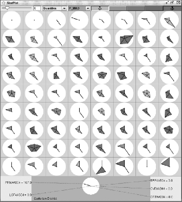
FIGURE 5.7
A star plot of the cancer burden across the Māori population of New Zealand for a group of five
cancers - thus creating a five-sided geometric figure. Each symbol represents a different geographical region.
The cancer rates show a good deal of variation from place to place, though the data contain some missing
values that cause the affected symbols to become linear in places.
to support visualisation activities is not covered here since these needs are being independently
pursued by many different research communities.
Building on Bertin's work, Mackinlay (1986) synthesised a rank ordering of the difficulty of
perception tasks. As Table 5.2 shows, he found that the orderings actually differ according to the
statistical scale
of the data under consideration (nominal, ordinal or quantitative). It is interesting
to note that
position
is ranked as the most easily separable visual variable for all statistical scales,
but after that, the most separable variable to use depends quite heavily on the statistical scale of the
data to be visually encoded. This tells us that to make an effective visualisation, the choice of visual
variable should depend on the nature of the task (integration or separation of values)
and
also on the
statistical scale of the data.
The aforementioned guidelines can be adopted as a starting point from which to construct a
visualisation, a topic that is taken up in the next section.
5.5.1 d
eSigning
a
V
iSualiSation
In order to ensure that a visualisation achieves its goal, the data should be encoded to the available
visual variables bearing in mind the effort required to correctly perceive and interpret them. For
example, humans are generally poor performers at quantifying differences in colour hue (and about