Geoscience Reference
In-Depth Information
picking out pattern than did the Equal Interval map. On the other hand, larger
countries in size tend to have more population, so at this scale it is difficult to
see the pattern of the smaller-population countries. There is a balance between
enough classes to differentiate between countries, but not too many or else
it exceeds the mind's capacity to differentiate between the classes and colors.
Thoughtful analysis in choosing data ranges is critical; vastly different visual
displays may result from the same data set based on choice of ranging the data!
6.6.3 Normalization activity
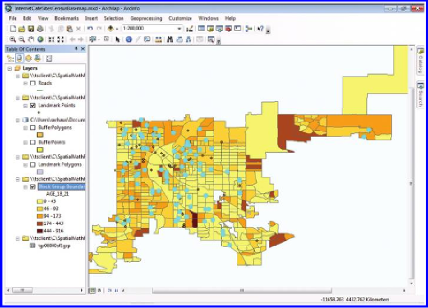
Return to the Denver Internet Café activity that you began in an earlier chap-
ter. Now, focus on the normalization section of the activity. Normalization
allows you to see patterns that you cannot see while mapping total quantities,
such as the percentage of 18 to 21 year-olds. Compare the raw values mapped
in Figure 6.19 (from Chapter 5) to the normalized values (with number of
18 to 21 year-olds divided by total population in 2000) for each Block Group
(
Figures 6.20
and
6.21
)
. One way to see the number of block groups with
more than 10% 18 to 21 year-olds is simply to alter the way in which the
data set is partitioned, as in
Figure 6.22
. Try it! As in the previous chapter,
consider trying more of the activity for yourself, to return to a more complete
view of it in a later chapter.
Figure 6.19 Raw values of 18 to 21 year-olds mapped by Block Group. Source of base
map: Esri software.
Search WWH ::

Custom Search