Geoscience Reference
In-Depth Information
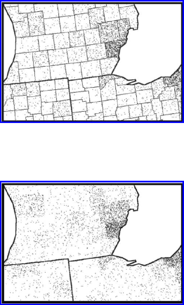
Figure 5.3 Dot scatter at the county level. The individual dots do not correspond to
addresses or other geographic features. The scatter is assigned to random positions
within a base of polygons—counties here. Source: Arlinghaus, S. L., unpublished
lecture notes. Source of base map: Esri software.
Figure 5.4 Dot scatter viewed through the lens of state boundaries shows patterns of
population clustering (with randomization of scatter taking place at the county
level). Source: Arlinghaus, S. L., unpublished lecture notes. Source of base map:
Esri software.
as a “randomizing layer.” However, when the scale of viewing is changed,
and when the county boundaries are removed and the state boundaries are
shown, one gets a good picture of the clustering of population at the state
scale through a state, rather than a county, lens (Figure 5.4). Further scale
change may reveal broader patterns, as well. When looking at maps that
purport to be dot density maps, it is critical to know if one is looking at
Search WWH ::

Custom Search