Geoscience Reference
In-Depth Information
Color scale
Color scale
-48
200
-48
200
96
96
64
64
32
32
0
0
0.0
29.7
395451. to 395515.
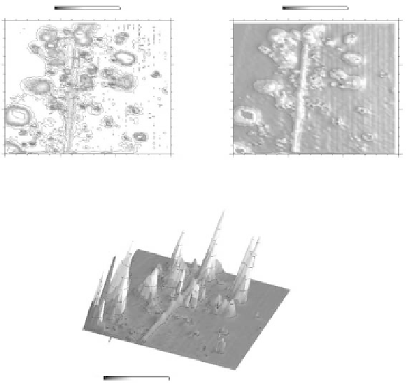
(a) Line contours
59.3
89.0
0.0
29.7
59.3
89.0
395451. to 395515.
(b) Shaded contours
-35.4823
179.151
Color scale
(c) Shaded relief
fIGURe 6.12
Basic presentations of gridded data: (a) line contours, (b) shaded contours, and (c) perspective
view.
alternative schemes of presentation (e.g., gray scale, perspective views, shaded relief, color contour-
ing) that are widely used to supplement or complement the traditional black-and-white contour maps
(or profiles).
Gridded data can be presented in numerous useful forms that complement the contour map
and assist the analyst in evaluating and interpreting the data set. The most basic form is the con-
tour map, where lines are drawn through data with the same values. The simplest presentation of
data is the line contour map (Figure 6.12a), but the shaded contours (Figure 6.12b) can provide a
view that is easier to interpret. Perspective presentations (Figure 6.12c) of gridded data provide
a three-dimensional view of the data set that generally is more pictorial than a contour map. The
three-dimensional view is pictured from a specified azimuth and angle above the zero level (hori-
zon) with variable amplitudes plotted as heights as in a three-dimensional view of topography.
The information shown is highly dependent on the position of the viewing site and the vertical scale
exaggeration. Thus, finding an optimum presentation often is an iterative process.
Amplitude filtering is probably the most commonly used processing and interpretation tool.
In fact, it is so common that we do not even think of it as filtering. Amplitude filtering is best
illustrated by example. Figure 6.13 shows a magnetic contour map that has been plotted at two dif-
ferent amplitude levels. Clearly, a few anomalies are enhanced when we filter out the low-intensity
(low-amplitude) anomalies. However, the trade-off is always that we lose detail and may eliminate
anomalies of interest when we select the cutoff values. It is usually best to display and interpret
several maps with different cutoff values.
There are many other forms of automated spatial filtering of gridded data that we will not detail
in this chapter. Examples and explanations of filtering based on linear systems analysis and statis-
tics can be found in Odgers (2007) and Cressie (1993). Profiles of EM measurements are useful to