Geoscience Reference
In-Depth Information
Worked example of flood frequency analysis
The data used to illustrate the flood frequency
analysis are from the same place as the flow
duration curve (the upper Wye catchment in
Wales, UK). In this case it is an annual maximum
series for the period 1970 until 1997 (inclusive).
In order to establish the best time of year to set
a cut off for the hydrological year all daily mean
flows above a threshold value (4.5 m
3
/s) were
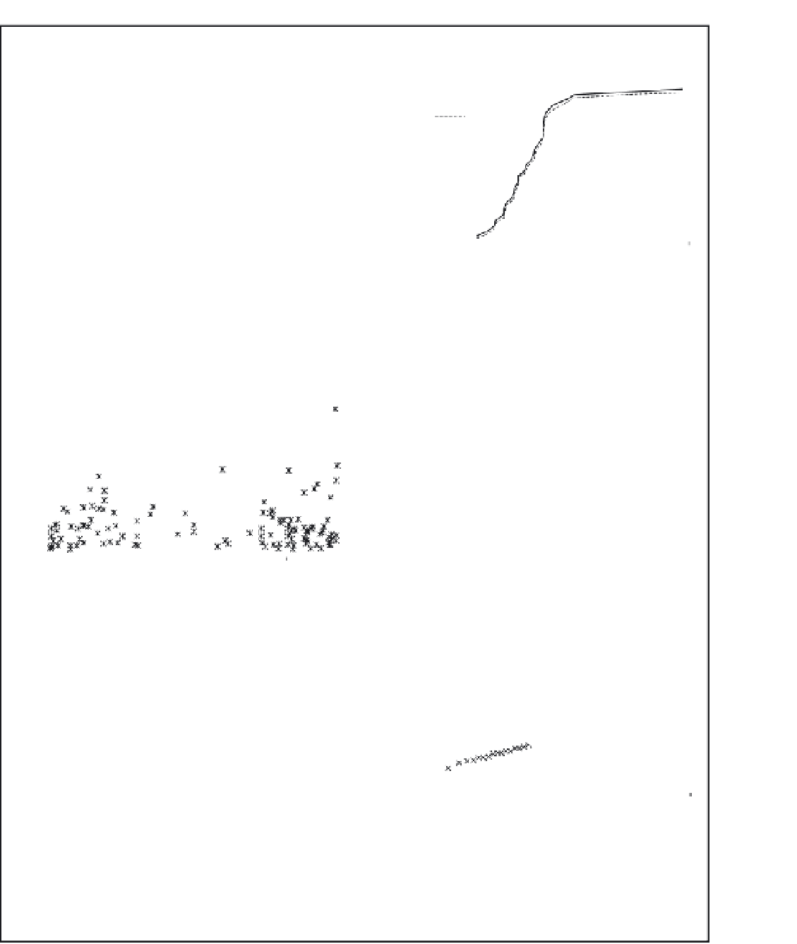
plotted against their day number (figure 6.12). It
is clear from Figure 6.12 that high flows can occur
at almost any time of the year although at the start
and end of the summer (150 = 30 May; 250 = 9
September) there are slight gaps. The hydrological
year from June to June is sensible to choose for this
example.
1.0
Weibull
Gringorten
0.8
0.6
0.4
0.2
0.0
0
10
20
30
40
50
Annual maximum flow (X) (m
3
/s)
Figure 6.13
Frequency of flows less than X plotted
against the X values. The
F
(X) values are calculated
using both the Weibull and Gringorten formulae.
When the data are plotted with a trans-
formation to fit the Gumbel distribution they
almost fit a straight line, suggesting that they do
fit a distribution for extreme values such as the
Gumbel but that a larger data set would be
required to make an absolute straight line. A
longer period of records is likely to make the
extreme outlier lie further along the x-axis. The
plot presented here has transformed the data to fit
the Gumbel distribution. Another method of
presenting this data is to plot them on Gumbel
distribution paper. This provides a non-linear scale
for the x-axis based on the Gumbel distribution.
14
12
10
8
6
4
0
100
200
300
Day number
Figure 6.12
Daily mean flows above a threshold value
plotted against day number (1-365) for the Wye
catchment.
60
50
40
30
20
10
0
The Weibull and Gringorten position plotting
formulae are both applied to the data (see Table
6.3) and the
F
(
X
),
P
(
X
) and
T
(
X
) (average
recurrence interval) values calculated. The data
look different from those in Figure 6.12 and from
the flow duration curve because they are the peak
flow values recorded in each year. This is the peak
value of each storm hydrograph, which is not the
same as the peak mean daily flow values.
When the Weibull and Gringorten values are
plotted together (Figure 6.13) it can be seen that
there is very little difference between them.
-2
0
2
4
-In (-In(F(X)))
Figure 6.14
Frequency of flows less than a value X.
NB The
F
(X) values on the x-axis have undergone a
transformation to fit the Gumbel distribution (see
text for explanation).