Graphics Reference
In-Depth Information
you some ideas of both good and bad navigation. Putting
the actual look of the menu aside, you should think about aspects
like movement, interaction, readability, and the submenu (if there
is one).
Plain or Pretty
While you
re figuring out how you want the navigation to look and
move, don
'
t forget to consider the number one factor in the pro-
ject:yourclient.Themenudesignofsomesiteswillhavetobe
plain, while others get to be more decorative and pretty. It may go
without saying, but if you
'
'
re working on a microsite for cancer
research, you
re probably not going to design the same menu as
you might for a fun-and-games site for kids. One will be more
straightforward and simple, while the other has a crazier, outside-
the-box look to it. However, both menus should be very easy to
understand and navigate. If you find that you have to include any
kind of directions telling users how to use the menu, it may be
time to rethink the design.
'
Figure 8.10
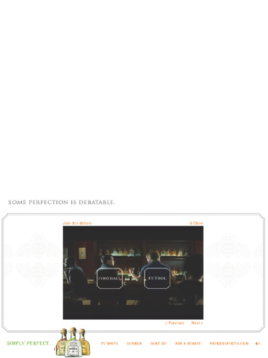
Patrón, Simply Perfect (watch the commercials) - Produced by Click Here, Inc.