HTML and CSS Reference
In-Depth Information
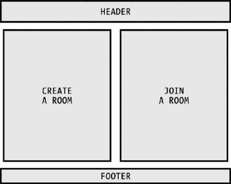
Wireframing for Wider Screens
On wider screens, it makes sense to set these two forms side by side because neither is more or less important than
the other. When we put this all into a basic wireframe, it looks like Figure
5-4
.
Figure 5-4.
Home page wireframe for wider screens
Wireframing for Narrower Screens
On narrower screens, a two-column layout isn't feasible, so we have to reflow the content into a single column.
The form for attendees to join a room should be on top for two reasons: It will be much shorter than the presenter
form, and it's reasonable to assume that more people will be using the app to attend sessions than to present.
After reflowing the content, it will look like Figure
5-5
.
Search WWH ::

Custom Search