Information Technology Reference
In-Depth Information
Table 15. Rank comparisons between resource demand levels and APRDRG indices
Hospital
APRDRG Ranking
Demand Staging Ranking
Text Clusters
1
4
1
5
2
3
7
6
3
2
7
1
4
7
4
7
5
5
2
8
6
1
3
4
7
8
9
2
9
6
1
3
10
9
7
9
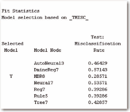
Figure 23. Results of predictive model
Then, we will compare the results to the hospitals. Table 16 gives the results of the text analysis.
We examine outcomes to define an order relationship to these clusters. Table 17 gives the comparison
of mortality to cluster.
It is clear that 5>3>4>1>2 in terms of severity by actual mortality. We examine length of stay and
total charges to see if that ordering holds. Note that none of the clusters has a high proportion of mortal-
ity, except possibly for cluster 5. Table 18 gives the summary statistics.
For length of stay, 5>4>1>2>3, and for total charges, 5>4>2>1>3. There is little difference between
clusters 5 and 4, and between clusters 2 and 1. Therefore, the boundaries will be a little fuzzy and do
switch the ordering. However, these changes are well within the margin of error as defined by the stan-
dard deviation. Table 19 gives the relationship of cluster to hospital.
Hospital 2, which has always ranked the lowest because of a zero mortality rate has most of its patients
in clusters 2 and 5, which are on the extremes in terms of actual mortality. Hospital #7, which ranks high,
has approximately 65% of its patients in the same two clusters. Therefore, the fact that Hospital #2 has


Search WWH ::

Custom Search