Information Technology Reference
In-Depth Information
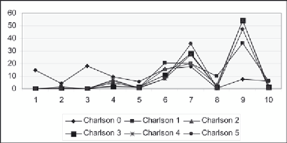
Figure 8. Charlson index by diagnosis cluster for index values 1-5
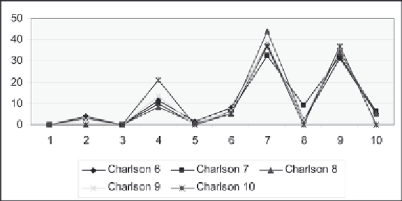
Figure 9. Charlson index by diagnosis cluster for index values 6-10
However, as we saw in Chapter 5, the Charlson Index itself is not linear in that patients at a higher index
can have higher average charges and length of stay compared to a patient at a lower index.
Figure 9 also shows that clusters 7 and 9 have the highest risk compared to the remaining clusters.
However, clusters 3 and 6 show a much lower occurrence of these higher Charlson values; cluster 4
appears to have a higher occurrence, but not as high as clusters 7 and 9. This is not unreasonable since
the higher Charlson Index values should not have cluster levels that have a lower rate of risk.
Similarly, we consider the relationship of the Charlson Index to the procedure clusters as identified in
Table 8 (Figures 10 and 11). Here, it is clearly cluster 6 with the highest proportion for all index levels.
The pattern is quite similar for Index levels 6-10 (Figure 11).
Overall, these graphs show that there is a pattern to the diagnosis and procedure clusters, but the pat-
tern differs from the one used to develop the Charlson Index. We use the predictive model to determine
whether the inclusion of patient demographic information will allow us to predict the Charlson Index
using both the diagnosis and procedure clusters. The best model is a decision tree with a 38% misclas-
sification rate. Figure 12 gives the tree. It shows the importance of both diagnosis and procedure clusters
to predict the Charlson level, along with the patient's age and mortality.
Search WWH ::

Custom Search