Java Reference
In-Depth Information
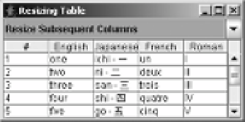
Figure 18-6.
Demonstrating JTable resizing column modes
Rendering Table Cells
By default, the rendering of table data is done by a
JLabel
. Whatever value is stored in the table
is rendered as a text string. The odd thing is that additional default renderers are installed for
classes such as
Date
and
Number
subclasses, but they're not enabled. You'll see how to enable
these specialized renderers in the “Enabling the Default Table Cell Renderers” section later in
this chapter.
Using the TableCellRenderer Interface and DefaultTableCellRenderer Class
The
TableCellRenderer
interface defines the single method necessary for that class to be a
TableCellRenderer
.
public interface TableCellRenderer {
public Component getTableCellRendererComponent(JTable table, Object value,
boolean isSelected, boolean hasFocus, int row, int column);
}
By using information given to the
getTableCellRendererComponent()
method, proper
renderer components can be created and sent on their way to display the appropriate content
of the
JTable
. “Proper” means renderers that reflect the table cell state that you've decided to
display, such as when you want to display selected cells differently than unselected cells, or
how you want the selected cell to appear when it has the input focus.
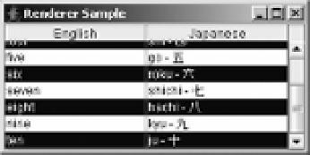
To see a simple demonstration of this, look at Figure 18-7, which shows a renderer that
alternates colors based on which row the renderer is displayed within.
Figure 18-7.
JTable with custom renderer
The source for the custom renderer used to produce the example in Figure 18-7 is shown
in Listing 18-2.