Java Reference
In-Depth Information
■
Note
Besides setting the
popupVisible
property, you can use the
public void hidePopup()
and
public void showPopup()
methods to toggle the pop-up list's visibility status.
Rendering JComboBox Elements
The rendering of elements within a
JComboBox
is done with a
ListCellRenderer
. This is the same
renderer that is used for a
JList
component. Once you've created a renderer for either one of
these two components, you can use that renderer for the other component. To reuse the
ComplexCellRenderer
from earlier in the chapter (Listing 13-6), you could add the following
lines to the
ComplexRenderingSample
example (Listing 13-7) to have the two components share
the same renderer.
JComboBox comboBox = new JComboBox(elements);
comboBox.setRenderer(renderer);
frame.add(comboBox, BorderLayout.NORTH);
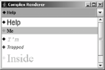
The result of adding these lines is shown in Figure 13-15.
Figure 13-15.
A JComboBox with a custom renderer
Not all renderers will work as expected with both the
JComboBox
and
JList
components.
For instance, the
FocusedTitleListCellRenderer
demonstrated earlier in Figure 13-6 wouldn't
show the “Focused” title border in a
JComboBox
because the choices never had the input focus.
In addition, different components may have different default colors (a different unselected
background color, in this case). It may be necessary to ask what color the component normally
would be rendered in, and then act accordingly.
Selecting JComboBox Elements
The
JComboBox
component supports at least three different events related to selection.
You can listen for keyboard input to support key selection with the help of the
JComboBox.
KeySelectionManager
class. You can also listen with an
ActionListener
or an
ItemListener
to find out when the selected item of the
JComboBox
changes.
If you want to programmatically select an element, use
public void
setSelectedItem(Object element)
or
public void setSelectedIndex(int index)
.