Java Reference
In-Depth Information
The
JSlider
resources allow customization of elements that aren't accessible through
JSlider
or
SliderUI
methods. For instance, to customize the
JSlider
appearance of your
application, you may want to alter the icon used for the draggable thumb. With just a few lines
of code, you can take any icon and make it the slider's icon for every slider in your application.
Icon icon = new ImageIcon("logo.jpg");
UIDefaults defaults = UIManager.getDefaults();
defaults.put("Slider.horizontalThumbIcon", icon);
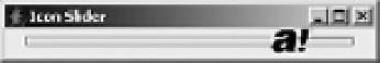
Figure 12-10 shows the results. As with all
UIResource
properties, this change will affect all
JSlider
components created after setting the property.
Figure 12-10.
A JSlider with a custom icon
■
Note
The height and width of the icon are limited to the dimensions of the slider. Changing the
icon
property
doesn't affect the slider size.
JSlider Client Properties
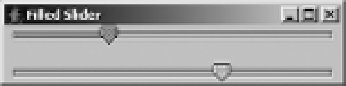
By default, with the Metal look and feel, when the track is visible, the track on which the slider
moves does not change as the slider is moved over it. Nevertheless, you can enable a client
property that will signal the slider to fill this track up to the point of the current value that the
thumb has crossed. The name of this property is
JSlider.isFilled
, and a
Boolean
object repre-
sents the current setting. By default, this setting is
Boolean.FALSE
. Figure 12-11 demonstrates
both a
Boolean.TRUE
and a
Boolean.FALSE
setting; the code fragment follows:
JSlider oneJSlider = new JSlider();
oneJSlider.putClientProperty("JSlider.isFilled", Boolean.TRUE);
JSlider anotherJSlider = new JSlider();
// Set to default setting
anotherJSlider.putClientProperty("JSlider.isFilled", Boolean.FALSE);
Figure 12-11.
Filled and unfilled JSlider
This setting works only in the Metal look and feel. The Ocean theme of the Metal look and
feel ignores this setting, always drawing the track filled. To get this behavior, you need to set the
system property
swing.metalTheme
to
steel
, as in
java -Dswing.metalTheme=steel ClassName
.