Java Reference
In-Depth Information
Table 11-5.
JTabbedPane UIResource Elements (Continued)
Property String
Object Type
TabbedPane.unselectedTabBackground
Color
TabbedPane.unselectedTabForeground
Color
TabbedPane.unselectedTabHighlight
Color
TabbedPane.unselectedTabShadow
Color
TabbedPaneUI
String
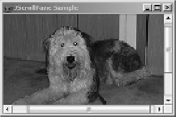
JScrollPane Class
Swing's
JScrollPane
container provides for the display of a large component within a smaller
display area, with scrolling support (if necessary) to get to the parts currently invisible. Figure 11-14
shows one such implementation, in which the large component is a
JLabel
with an
ImageIcon
on it.
Figure 11-14.
JScrollPane example
Identifying the component to be scrolled can be done in one of two ways. Instead of adding
the component to be scrolled directly to the
JScrollPane
container, you add the component to
another component, a
JViewport
, already contained within the scroll pane. Alternatively, you
can identify the component at construction time, by passing it into the constructor.
Icon icon = new ImageIcon("dog.jpg");
JLabel label = new JLabel(icon);
JScrollPane jScrollPane = new JScrollPane();
jScrollPane.setViewportView(label);
// or
JScrollPane jScrollPane2 = new JScrollPane(label);
Once you've added the component into the
JScrollPane
, users can use the scrollbars to
see the parts of the large component that aren't visible within the inner area of the
JScrollPane
.
In addition to giving you the means to set the scrollable component for the
JScrollPane
, a
display policy determines if and when scrollbars are shown around the
JScrollPane
. Swing's
JScrollPane
maintains separate display policies for the horizontal and vertical scrollbars.