Java Reference
In-Depth Information
checkBox.setMnemonic(KeyEvent.VK_S);
frame.add(checkBox, BorderLayout.NORTH);
frame.setSize(300, 100);
frame.setVisible(true);
}
};
EventQueue.invokeLater(runner);
}
}
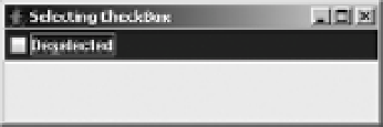
The
SelectingCheckBox
class produces the screen shown in Figure 5-8, after selecting and
deselecting the
JCheckBox
.
Figure 5-8.
SelectingCheckBox program screen
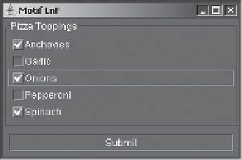
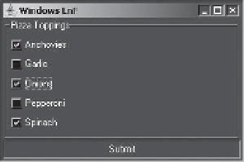
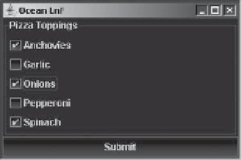
Customizing a JCheckBox Look and Feel
Each installable Swing look and feel provides a different
JCheckBox
appearance and set of
default
UIResource
values. Figure 5-9 shows the appearance of the
JCheckBox
component for
the preinstalled set of look and feel types: Motif, Windows, and Ocean. The first, third, and fifth
check boxes are selected; the third has the input focus.
-OTIF
7INDOWS
/CEAN
Figure 5-9.
JCheckBox under different look and feel types