Java Reference
In-Depth Information
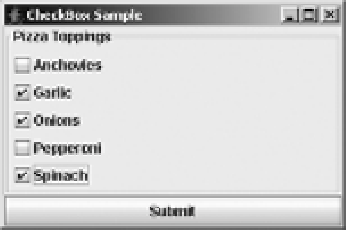
Figure 5-5.
Sample JCheckBox components
The
JCheckBox
is made up of several pieces. Like
JToggleButton
, the
JCheckBox
uses a
ToggleButtonModel
to represent its data model. The user interface delegate is
CheckBoxUI
.
Although the
ButtonGroup
is available to group together check boxes, it isn't normally appropriate.
When multiple
JCheckBox
components are within a
ButtonGroup
, they behave like
JRadioButton
components but look like
JCheckBox
components. Because of this visual irregularity, you
shouldn't put
JCheckBox
components into a
ButtonGroup
.
Now that you've seen the different pieces of a
JCheckBox
, let's find out how to use them.
Creating JCheckBox Components
Eight constructors exist for
JCheckBox
:
public JCheckBox()
JCheckBox aCheckBox = new JCheckBox();
public JCheckBox(Icon icon)
JCheckBox aCheckBox = new JCheckBox(new DiamondIcon(Color.RED, false));
aCheckBox.setSelectedIcon(new DiamondIcon(Color.PINK, true));
public JCheckBox(Icon icon, boolean selected)
JCheckBox aCheckBox = new JCheckBox(new DiamondIcon(Color.RED, false), true);
aCheckBox.setSelectedIcon(new DiamondIcon(Color.PINK, true));
public JCheckBox(String text)
JCheckBox aCheckBox = new JCheckBox("Spinach");
public JCheckBox(String text, boolean selected)
JCheckBox aCheckBox = new JCheckBox("Onions", true);
public JCheckBox(String text, Icon icon)
JCheckBox aCheckBox = new JCheckBox("Garlic", new DiamondIcon(Color.RED, false));
aCheckBox.setSelectedIcon(new DiamondIcon(Color.PINK, true));