Java Reference
In-Depth Information
Icon warnIcon = new ImageIcon("Warn.gif");
JButton button2 = new JButton(warnIcon);
button2.setActionCommand("Second");
button2.addActionListener(actionListener);
frame.add(button2);
JButton button3 = new JButton("Warning", warnIcon);
button3.setActionCommand("Third");
button3.addActionListener(actionListener);
frame.add(button3);
String htmlButton = "<html><sup>HTML</sup> <sub><em>Button</em></sub><br>" +
"<font color=\"#FF0080\"><u>Multi-line</u></font>";
JButton button4 = new JButton(htmlButton);
button4.setActionCommand("Fourth");
button4.addActionListener(actionListener);
frame.add(button4);
JRootPane rootPane = frame.getRootPane();
rootPane.setDefaultButton(button2);
frame.setSize(300, 200);
frame.setVisible(true);
}
};
EventQueue.invokeLater(runner);
}
}
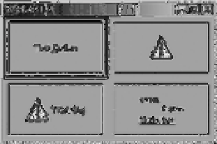
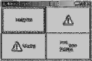
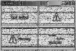
Customizing a JButton Look and Feel
Each installable Swing look and feel provides a different
JButton
appearance and set of default
UIResource
value settings. Figure 4-14 shows the appearance of the
JButton
component for the
preinstalled set of look and feel types: Motif, Windows, and Ocean.
Motif
Windows
Ocean
Figure 4-14.
JButton under different look and feel types